
Data visualization is not as easy as it may sounds: you don’t have to show your data; you have to tell a story and you have to choose your heroes properly.
In this case, your heroes are the graphs you choose to use to tell your story, and you have to know one important thing: not everyone is a technician. One of the things people in data have to master, in fact, is storytelling and data exposition techniques because, in most cases, we have to tell stories to people who do not know math and statistics.
If you have some young children, you will read them a book with a lot of pictures and a few words (and not the contrary), won’t you? This is because children want to understand, but until they learn how to read they can understand your story, while you read it, watching the pictures. They really see the wolf in the woods seeking Little Red Riding Hood, but they’re helped by the pictures in the book: and this helps them to develop their imagination.
In this article, we’ll see a couple of heroes to master your data stories, and they are:
- barplot
- histogram
Since these two heroes are very similar, I’ll give some practical examples on how and when you have better use them and what you communicate when you use them.
1. Histograms
Quoting Wikipedia:
A histogram is an approximate representation of the distribution of numerical data
Practically speaking, a histogram helps us see the frequencies of the data we want to show to people. Since visually a histogram is represented with bars, the more a bar is high the more the frequency is high.
Let’s see an example; if we have a data frame "df" in which we want to represent the frequencies of data called "MY DATA", we can plot a histogram with seaborn like that:
import seaborn as sns
import matplotlib.pyplot as plt
#plotting the histogram
sns.histplot(data=df, x='MY DATA', color='red', binwidth=1)#labeling
plt.title(f"THE FREQUENCIES OF MY DATA", fontsize=25) #plot TITLE
plt.xlabel("MY DATA", fontsize=25) #x-axis label
plt.ylabel("FREQUENCIES", fontsize=25) #y-axis label#showing grid
plt.grid(True, color="grey", linewidth="1.4", linestyle="-.") 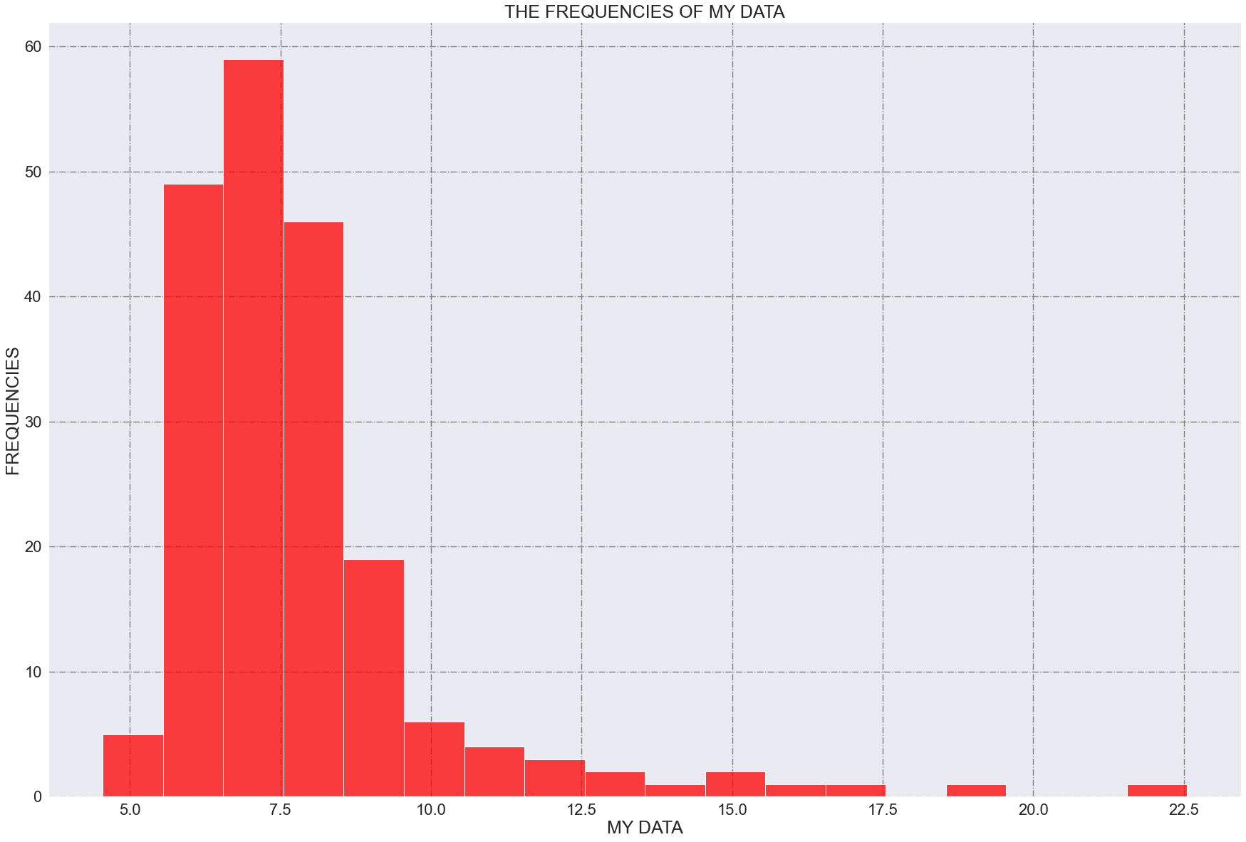
In histograms, we define "binwidth" as the width of each rectangle. In this example, I’ve set a binwith of 1.
Suppose that this histogram represents measured times and that the bins have a width of 1 minute each. This chart tells us this story:
the most frequent measured times are between 6.5 and 7.5 minutes since this range of values has been measured about 60 times (the height of the highest column is very near to 60)
Also, what can we say about the distribution? Well, we can clearly say that the data are not distributed as a normal distribution (Gaussian) since they are clearly (right) skewed.
2. Barplots
A barplot (or barchart) is a graph that represents data with rectangular bars, having heights proportional to the values they represent.
In other words, a barplot shows the relationship between a numerical and a categorical variable, and each categorical variable is represented as a bar: the size of the bar (its height) represents its numeric value.
Let’s see an example:
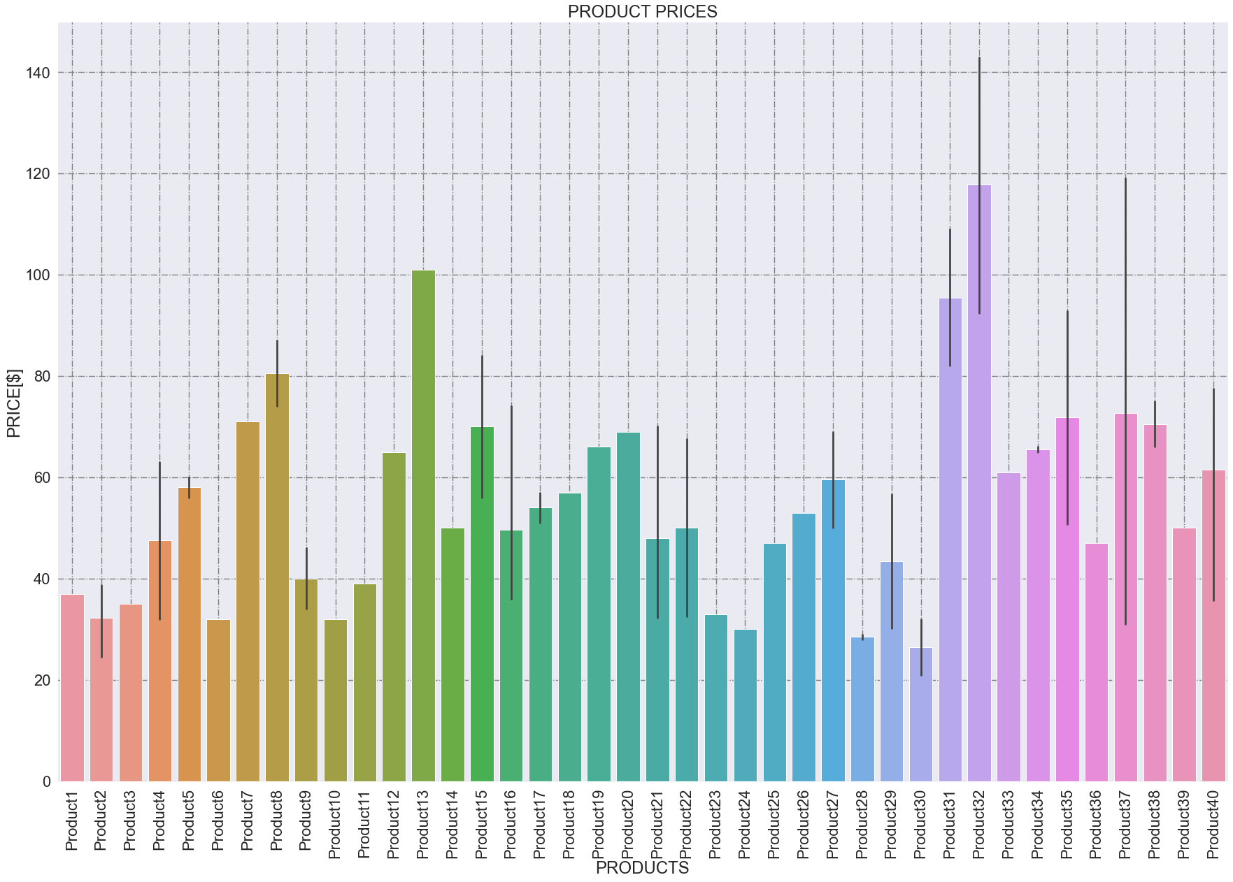
In this case, we have 40 products and we can see the prices for each product, helping us compare the products themself. In such cases – when we have "a lot" of products – for a better visualization we have better order the bars, in ascendent or descendent order.
If we use seaborn, our data frame is "df", and our data to plot are "PRODUCT", and "PRICE", we can do so this way:
import seaborn as sns
import matplotlib.pyplot as plt
#setting the ascendent order
order = df.groupby(['PRODUCT']).mean().sort_values('PRICE').index#plotting the barplot
sns.barplot(data=df, x='PRODUCT' , y='PRICE', order=order)#rotating x-axes values for better viz
plt.xticks(rotation = 'vertical')#labeling
plt.title('PRODUCT PRICES')
plt.xlabel(f'PRODUCTS')
plt.ylabel(f'PRICE[$]')#showing grid
plt.grid(True, color="grey", linewidth="1.4", linestyle="-.") 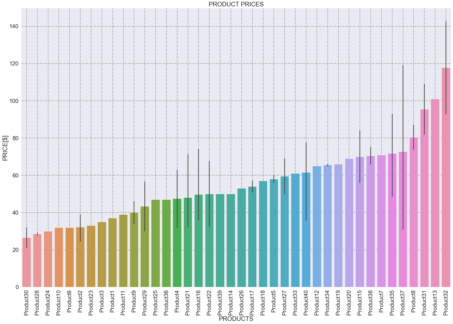
So, this way we can easily see that the most expensive product is "product32" and the cheapest is "product30".
Conclusions
In this article we’ve seen the difference between a histogram and a barplot; both use rectangles as a visual way to explain data, but the outcome they communicate is different. Summarizing:
- A histogram:
- approximates the distribution of the data
- shows the relationship between numerical data
- helps us to understand how frequently a numerical value occurs
- A barplot:
- represents data with rectangular bars with heights proportional to the values they represent
- shows the relationship between a numerical and a categorical variable
- helps us compare the values of different categorical variables
SPOILER ALERT: if you are a newbie or you want to learn Data Science and you liked this article, then consider that in the next few months I’ll start tutoring aspiring Data Scientists like you. I’ll tell you in the next weeks when I’ll start tutoring, and if you want to reserve your seat…subscribe to my mailing list: I‘ll be communicating the beginning of my tutoring journey through it, and in the next articles.
Let’s connect together!
LINKEDIN (send me a connection request)
Consider becoming a member: you could support me and other writers like me with no additional fee. Click here to become a member.


