Drug-drug interactions occur when two or more drugs react with each other, resulting in unexpected (and potentially fatal) adverse reactions.
Being a data scientist with a background in clinical pharmacy, I was keen to leverage my domain knowledge to explore the data around drug interactions.
Drug-drug interactions involve linkages between multiple entities, so it would be apt to analyze these drug interactions with networks as the core concept.
Contents
(1) Data Acquisition and Preparation (2) Network Analysis with NetworkX (3) Visualization with Pyvis and DataPane (4) Python Implementation Codes (5) Moving forward

Disclaimer: This article is NOT intended to provide any form of medical advice or recommendations. Please consult your doctor or pharmacist for professional advice relating to any drug therapy.
(1) Data Acquisition and Preparation
The Stanford Network Analysis Project (SNAP) has a public Biomedical Network Dataset Collection comprising many datasets with information on relationships between entities. Some examples include disease-drug association, relations between biological processes, and even similarity networks between butterflies.
I used the ChCh-Miner dataset for this project, which comprises a network of interactions between Food and Drug Administration (FDA) approved drugs.
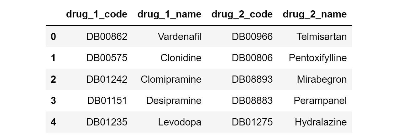
The raw data is stored as a CSV file of 48,464 rows and 2 columns, where each row represents an interaction between a particular pair of drugs.
The values are in the form of DrugBank (DB) codes, so they need to be matched with actual drug names. This is done manually by searching iteratively for the corresponding drug names from the public DrugBank database.
After further data pre-processing (e.g. removal of compounds without drug names), we get a Pandas DataFrame that looks like this:
A downside of this dataset is that the severity of drug interactions is not provided. Therefore, a custom column (named ‘Weight) filled with 1’s was added to indicate ‘equal’ severity for all interactions.
(2) Network Analysis with NetworkX
(i) Overview
A network is simply a collection of connected objects, and they are highly useful for modeling relationships (aka edges) between entities (aka nodes).
In our dataset, every pairwise drug interaction is a relationship between two nodes (i.e. the two drug compounds).
Given that we have a bunch of undirected linkages between drug entities, we can proceed to perform network analysis with NetworkX, a Python package used for the creation, manipulation, and study of networks.
(ii) Creation of Network Graph
NetworkX can be installed with: pip install networkx[default]
Once done, we generate a network graph object from the drug interactions Pandas DataFrame, and retrieve a basic summary of the network graph:
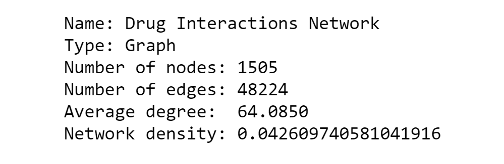
We can see that the network has a total of 1,505 drug entities (nodes) with 48,224 documented interactions (edges).
The average degree is 64, meaning that each drug typically interacts with 64 other drugs on average. (More on node degree in the later section)
Network density describes the proportion of potential connections in a network that are actual connections, with 0 representing a graph with zero edges, and 1 representing a complete graph where all nodes are interconnected.
The low network density of 0.04 makes sense because we do not expect too many medications to have interactions with each other.
(iii) Degree Centrality
The degree of a node refers to the number of connections the node has. When working with networks, we deal with a key concept called degree centrality.
To put it simply, the degree centrality of a node is simply the number of edges it has. This means that a drug node with 5 interactions would have a degree centrality of 5.
By calculating the degree centrality of each node, we can get the top 20 drugs most frequently involved in drug interactions:
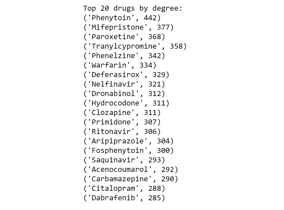
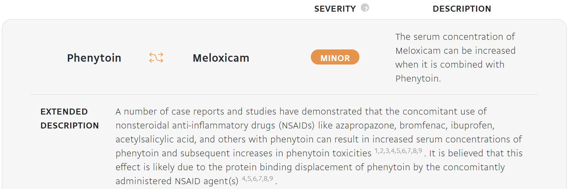
The output above reveals that the drug most frequently involved in drug interactions is Phenytoin, with a node degree of 442.
Phenytoin is a commonly used anti-epileptic medication for the treatment of seizure disorders, and its concentration in the blood has to be kept carefully within consistent levels to ensure its effectiveness and safety.
Here is an example of what a drug interaction involving Phenytoin looks like:
(3) Visualization with Pyvis and DataPane
(i) Overview
Probably the coolest part about working with networks is the visualization aspect. A tool to help us easily construct such visualizations is Pyvis, a Python library well-known for creating interactive network graphs.
Pyvis can be installed with: pip install pyvis
The sequence to creating a Pyvis visualization from a DataFrame is as such:
- Generate a NetworkX graph from the Pandas DataFrame containing the edge list with the
[nx.from_pandas_edgelist](https://networkx.org/documentation/stable/reference/generated/networkx.convert_matrix.from_pandas_edgelist.html)method. - Initiate a Pyvis Network class instance with
[Network()](https://pyvis.readthedocs.io/en/latest/_modules/pyvis/network.html) - Take the NetworkX graph and translate it to a Pyvis graph format with the
.from_nxmethod of theNetwork()class
There is plenty of customization available to structure or modify the appearance of the network visualization. In my case, I experimented with the popular Repulsion solver and Barnes Hut physics model.
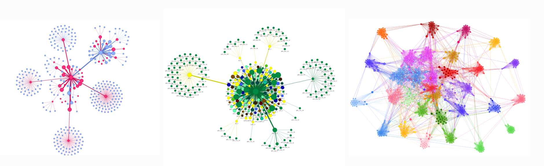
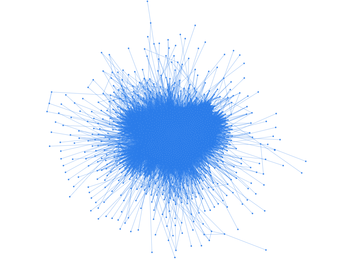
I started by dumping the entire drug interactions data into a Pyvis Barnes Hut graph and in return, I obtained a terrifying ‘sea urchin lookalike’ network.
(ii) Exploring a single drug
To make the graphs more meaningful and interpretable, it would be better to work on a smaller subset of data instead of the full dataset.
Since we discovered earlier that Phenytoin has the most drug interactions, let’s create a Pyvis network (using Repulsion solver) for Phenytoin alone:
Note: Click the ‘fullscreen’ button if viewing this on mobile devices
The above visualization presents Phenytoin as the central node, surrounded by 442 other drug entities that it interacts with.
The beauty of Pyvis is that the visualizations are interactive, meaning that you can actually mouse over the graph to zoom, point or drag the nodes.
Since Pyvis saves the graphs as HTML files locally, so we will need a separate tool to share the results publicly. This is where Datapane comes into the fray.
Datapane is an open-source Python library that allows users to publish objects like HTML files and Python plots on the web for sharing and visualization. You can find the script I wrote for uploading HTML files to Datapane here.
(iii) Exploring multiple drugs
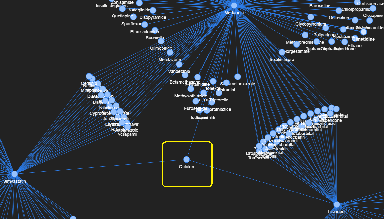
Looking at one drug is probably not insightful, so let’s explore a network comprising a slightly larger data subset.
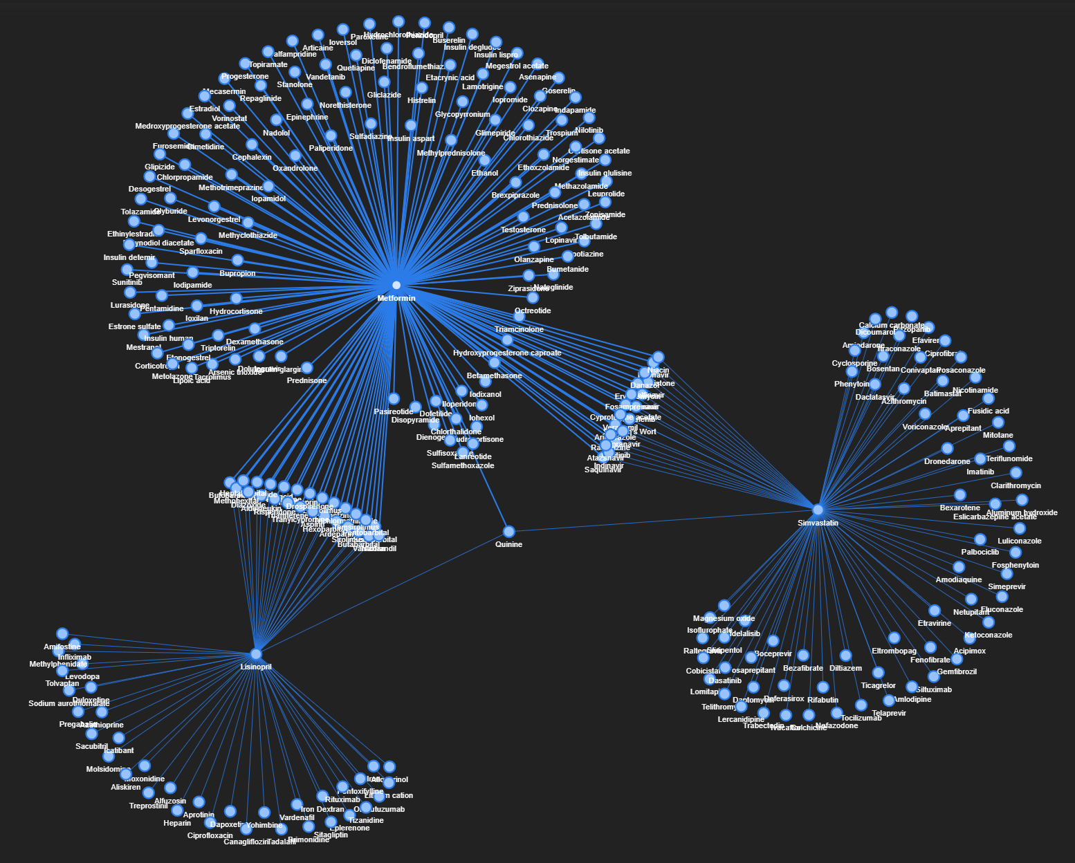
I picked three drugs (Metformin, Lisinopril, and Simvastatin) for further exploration based on their key roles in the prevalent diseases of diabetes, hypertension, and hyperlipidemia respectively.
Upon filtering the data to keep interactions that involve at least one of these three drugs, the resulting graph looks like this (somewhat resembling shapes of jellyfish and broccoli):
From the network graph, we can readily pinpoint the different drugs which have common interactions with Metformin, Lisinopril, and/or Simvastatin. As before, this network graph is interactive, so go ahead and explore it.
One interesting insight is that there is only one entity that interacts (i.e. has edges) with all three handpicked drugs, and that drug is Quinine.
(4) Python Implementation Codes
I have posted the comprehensive codes and data inside this GitHub repo, so feel free to explore (and star/fork) the contents.
Do experiment with the other functionalities and network customizations within NetworkX and Pyvis, and also try creating your very own networks!

(5) Moving forward
With the baseline analysis and visualizations complete, here are several potential next steps:
- Drug interactions have different levels of severity (i.e. minor, moderate, severe), and this was not accounted for due to lack of data. It would be ideal to find and include that information so that the edges can have different thicknesses to reflect varying severity.
- Add details of the interaction as a pop-up upon hover over the nodes and edges
- Deploy this project as a Streamlit web app so that users can handpick their own set of drugs to visualize in a network graph.
Update: The Streamlit deployment has recently been completed! Check it out here:
Before You Go
I welcome you to join me on a Data Science learning journey! Do give this Medium page a follow to stay in the loop of more exciting data science content, or reach out on LinkedIn. Have fun exploring network graphs!


