
In this article, we will discuss why accuracy is not always the best measure to evaluate the performance of a model, especially in the case of Classification tasks, and then we will introduce alternative metrics that give us a better sense of how well our classifier is doing. We will also look at examples to get a better intuition behind the ideology of these metrics and get an idea about when to use what. But prior to going directly into this discussion, let’s first make sure we are well aware of some basics.
Regression vs Classification
Supervised machine learning can be broadly classified into two types: regression and classification.
Regression: In regression, the goal of the model is to predict continuous values, for example, predicting house prices based on input features like size, number of bedrooms, locality, etc.
Classification: It deals with predicting discrete class labels based on input features. Some examples of classification include email spam detection, disease detection, image classification, etc.
As our target values (the value we want to predict is known as target) **** are continuous in case of regression problems, it makes complete sense to use metrics such as Mean Absolute Error (MAE), Mean Squared Error (MSE), R-squared, etc. These metrics require the computation of difference (also known as error or _residua_l) between the actual value and _predicted valu_e for each instance.
However, target values in classification are often categorical, and computation of such mathematical measures is not appropriate. So, we need something else to quantify the performance of our classification models and accuracy is one such option.
What is Accuracy?
One of the simplest and most straightforward methods to evaluate our classifier is to look at the proportion of the instances it has classified correctly. We can do this by simply dividing the number of correct predictions by the total number of instances in our dataset. This is called accuracy – as simple as that!

Accuracy seems to be an elegant way to evaluate the performance of our classifier, but there are some limitations on when to rely on it and when to not.
There are some cases in which we can’t blindly trust the accuracy of a classification model to judge its performance, as it can be deceptive and possibly level up our expectations from the model even if the model is not promising at all!
Accuracy – When NOT to use & Why NOT to use?
Let’s look at a simple example. You’re armed with a responsibility to build a machine learning model to identify whether a patient has a rare disease (which can be life-threatening) based on their symptoms. As you need to build a model that labels each patient as either having the disease or not having the disease, it becomes a binary classification problem.
Assume that the dataset consists of records of 100 patients, out of which 4 are labeled as having the disease and the rest are healthy. In this case, even if you design the dumbest classifier that labels every patient as healthy and then calculate its accuracy, it will come out to be 96%!
If we only look at this accuracy, the model definitely looks promising but you know what you have done right?! We can immediately infer that we cannot rely on such loose metrics especially when the stakes are high – we cannot risk someone’s life by failing to diagnose the disease and not treating them at the right time.
Now we should understand what went wrong in the above example, or what did we not take into account during the performance evaluation.
Accuracy doesn’t care about the following:
- Type of the dataset (whether it is skewed/imbalanced or balanced dataset): In our example, we have an imbalanced class dataset with two classes i.e. having the disease(4 instances) and not having the disease (96 instances). Accuracy just directly divides the number of correct predictions by the total number of instances and does not take into account the distribution or weight of each class in the dataset.
- Context/Nature of the problem (are there any relevant classes/sensitive classes that we cannot risk to mis-classify?): In most of the real-world classification problems, we are often interested in one class (important/relevant class) that we don’t want to mis-label, for example, having the disease class in our case.
Accuracy does not consider any semantic difference between two classes and treats them as equally important.
We want no patient having the disease to be deprived of the treatment at any cost. In the example, we have only 4 instances of the relevant class, and the classifier (that we called a dumb one) we built with 96% accuracy got all of them wrong! This technically means that we must use some other metric that returns 0 for our classifier. However, accuracy does not consider any semantic difference between the two classes and treats them as equally important.
As accuracy doesn’t take into account some sensitive factors about our dataset and the problem at hand, we move on to using some better metrics for performance evaluation. These include Confusion Matrix, recall, precision, F1 score, and ROC-AUC score.
For the sake of simplicity, we are discussing these metrics for binary classification but can be extended for multi-class classification.
Metrics beyond Accuracy
Let’s carry forward the same task of predicting whether a patient is suffering from a rare disease based on their medical attributes. We take presence of disease as ‘positive class‘ and absence of disease as ‘negative class’. Let’s assume for simplicity that our dataset consists of 100 samples out of which 6 are found to be positive, and the rest are negative.
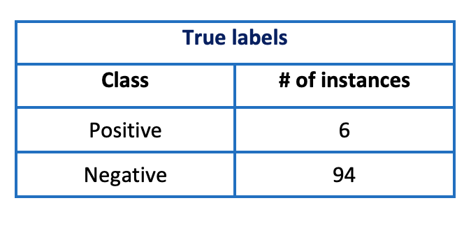
Let’s assume that we have trained our model on the above dataset. We then use the trained model to make predictions on the same dataset first before trying it out on new data or test data.
Also assume that our model predicts 9 instances as positive and 91 as negative. We further break our predictions in the below table (that is just like a version of confusion matrix we will discuss shortly). The following cases can arise:
- Positive/Positive: model predicted positive, and it was actually positive
- Positive/Negative: model predicted positive, but it was actually negative
- Negative/Positive: model predicted negative, but it was actually positive
- Negative/Negative: model predicted negative, and it was actually negative
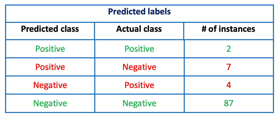
We observe that our model failed to classify four positive cases-that makes up about 67% (4 out of 6) of our relevant classes! As one can see in third row of the above table, it predicted four positive cases as negative – this can have a very severe impact on the lives of the patients who were incorrectly diagnosed as they will not be treated at the right time because they’ll think that they are not having the disease.
The values in green represent correct predictions whereas the values in red represent incorrect predictions. If we calculate the accuracy of our model, it will come out to be 89% – doesn’t look too bad, right? However, considering the sensitivity of even mis-classifying one positive case as negative, we cannot rely on accuracy, as positive class has a larger importance/weight than the negative class. So instead of accuracy, we use following metrics to evaluate our classifier from different angles and perspectives.
Confusion Matrix
Confusion matrix for a binary classifier is represented by a 2×2 matrix that records how many instances were classified correctly, and how many times the model confused positive class as negative or vice versa.
- Rows represent actual classes (true labels)
- Columns represent predicted classes (those predicted by our model)
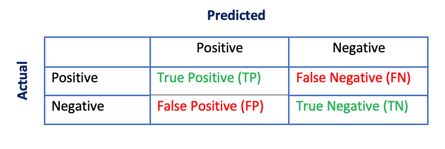
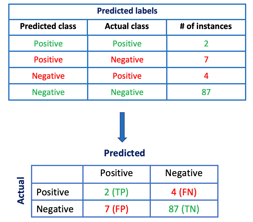
We can now associate TP, FP, FN, and TN with our earlier discussion about predicted/actual class cases that can arise:
- True Positive (TP)— Positive/Positive: model predicted positive, and it was actually positive
- False Positive (FP) – Positive/Negative: model predicted positive, but it was actually negative
- False Negative (FN) – Negative/Positive: model predicted negative, but it was actually positive
- True Negative (TN)— Negative/Negative: model predicted negative, and it was actually negative
Confusion matrix gives us a quick glance at our model’s performance. Correct predictions are shown along the main diagonal of the matrix i.e. True Positives (TP) and True Negatives (TN). An ideal model will have non-zero values only along the main diagonal, and all the non-diagonal entries will be zero.
We can easily convert our recordings of model predictions given in the table earlier to a confusion matrix, which will make it easier to interpret the results.
Although the confusion matrix gives us a quick look at our model’s performance, sometimes we may need more concise metrics, and precision and recall serve this purpose.
Before jumping directly into the formula of precision or recall, it is important to get an intuition behind their purpose. Once we understand what they are trying to measure, we can make more sense of the formula and we will not have to remember it.
Precision
Precision gives us the proportion of data instances our model says are relevant that are actually relevant. In other words, it measures the accuracy of positive predictions.
In our example of disease detection, positive class instances are more relevant to us. So, precision answers the following question: out of all the examples we have predicted as positive, how many were actually positive? We need two things:
- how many examples our model says are positive, including both correct predictions (TP) and incorrect predictions (FP)
- how many examples are actually positive that our model says are positive (TP)
Thus, we can compute precision as: Precision = TP/(TP + FP)
For our example, we can calculate precision as 2/(2 + 7) = 0.22 which is not very impressive.
When to look at precision? Precision is a suitable metric in cases when we do not want mis-classify a negative class as a positive class i.e. we want to minimize the number of false positives. For example, if a model predicts whether a given video is safe for kids or not i.e. safe (positive) and not-safe (negative). This model can do following mistakes:
- False Negative: Classifies safe video as not-safe and reject it, and it is okay!
- False Positive: Classifies not-safe videos as safe and shows it to kids, which is not okay!
In such cases where we want to minimize false positives, precision can be used.
Recall
Recall measures the ability of our model to find all relevant classes in the dataset.
In our example of disease detection, we are more interested in finding all relevant classes (positive cases) in our dataset and we don’t want to mis-classify any positive example as a negative one. Recall answers the following question: How good is our model in detecting all relevant classes? In other words, it computes the proportion of positive data instances that were correctly classified. We need two things:
- how many examples are actually positive in original dataset including those correctly classified (TP) and incorrectly classified (FN)
- how many positive examples are correctly classified by our model (TP)
Thus, we can compute recall as: Recall = TP/(TP + FN)
We can compute the recall of our model as 2/(2 + 4) = 0.33, not very impressive! This means we need to improve our existing model or try to train a more complex one.
Note: Recall is also known as Sensitivity or True Positive Rate (TPR).
When to look at recall? Recall is a suitable metric in cases when we don’t want the risk of mis-labeling a positive instance as negative instance. One example is rare disease detection in which we don’t want to tell any positive patient that they don’t have the disease. Another example can be of a classifier that detects presence of shoplifter based on serveillance images. Missing a shoplifter i.e. labeling a shoplifter as a safe shopper (FN) is much critical to the business as compared to getting a false alarm (FP – labeling a safe shopper as a shoplifter).
In such cases where we want to minimize false negatives, recall can be used.
F1 Score
It is the harmonic mean of precision and recall.
F1 score combines the precision and recall into a single metric by computing their harmonic mean.

Why harmonic mean? If we calculate the regular mean of precision and recall, it will treat them as equally important. To make more sense of it, consider the following cases:
- Precision = 1, Recall = 0, Mean = 0.5
- Precision = 0, Recall = 1, Mean = 0.5
The regular mean computes the same value for both cases stated above and thus cannot differentiate between them.
Harmonic mean, on the other hand, gives much more weight to low values. Thus, F1 score will only have a larger value if both precision and recall have high values, and will not be biased towards any one of them.
- Precision = 1, Recall = 0, Harmonic mean (F1 score) = 0
- Precision = 0, Recall = 1, Harmonic mean (F1 score) = 0
Precision-Recall Curve
It is the plot of precision against recall.
It is worth mentioning here that it is not possible to increase precision and recall together. Increasing precision reduces recall, and vice-versa. This is known as ** the precision/recall tradeoff**.
To select a good precision/recall tradeoff, we can plot precision against recall, the resulting plot being termed as Precision-Recall or PR curve. The following figure represents the PR curve for a classifier trained to classify MNIST handwritten digit images. Notebook can be found here.
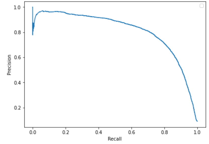
We probably want to select a precision/recall trade-off just before we see a drop in the plot (recall of about 0.7 and precision of about 0.8 in above case)— however, it may depend on the requirements of the task.
If someone says, "Let’s reach a 99% precision", you should ask, "At what recall?" – Aurélien Géron.
ROC Curve
It is the plot of true positive rate (TPR) versus false positive rate (FPR).
The Receiver Operating Characteristics (ROC) curve is another tool used in classification problems to determine the performance of a model. As opposed to plotting precision versus recall in PR curve, it plots the true positive rate (recall or sensitivity) against false positive rate (sensitivity).
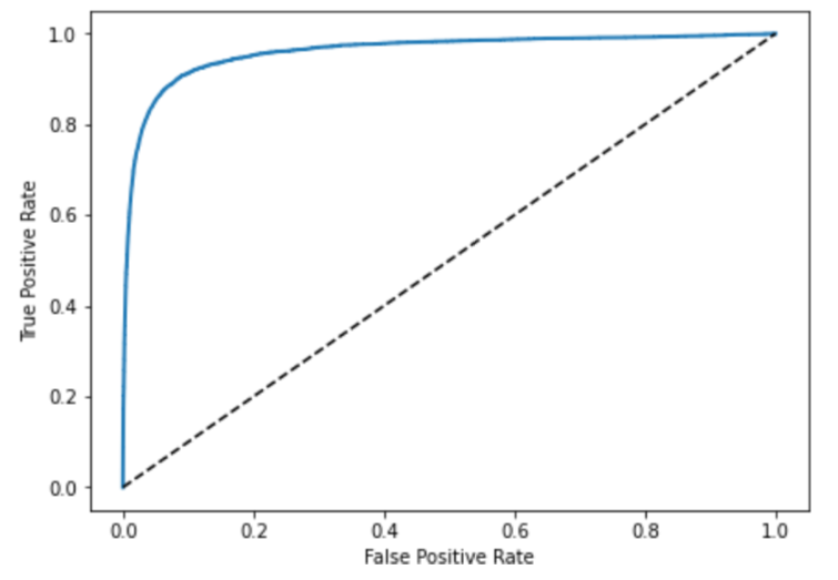
The above figure shows the ROC curve of a classifier trained on MNIST handwritten digits data (implementation can be found here). In the plot, the dashed line represents ROC curve of a purely random classifier. There is a trade-off between FPR and TPR also, higher the recall (TPR), more the number of false positives (FPR) are produced.
To compare the performance of different classifiers based on their ROC curve, their AUC (Area Under Curve) is computed that can range between 0 and 1. A perfect classifier will have an AUC equal to 1, while a random classifier depicted by dashed line will have an AUC equal to 0.5. This metric is also known as ROC-AUC score.
TL; DR
- Supervised Machine Learning is broadly classified into two types of tasks – regression & classification.
- Regression: In regression, the goal is to predict continuous target variables, such as the prediction of house prices. We can use measures such as mean absolute error (MAE), root mean squared error (RMSE), etc. to quantify the performance of our regression model.
- Classification: In classification, the goal is to predict a categorical target variable, such as a bank predicting whether a customer will default or not. As the target is not numerical or continuous, we can’t directly compute MAE, and RMSE, for classification models. So, we use measures such as accuracy.
- Accuracy: It is a measure to quantify the performance of a classification model and can be defined as the proportion of correctly classified instances. For example, if our model correctly labels 90 instances out of a total of 100 instances, then accuracy will be computed as 90%.
- Accuracy is a simple measure but not suitable in most of the cases because it doesn’t take into account the sensitivity (or weight) of different classes, and gives a poor judgmental ground for imbalanced datasets.
- For example, in the case of binary classification problems, if 95% of our training data belongs to class A and 5% belongs to class B, then even if our model is labeling every training example as class A, it will be at 95% accuracy. It is tricking us to believe that the model is doing a decent job, but in reality, it isn’t.
- Besides accuracy, it’s advisable to look at some other metrics as well to evaluate the performance of our classifier, such as confusion matrix, precision, recall, and F1 score.
- Confusion matrix: For binary classification, a confusion matrix is a 2×2 grid that records how many instances were classified correctly, and how many times the model confused positive class as negative or vice versa. An ideal confusion matrix should have zeros at non-diagonal cells.
- Precision: Precision answers the following question: out of all the examples we have predicted as positive, how many were actually positive? It is calculated as, Precision = TP / (TP + FP)
- Recall: Recall answers the following question: How good is our model in detecting all relevant classes? In other words, it computes the proportion of positive data instances that were correctly classified. It is calculated as, Recall = TP / (TP + FN)
- Recall is also known as sensitivity.
- F1 Score: It is the harmonic mean of precision and recall.
- Precision/Recall Curve: Increasing precision leads to a decrease in recall and vice versa – so we need to settle for a precision-recall tradeoff. To find a suitable balance, we can plot precision versus recall.
- ROC Curve: It is a plot of the true positive rate (recall or sensitivity) against false positive rate (sensitivity).
Closing Note
The above discussion provides a basic understanding and intuition behind some commonly used classification metrics using suitable examples that make all the metrics and their idea easier to interpret. It is not as comprehensive as there is so much more to explore. However, the given information is enough to make wise decisions while choosing your performance evaluation metrics for your next classification model!
Thank you for reading so far, open to taking feedback or suggestions!
References:
- Aurlien Gron. 2017. Hands-On Machine Learning with Scikit-Learn and TensorFlow: Concepts, Tools, and Techniques to Build Intelligent Systems (1st. ed.). O’Reilly Media, Inc.
- https://towardsdatascience.com/accuracy-is-not-enough-for-classification-task-47fca7d6a8ec
- https://machinelearningmastery.com/confusion-matrix-machine-learning/
- https://machinelearningmastery.com/roc-curves-and-precision-recall-curves-for-classification-in-python/


