Using Python to gather and clean data and used Excel/Spreadsheet(Pivot table, VLOOKUP, Data validation, Conditional formatting, and Charts) to create an interactive dashboard

Imaginary situation: My manager wanted to understand the video game market. Although she has some domain knowledge in the gaming industry, she doesn’t know how to manipulate the data. Therefore, she asked me to create an easily used interactive dashboard.

In real life, the managers might give analysts some must-addressed questions and needs beforehand. So, I imagine some questions and needs she might provide. Below are the must-have elements from my imaginary manager:
- The user can choose a specific region and year, and the data and graphs in the dashboard would be altered correspondingly.
- It should contains top 5 game platforms by sales in descending order corresponding to a chosen region and year.
- If the sales of the game platform and genre is above 25%, highlight it automatically.
- It should contain top 5 game genres by sales in descending order corresponding to a chosen region and year.
- It should contain video game sales from the earliest year to the most recent year corresponding to a chosen region.
This dataset contains a list of video games with sales greater than 100,000 copies. It was generated by a scrape of vgchartz.com (from Kaggle).
Let’s start by explaining the whole process in this project:
Step 1: Gather the data using Python (Code)
Step 2: Assess and clean the data using Python (Code)
Step 3: Wrangle the data with Spreadsheet/Excel
Step 4: Create the interactive dashboard with Spreadsheet/Excel
Step 1: Gather the data using Python (Code)
Step 2: Assess and clean the data (Code)
Since it’s a pretty clean dataset already, so in the assessment process, I only found 2 quality issues:
- Missing values in ‘Year,’ ‘Publisher’
- 6761 rows have wrong Global_Sales numbers
Before cleaning, let’s copy the original data first:
df_copy = df.copy()Cleaning 1: Missing values in ‘Year,’ ‘Publisher.’
Action: delete data without year and publisher because there are not many of them without those data.
df_copy.dropna(axis=0, how='any',inplace=True)Test
df_copy.info()
Cleaning 2: 6761 rows have wrong Global_Sales numbers
Action: Add up ‘NA_Sales,’ ‘EU_Sales,’ ‘JP_Sales,’ and ‘Other_Sales’ and save them into the ‘Global_Sales’ column
df_copy['Global_Sales'] = df_copy['NA_Sales'] + df_copy['EU_Sales'] + df_copy['JP_Sales']+df_copy['Other_Sales']Test
df_copy[df_copy['Global_Sales'] != df_copy['NA_Sales']+df_copy['EU_Sales']+df_copy['JP_Sales']+df_copy['Other_Sales']].shape[0]Out[391]: 0
Finally, let’s save it.
# store the file df_copy.reset_index(drop=True) df_copy.to_csv('clean_vgsales.csv')Step 3: Wrangle the data with Spreadsheet/Excel
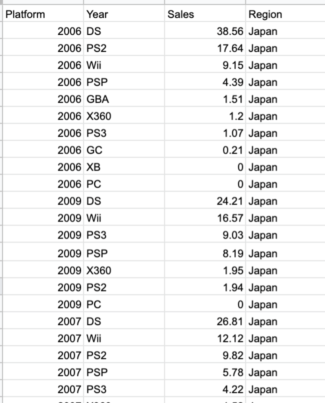
Before wrangling, let’s load the clean data(16292 rows, 11 columns) into Spreadsheet, and it looks like this:

Now, let’s wrangle the data to the formats that can be used to create the graphs and tables we want. Let’s start with the needs one by one:
- The manager can choose a specific year and region, and the data and graphs in the dashboard would be altered by them.
To realize this need and given our dataset is not grouped by year or region, so my solution is to use a pivot table to put the year on the row, and region on the column, and then sort it by year in descending order so that it would look like this:

And to make it choosable, we have to use data validation:
Choose the cell you want to put the options in, then right-click it and scroll down. You will find data validation. In the right second box to the criteria, input the range that you want, so in here, I went to the pivot table that I just created and selected the year from 2020 to 1980(the oldest).

And we will do the same thing to the region. The result will look like this:

And since we already have a chosen year and region, I think it would be good also to show the total sales. So I use VLOOKUP() to look up the total sales from the pivot table we just created:
=VLOOKUP(A2,'Year and Sales'!A2:E40, switch($B$2,'Year and Sales'!$B$1, 2, 'Year and Sales'!$C$1, 3, 'Year and Sales'!$D$1, 4, 'Year and Sales'!$E$1, 5),False)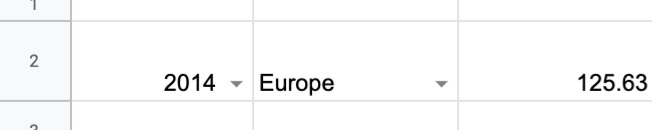
- It should contains top 5 game platforms by sales in descending order in a chosen region and year.
Firstly, remember, we need this to be simultaneously changing by the given year and region, so before we pivot and group it by the game platform, we need to group it by year first and then the game platform and sort it in descending order by the sales:

And since we put all the regions altogether, we can’t sort the value by each region separately simultaneously. We need to do this process one by one and copy the pivot table of each region into one combined tab. Here is the result:
If you keep scrolling down, you will see North America, Europe, and Global.
In the same tab, I used the filter() function to select the data we want to be given the chosen year and region from our dashboard tab.
=filter($A$2:$D$965, $A$2:$A$965= Dashboard!$A$2, $D$2:$D$965= Dashboard!$B$2)// this second parameter is to filter by the year selected by user in the dashboard tab, and the third one is to filter by the region also selected by user in the dashboard tabSo, for example. If we select 2016, Europe in the dashboard, it will show:

And, we don’t need to show Year and Region in the dashboard since it already shows in the dashboard. Therefore, we will use formulas of reference to show the data we want:
='Top sales by platform in given year and region (Table)'!G2And then copy this and paste to the cells we want to show.The result will be like this:

We can use this filtered table to create the graph showing the top 5 game platforms by sales in descending order in a chosen region and year.

- If the sales of the game platform and genre is highere than 25% in its region, highlight it automatically.
Let’s show how I did for the platform, and it applies to any other tables.
Select the range that you want to be highlighted, and right-click and then choose Conditional Formatting. It will show this:
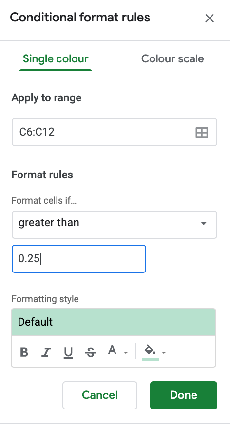
Result:

- It should contains top 5 game genres by sales in descending order in a chosen region and year.
Like what we did for the top 5 game platforms by sales in descending order in a chosen region and year. We also need to group the original dataset by year and then genre. And then combine the data of each region one by one into a single table. Here is the result:

And again, I use the filter() function to filter the data by the chosen year and Country. And use formulas of reference to show the data we want. Here is the result:

Now, let’s use this table to plot "top 5 game genres by sales in descending order".

- It should contains video game sales from the earliest year to the most recent year in a chosen region.
This one is relatively easy. Firstly, I use a pivot table to put the year in the row, and the sales of each region in the column, sort them in descending order by year, and then combine the individual region’s sales by only using sales and region to include the data:

Also, I use filter() to filter it by the given year:
=filter(A2:C157, C2:C157=Dashboard!B2)And I use a line chart to visualize it!

Step 4: Create the interactive dashboard
After we have every table and graph we need, we can put all these together and make it tidy and easy to use.
Since there are two tables in the dashboard, so I use titles, which are bold and bigger font size than its data to make it clear:


And I decide to put the graphs under and beneath each of the two tables. I intentionally made the tables not parallel because it’s hard to separate there are two different tables at first glance. It will be clearer if we put them this way:

And, don’t forget about the line chart!

Finally, let’s make it clear and tidy, and we’re done!

Thanks for spending your time reading this article.
If your company is hiring data analyst interns, here is my LinkedIn or contact me through my email(yuehhanchen@gmail.com)
If you’re also working in the data science/business Analytics field, feel free to connect with me on Linkedin or give me any feedback by email or comment below!


