
We all have faced the anxiety of looking at raw data and thinking what to do next. Though the data science algorithms are well-established, how to proceed from raw data to developing insights still remains a craft.
So how can one structure an art ? One of things which can be done is to develop some kind of list or building blocks. Take for example English language. The building blocks are alphabets A, B, C etc… It is with this basic building blocks of alphabets that we are able to build beautiful words
So in this article I make an attempt to list most effective Data Exploration techniques. This list is no means any exhaustive list, but my attempt here is to bring some structure to the art of data exploration
In order to illustrate these data exploration techniques, let me take a sample dataset of cars.
Now let me illustrate the data exploration techniques
1. Unique value count
One of the first things which can be useful during data exploration is to see how many unique values are there in categorical columns. This gives an idea of what is the data about. A unique value count of categorical columns in the cars dataset is shown here.
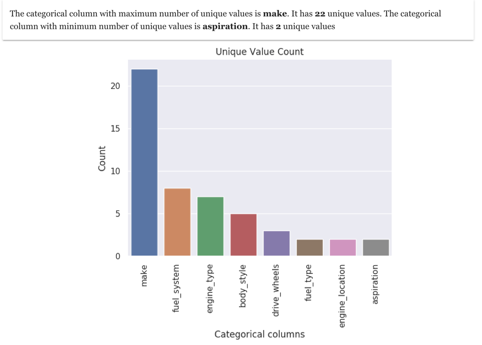
As you will observe that the maximum number of unique values is in "make" column, which means that the dataset is mainly around different brands of car
2. Frequency Count
Frequency count is finding how frequent individual values occur in column. For example, here is the frequency count for column "make".
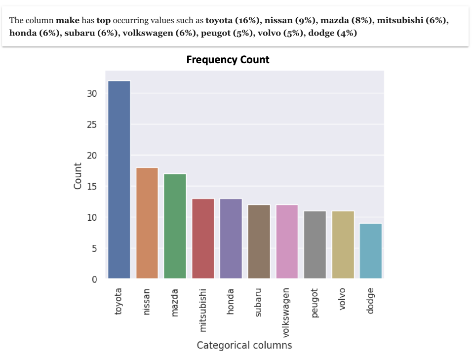
It shows that the value of Toyota occurs the most (16%) and the value of Dodge occurs the least (4%) in the make column. With such kind of analysis , you get a good insight into content of categorical variables
3. Variance
When it comes to analysing numeric values, some basic information such as minimum, maximum and variance are very useful. Variance gives a good indication how the values are spread.
Here is visualisation which shows the spread of values in numeric columns in the car dataset.
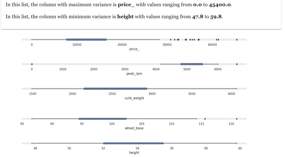
The above visualisation is organised in a way to show fields with high variance at top and fields with low variance at bottom. For example, for our cars dataset, the field with maximum variance is price and field with minimum variance is height
4. Pareto Analysis
Pareto analysis is a creative way of focusing on what is important. Pareto 80–20 rule can be effectively used in data exploration. In the cars dataset, we can apply Pareto analysis to price column as shown here
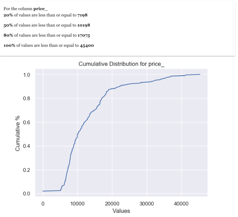
As the analysis suggests that 80% of prices are less than 17075. This is a good information to know as gives insight into what is the price level which can be considered as high
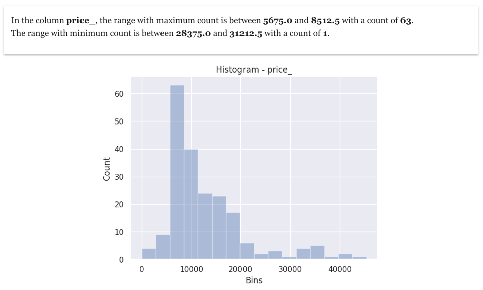
5. Histogram
Histogram are one of the data scientists favourite data exploration techniques. It gives information on the range of values in which most of the values fall. It also gives information on whether there is any skew in data. If we make an histogram in price column, it will indicate the price range which has maximum value and price range which has minimum value
6. Correlation Heat-map between all numeric columns
The term correlation refers to a mutual relationship or association between two things. In almost any business or for personal reasons, it is useful to express something in terms of its relationship with others. Finding correlation is very useful in data exploration, as it gives an idea on how the columns are related to each other
And one of the best ways to see correlation between numeric columns is using a heat-map. In the cars dataset, here is correlation heat-map amongst numeric columns
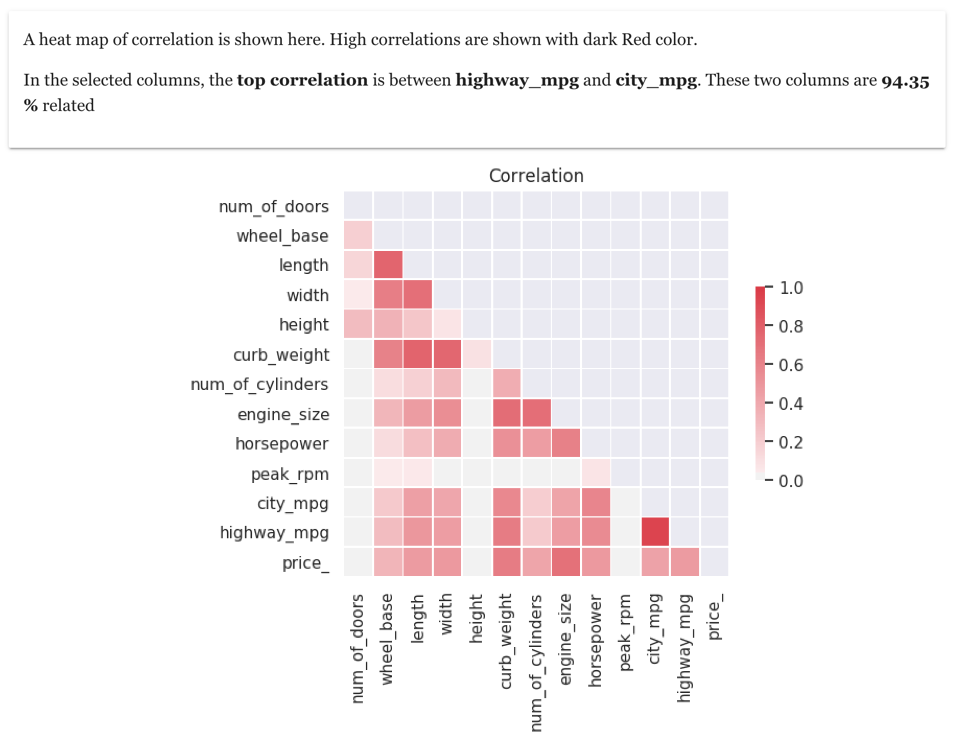
As the correlation heat-map shows high correlation between highway_mpg and city_mpg. You can see correlation between other columns also
7. Pearson Correlation and Trend between two numeric columns
Once you have visualised correlation heat-map , the next step is to see the correlation trend between two specific numeric columns. For example , here is correlation between city_mpg and highway_mpg in the cars dataset
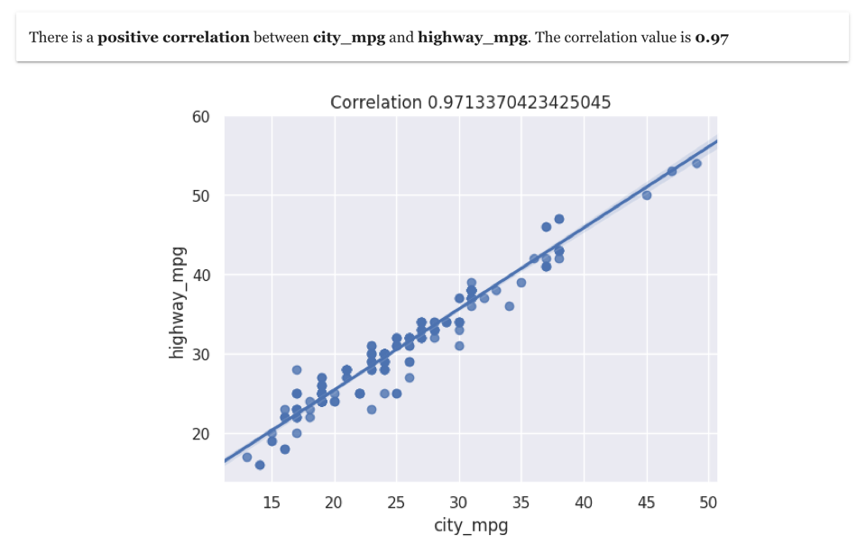
This correlation visualisation shows clearly a very positive correlation between the two columns
8. Cramer-V correlation between all Categorical columns
Cramer-V is a very useful data exploration technique to find the correlation between categorical variables. And the result of Cramer-V can also be visualised using heat-map.
In the cars dataset, there are many categorical columns. Here is resulting heat-map based on Cramer-V correlation between all categorical columns
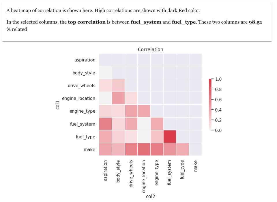
As we can see that columns fuel_system and fuel_type are highly correlated
9. Correlation between two specific categorical columns
Once you have checked correlation between categorical columns using Cramer-V correlation matrix, you can further explore correlation between any two categorical columns. This can be done using a bubble plot between the two columns with size of the bubble indicating the number of occurrences
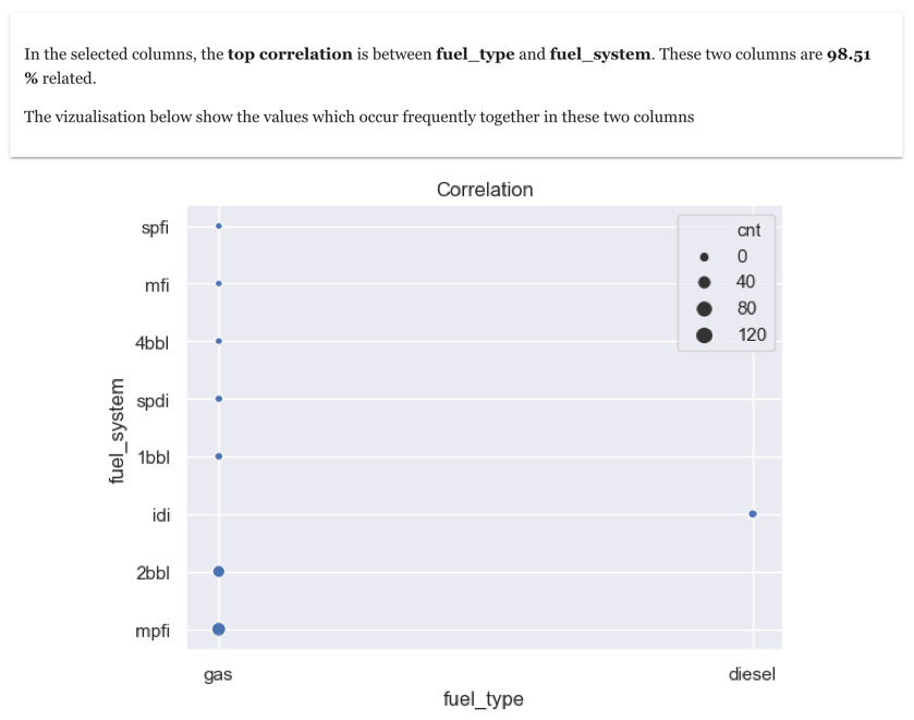
You will observe that most of the fuel_systems have a fuel_type gas, confirming the strong correlation between the two fields
10. Cluster size Analysis
We live in a world with immense amount of data. It is very easy to get bogged down by data overload. In order to survive in this ever-increasing data world, we need to look things from a high-level perspective.
Grouping things together allows us to have that high-level perspective. Groups of data allows us to first look at the groups rather than individual data point. What would you prefer – looking at millions of data records or looking at few groups of data? The answer is obviously later as we humans prefer understanding in a top-down way
Data Science can help us this amazing feat of creating few groups out of lots of data. In data science terminology, the process of grouping is also called clustering or segmentation. And making segments is an excellent data exploration technique as it gives an very good overview of data
As a first step in segmentation, it is useful to make an analysis of cluster size. The cluster size analysis shows on how can data can be split into different groups.
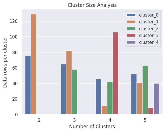
As we can observe that if we divide all data into 3 groups, then we will be having clusters which are more or less of same size
11. Clustering or Segmentation
Once you have determined the number of clusters, the next step is to divide all data into specific number of clusters or segments.
Shown here are the results of clustering of all data into three clusters. This results is extremely useful in data exploration
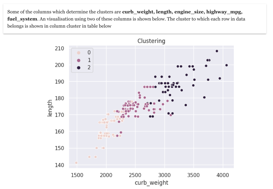
In order to make clustering more effective data exploration tool, it is necessary to understand the meaning of cluster. In this example, we observe that the important columns which determine the clusters are curb_weight and length. Based on this we can see that the cars can be grouped into three groups – small cars, mid-sized cars, big-cars. Such clustering exercise is immensely useful in data exploration
12. Outlier overview
Finding something unusual in data is called Outlier detection (also known as anomaly detection). These outliers represent something unusual, rare , anomaly or something exceptional. Outliers does not necessarily mean something negative. Outlier analysis helps tremendously to enhance the quality of exploratory data analysis
Outlier values in numeric columns can be obtained by various techniques such as standard deviation analysis, or algorithms such as Isolation forest. An outlier overview analysis gives overview of outliers in all numeric columns.
A bubble chart shows columns which have very low or very high values. Larger the size of the bubble means more outliers exists in the column
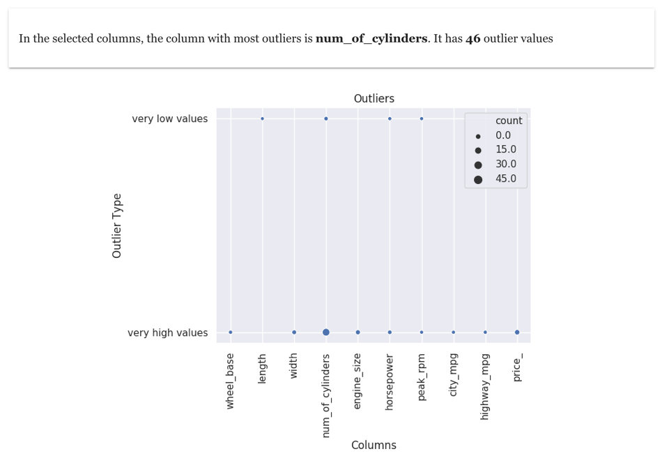
An outlier overview of numeric columns in cars dataset is shown above. It shows that most outliers are in the column num_of_cylinders
13. Outlier analysis for individual numeric column
Once you have checked which columns have very high or very low values, you can analyse individual columns.
A box plot is shown in the visualisation. In the box plot shows the normal range is represented by left-most and right-most vertical lines. The points shown outside this normal range are outliers. The points on the left-hand side are very low values and points on the right-most side are very high values
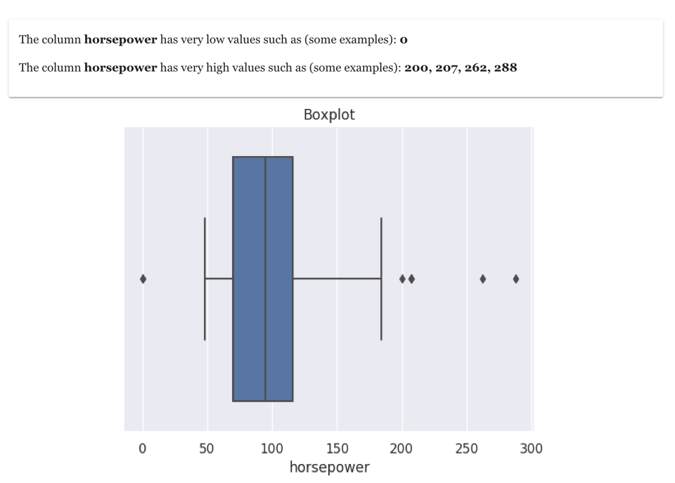
As an example above, outlier analysis of column horsepower in the cars dataset is shown above
14. Outlier analysis for multiple columns
One of the important step of exploratory data analysis is finding outlier based on multiple column (at row level). This can be obtained using various algorithms such as Isolation forest
A scatterplot is shown and outliers are marked in different colour (with label 1). The axis of the scatterplot is based on columns due to which the row is an outlier.
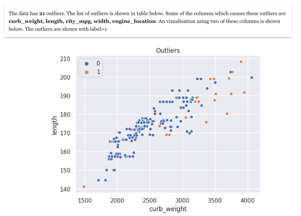
During outlier analysis , it is also important to capture the reason why a data point or row is an outlier. In the example of cars dataset, you can see that most of the outliers are related to high weight and high length
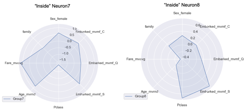
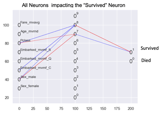
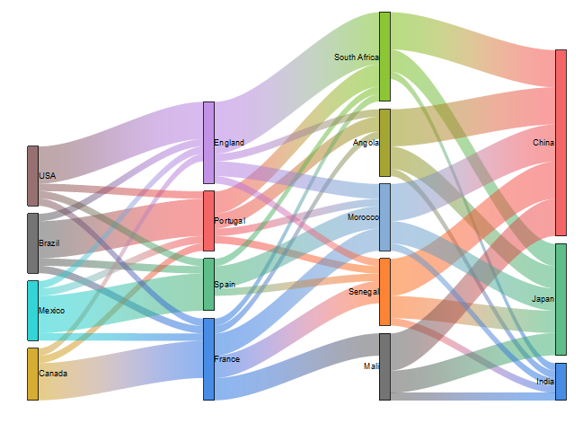
15. Specialised Visualisation
Till now most of the visualisation you have seen are classic ones such as Bar chart, scatter plot etc.. However during the data exploration it is very valuable to add some specialised visualisation such as Radar Chart , Neural Network visualisation or Sankey charts
It helps a lot to understand the data much better. Radar chart can help in comparison. While Neural network visualisation can help understand what combination of columns could be important features or also to understand hidden or latent features. Sankey charts can be very useful in making path analysis
There are many more data exploration techniques, but the above 15 will give you a head start. Next time you see some raw data, you will be extracting insights in no time with help of these data exploration techniques
Additional resources
Website
You can visit my website to make analytics with zero coding. https://experiencedatascience.com
Please subscribe to stay informed whenever I release a new story.
You can also join Medium with my referral link.
Youtube channel Here is link to my YouTube channel https://www.youtube.com/c/DataScienceDemonstrated


