Introduction
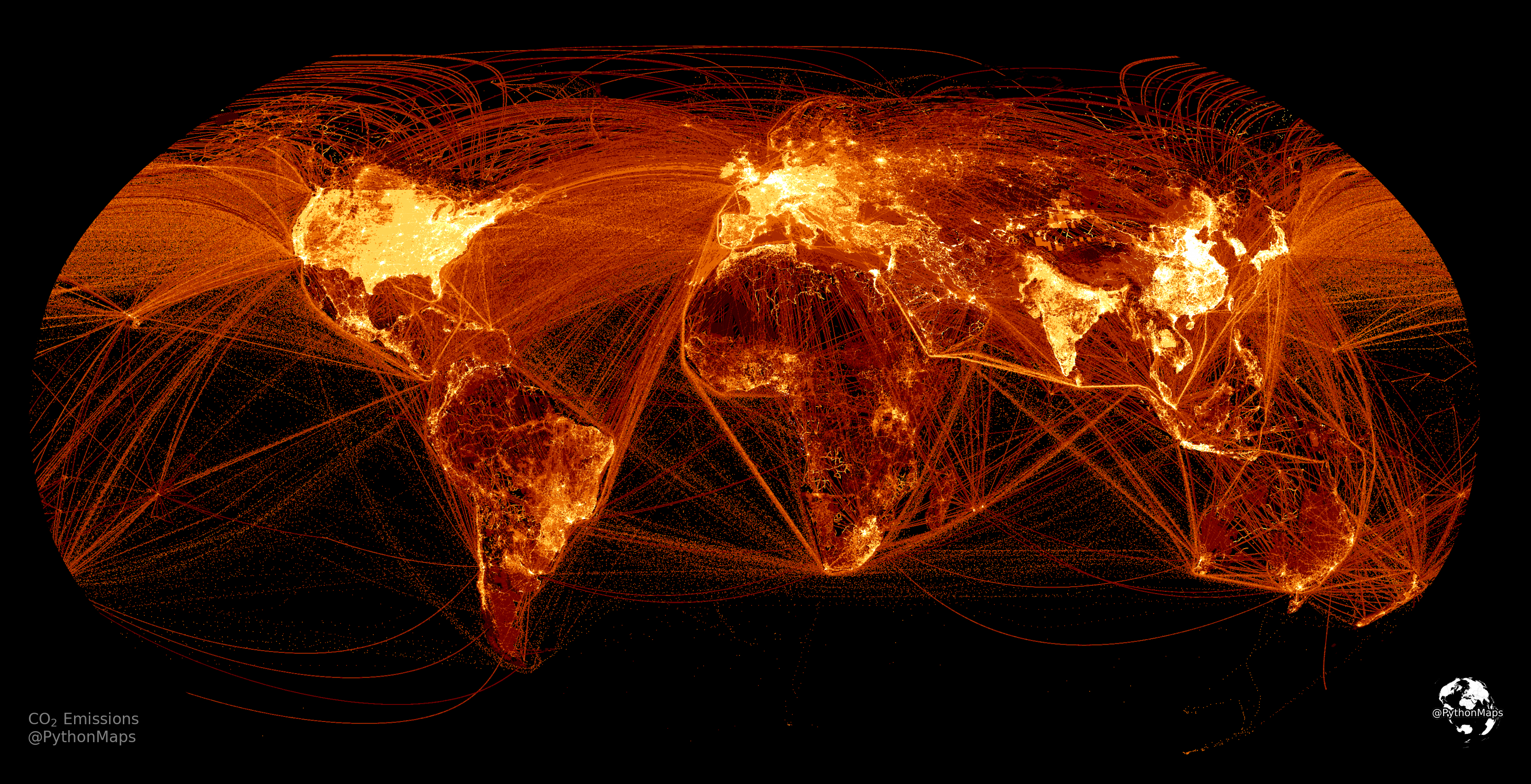
For some reason, Climate Change has been in the news a lot recently. Specifically the link between carbon dioxide emissions from our cars, factories, ships, planes (to name a few) and the warming of our planet via the greenhouse effect. The image above shows the world’s short cycle carbon dioxide emissions in 2018. Aside from looking fantastic and almost artistic, it provides useful context for where the world’s emissions are actually coming from. The map clearly shows the world’s emissions are dominated by North America, Europe, China and India. Zooming in on different areas reveal loads of interesting features, in North America and Europe there are bright areas on highlighting major cities, all linked with bright areas corresponding to the main roads. At sea, the major shipping lanes can be picked out, e.g. China – Singapore – Malacca Strait – Suez Canal stands out as a particularly bright line. There are also a series of curved lines corresponding to the major air routes, in particular leading between North America and Europe. Population density can be used to explain a lot of this map however there are some notable exceptions. For example, parts of South America are brighter than expected and West Africa is perhaps a bit dimmer than expected. In contrast, the Nile, where 95% of Egypt’s population lives, is lit up like a Christmas tree. With that said it is important to note that these maps are purely qualitative and not quantitative so it is important to be careful about what conclusions are drawn from them.
So how do we go about plotting the map? The first step is to fetch the data. The data is available from the EDGARv6.0 website ([link](https://data.jrc.ec.europa.eu/dataset/97a67d67-c62e-4826-b873-9d972c4f670b)) under the citation Crippa et al. (2021) (link) and is available for download and use as long as the appropriate citations are used. There are a number of datasets that you can choose from and I will explore some of these in future articles. In this article we will look at short cycle carbon dioxide emissions from 2018 (sadly 2018 is the most recent dataset). An important thing to note is that this dataset includes emissions from all fossil carbon dioxide sources, such as fossil fuel combustion, non-metallic mineral processes (e.g. cement production), metal (ferrous and non-ferrous) production processes, urea production, agricultural liming and solvents use. Large scale biomass burning with Savannah burning, forest fires, and sources and sinks from land-use, land-use change and forestry (LULUCF) are excluded. A full description of their methods can be found here.
So download the Data and store it wherever you like to execute you code. I have read the data into a pandas.DataFrame and printed the resulting DataFrame to see what we are dealing with. The data is very simple and consists of an emission value in units of tonnes per year for a particular latitude / longitude pair.
Data Exploration
It can also be fun to investigate where the most polluted areas are.
Perhaps unsurprisingly, the majority of these can be found in China although there are a few notable contributions from India, Russia and Taiwan.
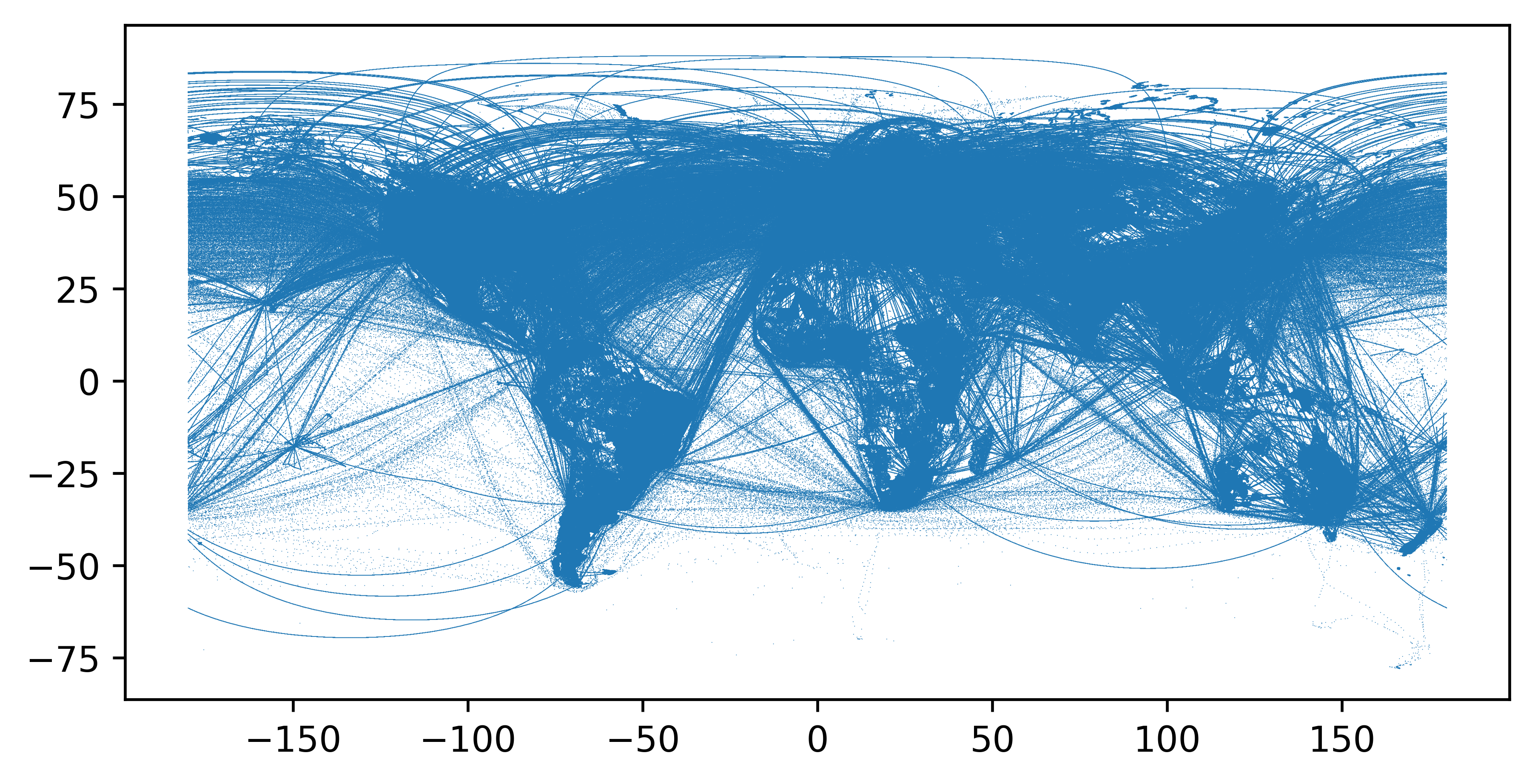
Plotting the data shows that the data does not cover the whole world and there are missing values for parts of the Pacific and Southern Oceans. This is hardly surprising as those Oceans are vast and often devoid of human impact. I have just used a scatter plot here for the latitude and longitude values. A few things to note about the plots going forward. The points are set to 0.05 because if left to the default value of 1 they overlap. The edge of a scatter point is a separate thing to the point itself and cannot be smaller than 1. So these have to be turned off. Also important to note, when plotting latitude and longitude values, latitude is y and longitude is x.
Colouring the points according to the emission value is a good way to get a sense of what the data is actually going to look like. Unfortunately the plot is dominated by low emissions values.
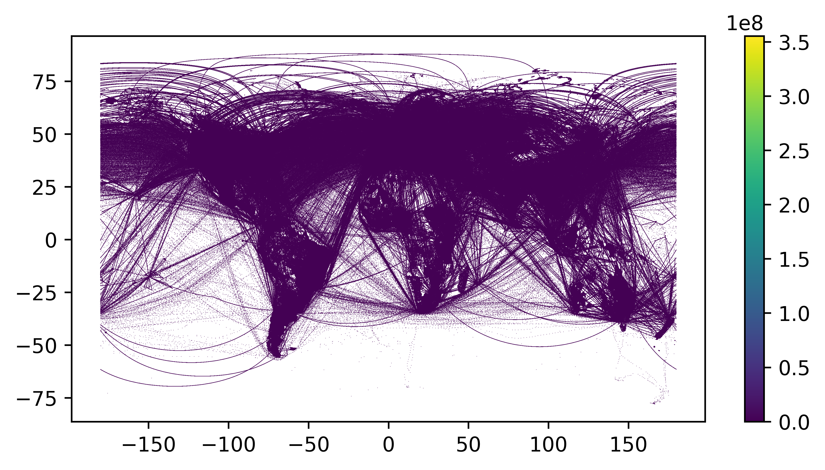
Exploring the data (which I have largely omitted for brevity) shows it is dominated by values in the range of 0–1000 tonnes of carbon dioxide per year and there are a small number of values a few orders of magnitude greater.
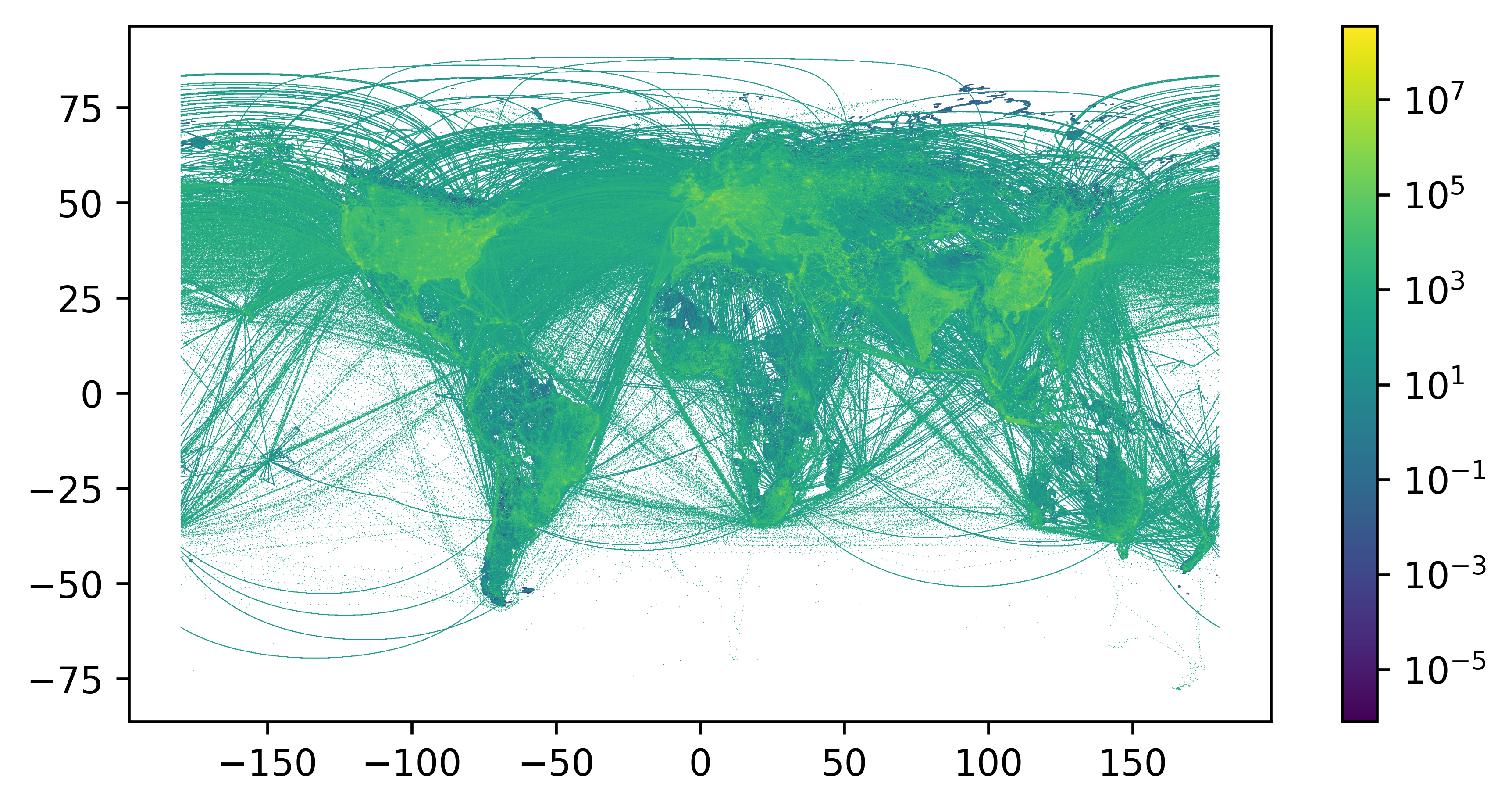
With this in mind we are going to plot the values on a log scale. I try to avoid log plots if possible because the resulting plot can be hard to interpret and the data is often meaningless. However, log plots are good when there is a small population of values orders of magnitude greater than the majority and also in plots where you are trying to show multiplicative factors. Our data fits into both of these categories so it is appropriate in this case. There is also a contextual reason for a log plot. We want to know where carbon dioxide emissions are coming from and if we used the plot above we would conclude that emissions are evenly distributed around the world. We know that emissions in London are probably higher than the middle of the Atlantic so we need a way to distinguish between the small numbers of high values and vast numbers of low values.
Plotting the data
Matplotlib has a built in log scale which is utilised in the block below.
The world as we know it is now starting to show itself so it is now time to start making it look pretty. While viridis is scientifically the perfect colourmap (https://www.youtube.com/watch?v=xAoljeRJ3lU), I want something fiery to show carbon dioxide emissions because they cause global warming, which is potentially fiery. So we are going to switch it to to afmhot_r (the _r means the colourmap is reversed and maps low values to light colours and large values to dark colours). I have reversed it because the background is white and we want the large emissions values to stand out.
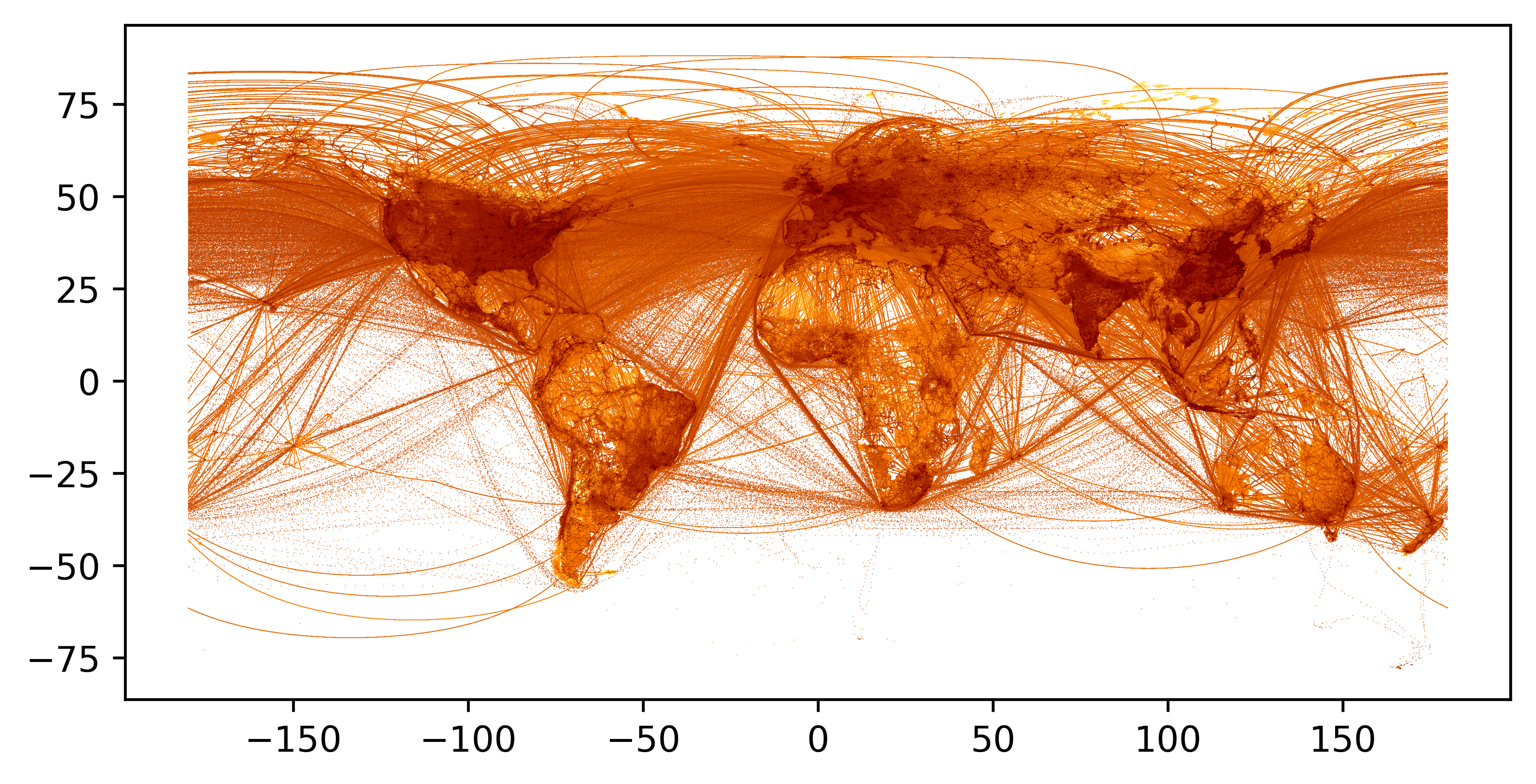
The map is starting to take shape, now onto projections. There are numerous geographical projections, the one shown in the opening image is known as the Robinson projection and while there is debate, it is often regarded as the most realistic. Until now we have been relying on plotting the values with a standard scatter plot (which vaguely corresponds to the mercator projection). This is technically fine however not appropriate if we want to properly map the emissions data to a geographical projection. So the latitude / longitude values need to be converted to into shapely points which can then be transformed into the projection we want.
The data can then be reprojected with a library called cartopy within the subplots function. Feel free to apply whatever style changes you want, for example I like dark mode so I have changed the background to black and flipped the colourmap so large values are lighter.

How does it compare to the original research?
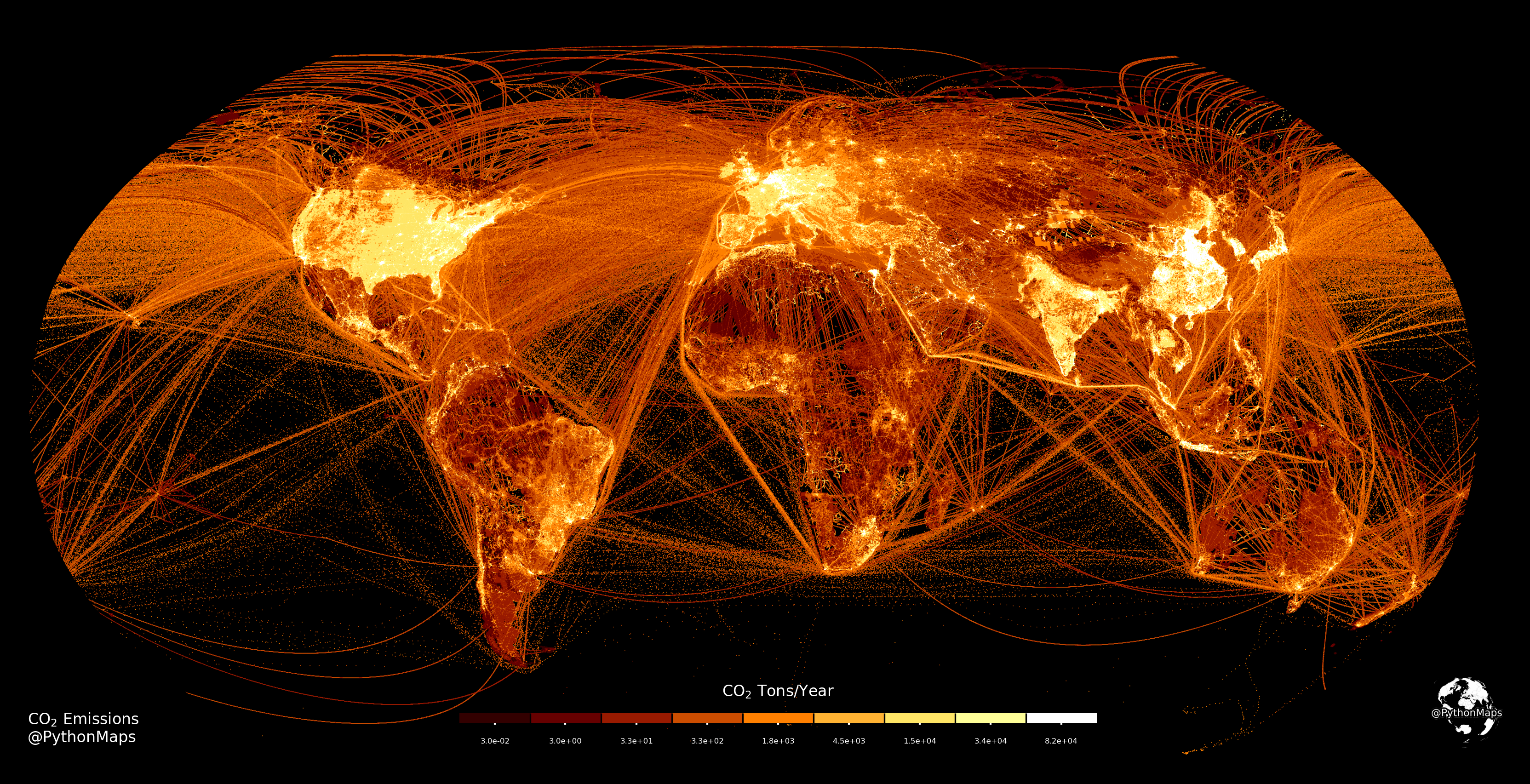
When initially plotting this map I was perfectly happy with the plot shown above but I thought it was best to check what it should look like by looking at the original publishers plot. The image shown below was generated by the original publishers. For reasons that I cannot quite establish, they have chosen an odd series of values for their colour scale, namely 0.0, 0.06, 6, 60, 600, 3000, 6000, 24000, 45000, 120000. Lack of explanation aside I thought it would be interesting to replicate this plot because these are the climate pros and probably know a lot more than I do, hence there is probably a good reason for it.
) to Crippa et al. (2021) (link). Image by Author](https://towardsdatascience.com/wp-content/uploads/2022/01/1VxOPpqF_HYV4fSFSMnOiCg.png)
As before we will use afmhot as our colourmap but this time we will map it to 10 colours and normalise those 10 colours to the 10 values in the key in the image above (0.0, 0.06, 6, 60, 600, 3000, 6000, 24000, 45000, 120000). Objects that use colormaps in matplotlib by default linearly map the colors in the colormap from the minimum value in the dataset to the maximum value in the dataset at discrete intervals determined by the number of colours in the colourmap. The BoundaryNorm class allows you to map colours in a colourmap to a set of custom values. In the code below we are creating a colourmap with 10 colours and a BoundaryNorm object which will map the values in our data to the colourmap according to the pre-defined levels.

The above image gives a rough visualisation of what is happening. The colourmap is generated with 10 colours and values within our emissions dataset will be coloured according to the values in the above image. For example, values equal to or greater than 120000 tonnes of carbon dioxide per year will be coloured white.
Now, armed with our new colormap and normalised boundaries we can replot the map, this time mapping values to colours in a way more reminiscent of what the original authors have done.

The final thing to do is to provide a colourbar so that our reader can understand what they are actually looking at. I sometimes don’t bother with this step but it is still useful to think know about.
Conclusion
There we have it, a beautiful map showing the where the world’s carbon dioxide emissions come from. This is the first of many articles planned to show how to make geospatial data look fantastic, please subscribe so you don’t miss them. I also love feedback so please let me know how you would do it differently or suggest changes to make it look even more awesome. I post data visualisations every week on my twitter account, have a look if geospatial data vis is your thing https://twitter.com/PythonMaps
References
Crippa, M., Guizzardi, D., Schaaf, E., Solazzo, E., Muntean, M., Monforti-Ferrario, F., Olivier, J.G.J., Vignati, E.: Fossil CO2 and GHG emissions of all world countries – 2021 Report, in prep.
Crippa, M., Solazzo, E., Huang, G., Guizzardi, D., Koffi, E., Muntean, M., Schieberle, C., Friedrich, R. and Janssens-Maenhout, G.: High resolution temporal profiles in the Emissions Database for Global Atmospheric Research. Sci Data 7, 121 (2020). doi:10.1038/s41597–020–0462–2.
IEA (2019) World Energy Balances, www.iea.org/data-and-statistics, All rights reserved, as modified by Joint Research Centre, European Commission.
Jalkanen, J. P., Johansson, L., Kukkonen, J., Brink, A., Kalli, J., & Stipa, T. (2012). Extension of an assessment model of ship traffic exhaust emissions for particulate matter and carbon monoxide. Atmospheric Chemistry and Physics, 12(5), 2641–2659. doi:10.5194/acp-12–2641–2012
Johansson, L., Jalkanen, J.-P., & Kukkonen, J. (2017). Global assessment of shipping emissions in 2015 on a high spatial and temporal resolution. Atmospheric Environment, 167, 403–415. doi:10.1016/j.atmosenv.2017.08.042


