Using SHAP Values to Explain How Your Machine Learning Model Works
Learn to use a tool that shows how each feature affects every prediction of the model

Machine Learning models are often black boxes that makes their interpretation difficult. In order to understand what are the main features that affect the output of the model, we need Explainable Machine Learning techniques that unravel some of these aspects.
One of these techniques is the SHAP method, used to explain how each feature affects the model, and allows local and global analysis for the dataset and problem at hand.
SHAP Values
SHAP values (SHapley Additive exPlanations) is a method based on cooperative game theory and used to increase transparency and interpretability of machine learning models.
Linear models, for example, can use their coefficients as a metric for the overall importance of each feature, but they are scaled with the scale of the variable itself, which might lead to distortions and misinterpretations. Also, the coefficient cannot account for the local importance of the feature, and how it changes with lower or higher values. The same can be said for feature importances of tree-based models, and this is why SHAP is useful for interpretability of models.
Important: while SHAP shows the contribution or the importance of each feature on the prediction of the model, it does not evaluate the quality of the prediction itself.
Consider a coooperative game with the same number of players as the name of features. SHAP will disclose the individual contribution of each player (or feature) on the output of the model, for each example or observation.
Given the California Housing Dataset [1,2](available on the scikit-learn library), we can isolate one single observation and calculate the SHAP values for this single data point:
shap.plots.waterfall(shap_values[x])
In the waterfall above, the x-axis has the values of the target (dependent) variable which is the house price. x is the chosen observation, f(x) is the predicted value of the model, given input x and E[f(x)] is the expected value of the target variable, or in other words, the mean of all predictions (mean(model.predict(X))).
The SHAP value for each feature in this observation is given by the length of the bar. In the example above, Longitude has a SHAP value of -0.48, Latitude has a SHAP of +0.25 and so on. The sum of all SHAP values will be equal to E[f(x)] — f(x).
The absolute SHAP value shows us how much a single feature affected the prediction, so Longitude contributed the most, MedInc the second one, AveOccup the third, and Population was the feature with the lowest contribution to the preditcion.
Note that these SHAP values are valid for this observation only. With other data points the SHAP values will change. In order to understand the importance or contribution of the features for the whole dataset, another plot can be used, the bee swarm plot:
shap.plots.beeswarm(shap_values)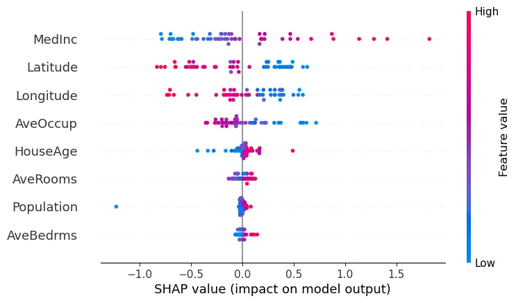
For example, high values of the Latitude variable have a high negative contribution on the prediction, while low values have a high positive contribution.
The MedInc variable has a really high positive contribution when its values are high, and a low negative contribution on low values. The feature Population has almost no contribution to the prediction, whether its values are high or low.
All variables are shown in the order of global feature importance, the first one being the most important and the last being the least important one.
Effectively, SHAP can show us both the global contribution by using the feature importances, and the local feature contribution for each instance of the problem by the scattering of the beeswarm plot.
Using SHAP values in Python
I made the code for this section available on my github. Check it out:
To use SHAP in Python we need to install SHAP module:
pip install shapThen, we need to train our model. In the example, we can import the California Housing dataset directly from the sklearn library and train any model, such as a Random Forest Regressor
import shap
import pandas as pd
from sklearn.datasets import fetch_california_housing
from sklearn.model_selection import train_test_split
from sklearn.ensemble import RandomForestRegressor# California Housing Prices
dataset = fetch_california_housing(as_frame = True)
X = dataset['data']
y = dataset['target']
X_train, X_test, y_train, y_test = train_test_split(X, y, test_size = 0.2)# Prepares a default instance of the random forest regressor
model = RandomForestRegressor()# Fits the model on the data
model.fit(X_train, y_train)
To compute SHAP values for the model, we need to create an Explainer object and use it to evaluate a sample or the full dataset:
# Fits the explainer
explainer = shap.Explainer(model.predict, X_test)
# Calculates the SHAP values - It takes some time
shap_values = explainer(X_test)
The shap_values variable will have three attributes: .values, .base_values and .data.
The .dataattribute is simply a copy of the input data, .base_values is the expected value of the target, or the average target value of all the train data, and .values are the SHAP values for each example.
If we are only interested in the SHAP values, we can use the explainer.shap_values() method:
# Evaluate SHAP values
shap_values = explainer.shap_values(X)
If we simply want the feature importances as determined by SHAP algorithm, we need to take the mean average value for each feature.
Some plots of the SHAP library
It is also possible to use the SHAP library to plot waterfall or beeswarm plots as the example above, or partial dependecy plots as well.
For analysis of the global effect of the features we can use the following plots.
Bar plot
shap.plots.bar(shap_values)
Here the features are ordered from the highest to the lowest effect on the prediction. It takes in account the absolute SHAP value, so it does not matter if the feature affects the prediction in a positive or negative way.
Summary plot: beeswarm
shap.summary_plot(shap_values)
# or
shap.plots.beeswarm(shap_values)
On the beeswarm the features are also ordered by their effect on prediction, but we can also see how higher and lower values of the feature will affect the result.
All the little dots on the plot represent a single observation. The horizontal axis represents the SHAP value, while the color of the point shows us if that observation has a higher or a lower value, when compared to other observations.
In this example, higher latitudes and longitudes have a negative impact on the prediction, while lower values have a positive impact.
Summary plot: violin
Another way to see the information of the beeswarm is by using the violin plot:
shap.summary_plot(shap_values, plot_type='violin')
For analysis of local, instance-wise effects, we can use the following plots on single observations (in the examples below I used shap_values[0]).
Local bar plot
shap.plots.bar(shap_values[0])
This plot shows us what are the main features affecting the prediction of a single observation, and the magnitude of the SHAP value for each feature.
Waterfall plot
shap.plots.waterfall(shap_values[0])The waterfall plot has the same information, represented in a different manner. Here we can see how the sum of all the SHAP values equals the difference between the prediction f(x) and the expected value E[f(x)].
Force plot
shap.plots.force(shap_test[0])
The force plot is another way to see the effect each feature has on the prediction, for a given observation. In this plot the positive SHAP values are displayed on the left side and the negative on the right side, as if competing against each other. The highlighted value is the prediction for that observation.
I hope this article helped you understand better how to use SHAP values to explain how your models work. This is a tool every data scientist should have in hand, and we should use this for every model.
Remember to check out the notebook for this article:
If you like this post…
Support me with a coffee!

And read this awesome post
References:
[1] Pace, R. Kelley and Ronald Barry, Sparse Spatial Autoregressions, Statistics and Probability Letters, 33 (1997) 291–297
[2] Scikit-learn developers. Real world datasets: California Housing dataset. Last access in Jan/2022. (BSD License)