Use Color Meaningfully
Color is a powerful tool when visualizing data but used excessively or incorrectly, it will ruin your work and cause confusion in your audience. Therefore, we should make color choices thoughtfully and keep in mind how human perception works.
In this article, I’ll focus on palette types and how to select the right one.
Different palette types
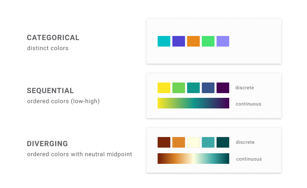
We have three types of palettes – categorical (also known as qualitative), sequential, and diverging.
In this classification, colors aren’t the determining aspect, and different palette types can share some colors. What defines each palette is the relation between those colors. In the categorical palette, colors should be primarily well distinguishable from one another, and they should not suggest any order. On the other hand, in the sequential and diverging palettes, we should order colors – either based on brightness, luminance, or saturation*.
*If those terms are new to you, check this brilliant and accessible introduction to Color Theory [1].
In addition to the ordered colors, the diverging palette has a neutral point in the middle. Usually, it is white, light grey, or beige. But in some cases, other colors might work as well. If you have a colored background, you can use this color for your neutral point (even if this is a dark one). So really, the neutral color depends on the context, and we should use whatever suggests "absence of color".
The continuity aspect is another difference between categorical and non-categorical palettes (sequential and diverging). The former only exists in discrete variants, while the laters can have both discrete (stepped) and continuous (smooth) variants.
When should we use each variant? It’s simple, every time you have discrete data, you should use the discrete variant, and if you have continuous data… yes, you should use the continuous one. Take as an example the test results. If you want to show grades, use the discrete version of the sequential palette, and when you want to show the actual result in percentage, use the continuous sequential one.
Different scale types
Knowing the palette types, let’s take a step back and focus on the data. This step is essential. Because if you want to choose the right palette, you must understand what kind of data you are going to visualize.
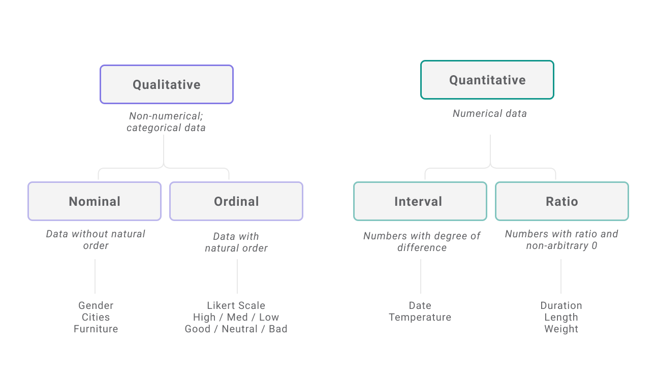
There are two types of data – quantitative and qualitative. Quantitative data is represented by numbers like age, temperature, or profit. Qualitative data, also called non-numeric data, consists of descriptive categories such as names or school grades. Another example of qualitative data is a satisfaction scale (e.g., very good – good – bad – very bad).
Those two data types can be split even further. Among qualitative data, we have a nominal scale and an ordinal scale, while among quantitative data, an interval scale and a ratio scale [2].
NOMINAL SCALE
Main characteristic: Non-numeric (qualitative) data without natural order
Examples: Gender, Cities, Furniture
ORDINAL SCALE
Main characteristic: Non-numeric (qualitative) data with the natural order
Examples: Likert Scale variants (e.g., very good – good – bad – very bad), High— Medium – Low
INTERVAL SCALE
Main characteristic: Numeric (quantitative) data without the arbitrary 0
Examples: Temperature, Date
RATIO SCALE
Main characteristic: Numeric (quantitative) data with the arbitrary 0
Examples: Duration, Length, Weight, Amount
Side note: What does arbitrary 0 mean?
And what is the difference between interval and ratio scales?
We have multiple units in which we can measure. Value can be presented in different currencies, weight and length in various unit systems (imperial or metric), the temperature in Celsius or Kelvins, and dates in the Gregorian, Islamic, or Hebrew calendar (to name a few). So why do the temperature and dates belong to a different categories?
This is due to the way they are constructed. Take, for example, the temperature. The Celsius scale is created based on water’s freezing and boiling point, while the Kelvin scale refers to absolute zero, the lowest observable temperature. Calendars are made similarly, and each one has a different (arbitrarily chosen) starting point. And this arbitrarily chosen zero is the main difference between interval and ratio scales. This makes calculating the ratio impossible (we can’t say that 20 °C is twice as hot as 10 °C).
The easiest way to determine whether we are dealing with an interval or ratio scale is checking if zero means the same in all unit systems. For example, zero meters mean the same as zero feet, but 0 °C is not the same as 0 Kelvins.
Relationship between the palettes and the scales
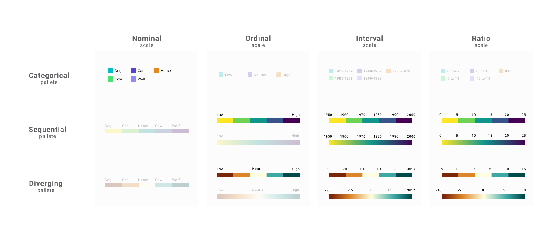
Now it’s time to combine what was said about scales and palettes and focus on their relationship. There are a few simple rules you need to remember when choosing the palette type, but the most important one is:
The categorical scale goes with the categorical palette. We should use sequential for other types of data unless we have a meaningful neutral point, in which case, we should use the diverging palette.
Sounds overwhelming? Let’s dig into more details, then. And to simplify things, we will only focus on choosing the suitable types and not the Colors.
When to use a categorical palette?
Reminder: In a categorical palette, colors are contrasting and don’t follow any order.
- USAGE: Their purpose is to emphasize differences in categories rather than relations between them.
- BEST PRACTICE: Limit the number of colors as they have to be easily distinguishable. If you have more than 7–10 categories, rethink your grouping (change categories or bundle some values together).
- GOES WITH: Nominal scale
When to use a sequential palette?
Reminder: In a sequential palette, colors are ordered from lighter to darker. We can have a palette created based on one color (single-hue) or more (multi-hue). In practice, we should not use more than two hues (Why? check the part on the rainbow hue above).
- USAGE: Their purpose is to show order by changing the luminance.
- BEST PRACTICE: Typically, lower values are associated with lighter colors, and higher values with darker colors. However, it’s common to assign values opposite on a dark background.
- GOES WITH: Ordinal scale, Interval scale, Ratio scale
When to use a diverging palette?
Reminder: The diverging palette is created by combining two sequential palettes with the neutral color in the middle. As the neutral color, we can use white, beige, grey, or the color of the background.
- USAGE: To show deviation from the specific value – for example, average, 0, or target.
- BEST PRACTICE: The central value is generally assigned to a light color, so the darker the color, the further from the center. Two ends of the scale should have similar luminance.
- GOES WITH: Ordinal scale, Interval scale, Ratio scale
Typical mistakes
What can go wrong when choosing a proper palette type? Probably a few things. Let’s discuss the most common mistakes so you can avoid them.
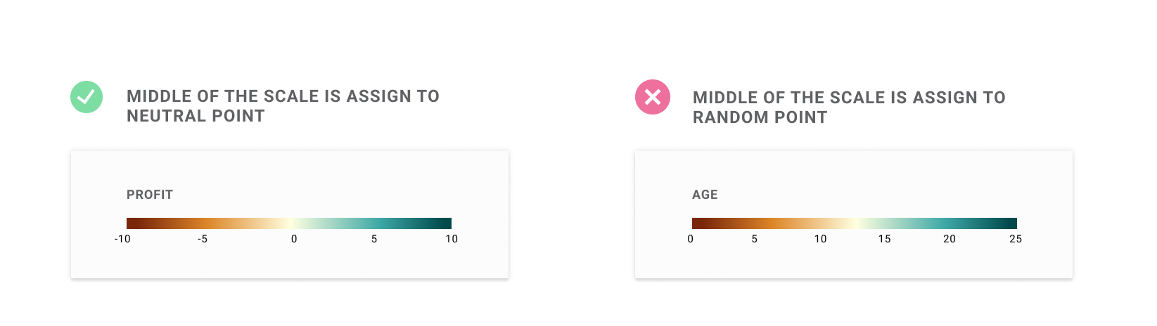
1) Using diverging palette for data without meaningful 0 point
The diverging palette should only be used when you have a meaningful middle point. If this is the case, the middle point should be assigned to the neutral (central) color. Setting other values to the neutral color is misleading. If we choose the average as a middle point, we should make it clear for the user (for example, by adding annotation).
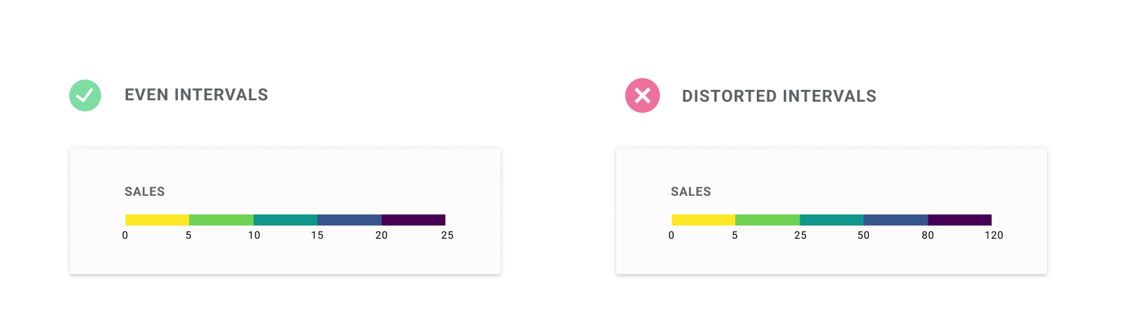
2) Using different intervals
The idea behind using colors is to allow users to easily compare the values. But the bottom line is that we must have equal intervals. Otherwise, the change in color will not reflect the change in value.
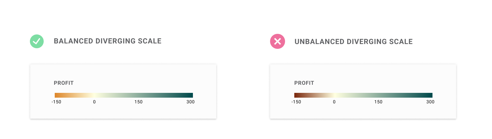
3) Distorting scale in the diverging palette
Diverging colors are designed to be balanced from a central point (0). It might happen that the data maximum and the minimum are not equally far away from the central point. In this case, the scale should be adjusted by "cropping out" the color. Color intensity should reflect the absolute distance from the center.
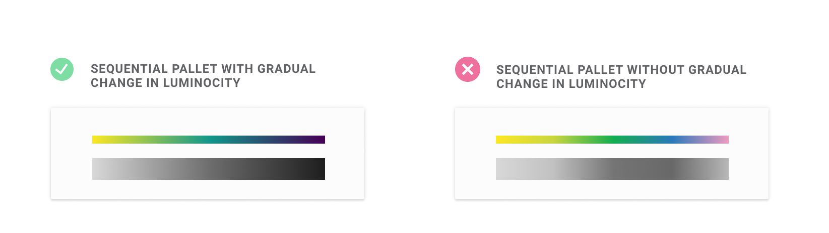
4) Using a rainbow hue palette
The sequential palette should go from the highest to the lowest luminance [3]. And within the rainbow palette, we have many distinct hues, which cause sudden jumps in luminance. Moreover, the luminance doesn’t even change in a consistent direction [4]. And, like in the example below, the darkest point falls in a random place.
Tools for creating a color palette
Luckily, there are many tools that will help us create a good palette, so we don’t have to do this manually. I can recommend two handy and intuitive tools for creating your palette:
- The first one is Color Brewer, which allows you to quickly find one of the predefined palettes that will work best with your data. An additional advantage is a colorblind and print-friendly option.
- The second one is Data Color Picker, which gives you more control over the selected colors. You can modify colors but still create a consistent palette.
Don’t wanna miss any of my posts? Get them directly to your inbox!
And if you are not a part of Medium family yet, consider signing up for a membership. It only costs $5 per month, supporting thousands of writers. Sign up with my affiliate link, and apart from access to all published content, you will get my eternal gratitude.
Links
[1] E. Kennedy, The HSB Color System: A Practitioner’s Primer, Learn UI Design blog
[2] S. S. Stevens, On the Theory of Scales of Measurement (1946), Science
[3] C. Shanley, Mixing Colours of Equal Luminance – Part 1, Medium publication
[4] R. Kosara, How The Rainbow Color Map Misleads (2013), Eager Eyes blog
Less is more – best data visualization principle
How to make your audience look right where you want them to?


