
I’ve been writing about Data Science for a while now and realized that while I had touched on many subjects, I’ve yet to cover the normal distribution – one of the foundational concepts of statistics. That’s an oversight I intend to fix with this post.
Regardless of whether you work in a quantitative field or not, you’ve probably heard of the normal distribution at some point. It’s commonly referred to as the bell curve because well, it looks like a bell.
What Is a Statistical Distribution?
Before we dive into the normal distribution, let’s first go over what a statistical distribution is. Borrowing from my previous post on the binomial distribution:
One thing that may trouble newcomers to probability and statistics is the idea of a probability distribution. We tend to think deterministically such as "I flipped a coin 10 times and produced 6 heads". So the outcome is 6 – where is the distribution then?
The probability distribution derives from variance. If both you and I flipped 10 coins, it’s pretty likely that we would get different results (you might get 5 heads and I get 7). This variance, a.k.a. uncertainty around the outcome, produces a probability distribution, which basically tells us what outcomes are relatively more likely (such as 5 heads) and which outcomes are relatively less likely (such as 10 heads).
So each set of 10 coin flips is like a random variable. We don’t know beforehand exactly how many heads we will get. But if we know its distribution, then we know which outcomes are probable and which are not. And that’s basically what any statistical distribution tells us – it’s a graph that tells us how likely it is to get each of the possible results.
Or another way to think about it, it is what the distribution of outcomes would converge to if we ran an experiment with an uncertain outcome over and over again (collecting the results each time).
The Normal Distribution
Now let’s return to the normal distribution. A normally distributed random variable might have a mean of 0 and a standard deviation of 1. What does that mean? That means that we expect the value to be 0 (on average) but the actual realized values of our random variable wiggle around 0. The amount that it wiggles by is 1. I’ve plotted a normal distribution below. The higher the blue line is in the plot, the higher the frequency of seeing that value below it on the x-axis. Notice how a value of 3 or more is extremely unlikely. That’s because our normally distributed random variable has a wiggle amount (standard deviation) of 1, and 3 is three standard deviations away from the mean 0 (really far!).

So the individual instances that combine to make the normal distribution are like the outcomes from a random number generator – a random number generator that can theoretically take on any value between negative and positive infinity but that has been preset to be centered around 0 and with most of the values occurring between -1 and 1 (because the standard deviation is 1).
Why Is It Useful?
Seems simple enough right? The normal distribution just tells us what the outcomes of running a random number generator (with the above mentioned preset characteristics) many, many times would look like.
So why is this useful? That’s because many real world phenomena conform to the normal distribution. For example, people’s heights are famously normally distributed. If you survey the heights of 5 of your friends, you will get a wonky looking distribution. But as you increase the number of friends sampled (e.g. all your Facebook friends, assuming you are reasonably social), the distribution will start looking more and more like a normal distribution.
In the corporate world, the distribution of the severity of manufacturing defects was found to be normally distributed (this makes sense: usually you make it right, a few times you make it slightly wrong, and once in a blue moon you completely mess it up) – in fact, the process improvement framework Six Sigma was basically built around this observation.
In the investment world, the periodic (daily, monthly, even annual) returns of assets like stocks and bonds are assumed to follow a normal distribution. Making this assumption probably understates the likelihood and therefore risk of fat tails (severe market crashes occur more frequently than the models tell us they should), but that is a discussion for another day.
In data science and Statistics, statistical inference (and hypothesis testing) relies heavily on the normal distribution. Since we like data science, let’s explore this particular application in more depth.
The Volatility of the Mean
When I first learned statistics, I was confused by standard error. I thought, "why do they sometimes call it standard deviation and other times standard error?" Only later did I learn that standard error actually refers to the volatility (standard deviation) of the mean.
Why does the mean vary? We are used to thinking of the mean, the expected value of something, as a static value. You take all the heights, divide it by the number of heights, and you get the mean (average) height. This is the expected value. If someone were to ask you to guess (and you can’t give your guess as a range) the height of a person based on no prior information at all, you would guess the mean (that’s why we call it the expected value).
But the mean itself is actually a random variable. That’s because our average height is based on a sample – it would be impossible to sample the entire population (everyone in the world), so no matter how large our height study might be, it would still be a sample.
So even if we try to be unbiased and pick each sample in a way that is representative of the population, every time we take a new sample, the average calculated from that sample will be a bit different from the prior ones. That’s annoying. If we can’t be certain of the value, then how can we do anything with it? For example, say our friend asked us:
"Is the average height of a person greater than 6 feet."
So we get to work and obtain some data (by conducting a quick survey of 10 people standing around us) and calculate the average of our sample to be 5 feet 9 inches. But then we tell our friend, "I don’t know, my sample mean is lower than 6 feet but at the end of the day it might be higher or it might be lower. The mean itself bounces around depending on the sample, so nobody really knows." That’s not very helpful (and extremely indecisive). After a while, nobody would ask for our insight anymore.
This is where the normal distribution comes in – the mean of our sample means is itself a normally distributed random variable. Meaning that if we took a large enough number of samples and calculated the mean for each one, the distribution of those means would be shaped just like the normal distribution. This allows us to make inferences about the overall population even from relatively small samples – meaning from just a few observations, we can learn a great deal about the statistical characteristics of the overall population.
In our previous example, the normally distributed random variable had a mean of 0 and a standard deviation of 1. But the mean and standard deviation can be whatever we need it to be. Let’s use some Python code to check out how the normal distribution can help us deliver a better answer to our friend.
Normal Distributions With Python
_(For the full code, please check out my GitHub here)_
First, let’s get our inputs out of the way:
import numpy as np
from scipy.stats import norm
import matplotlib.pyplot as plt
import seaborn as sns
Now let’s generate some data. We will assume that the true mean height of a person is 5 feet 6 inches and the true standard deviation is 1 foot (12 inches). We also define a variable called "target" of 6 feet, which is the height that our friend inquired about. To make life easier, we will convert everything to inches.
mean_height = 5.5*12
stdev_height = 1*12
target = 6*12
With these parameters, we can now fabricate some height data. We will make a 10,000 by 10 array to hold our survey results, where each row is a survey. Then we will fill out each element of the array with a normally distributed random variable. You can give the random variable function a mean and a standard deviation, but I wanted to show you how to manually customize the mean and standard deviation of your random variable (more intuitive):
- You can shift the mean by adding a constant to your normally distributed random variable (where the constant is your desired mean). It changes the central location of the random variable from 0 to whatever number you added to it.
- You can modify the standard deviation of your normally distributed random variable by multiplying a constant to your random variable (where the constant is your desired standard deviation).
In the code below, np.random.normal() generates a random number that is normally distributed with a mean of 0 and a standard deviation of 1. Then we multiply it by "stdev_height" to obtain our desired volatility of 12 inches and add "mean_height" to it in order to shift the central location by 66 inches.
mean_height + np.random.normal()*stdev_heightWe can use nested for loops to fill out our survey data and then check that the output conforms to our expectations:
height_surveys = np.zeros((10000,10))
for i in range(height_surveys.shape[0]):
    for j in range(height_surveys.shape[1]):
        height_surveys[i,j] = mean_height +
                              np.random.normal()*stdev_height
print('Mean Height:', round(np.mean(height_surveys)/12,1), 'feet')
print('Standard Deviation of Height:',
round(np.var(height_surveys)**0.5/12,1), 'foot')When I ran the code, it printed that the mean height was 5.5 feet and the standard deviation of peoples’ heights was 1 foot – these match our inputs. OK cool, we have our survey data. Now let’s do some statistical inference.
Assume for a second that we only had the time and resources to run one height survey (of 10 people). And we got the following result:
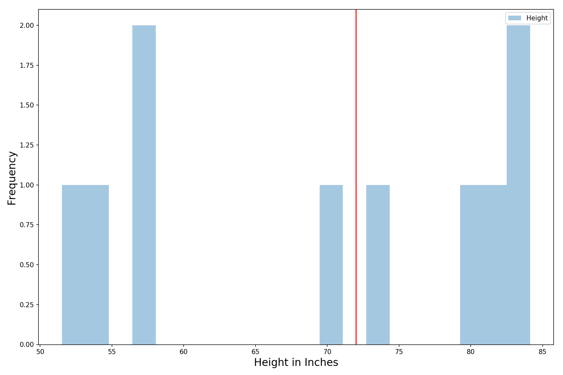
Half the people are taller than 6 feet and half are shorter (the red line denotes 6 feet) – not super informative. The average height in our sample is 69 inches, slightly below 6 feet.
Still, we remember that because our sample size is small (only 10 people in a survey), we should expect a lot of variance in our results. The cool thing is that even with just a single survey, we can get a pretty decent estimate of how much the mean varies. And we know the shape of the distribution – it’s normally distributed (hardcore statisticians will say that I need to say it is roughly normally distributed)!
Standard Error = Sample Standard Deviation / sqrt(N)
Where N is the number of observations (10 in our case) and sqrt denotes taking the square root.
The standard error is the standard deviation of the mean (if we keep conducting 10 people surveys and calculating a mean from each, the standard deviation of these means would eventually converge to the standard error). Like we mentioned, the distribution of sample means is the normal distribution. Meaning that if we were to conduct a large number of surveys and look at their individual means in aggregate, we would expect to see a bell curve. Let’s check this out.
Recall that earlier we created a 10,000 by 10 array of survey results. Each of our 10,000 rows is a survey. Let’s calculate the mean for each of our 10,000 surveys and plot the histogram via the following lines of code:
# Histogram that shows the distribution for the mean of all surveys
fig, ax = plt.subplots(figsize=(12,8))
sns.distplot(np.mean(height_surveys,axis=1),
             kde=False, label='Height')
ax.set_xlabel("Height in Inches",fontsize=16)
ax.set_ylabel("Frequency",fontsize=16)
plt.axvline(target, color='red')
plt.legend()
plt.tight_layout()Which gives us the following histogram – that’s a bell curve if I ever saw one:

Now let’s use just our original survey (the first wonky looking histogram I showed) to calculate the distribution. With just a single sample of 10 people, we have no choice but to guess the sample mean to be the true mean (the population mean as they say in statistics). So we will guess the mean to be 69 inches.
Now let’s calculate the standard error. The standard deviation of our sample is 12.5 inches:
# I picked sample number 35 at random to plot earlier
np.var(height_surveys[35])**0.5)    # = 12.5
Let’s overlay our inferred distribution, a normal distribution with a mean of 69 inches and a standard deviation of 12.5 inches on the true distribution (from our 10,000 simulated surveys, which we assume to be ground truth). We can do so with the following lines of code where
# Compare mean of all surveys with inferred distribution
fig, ax = plt.subplots(figsize=(12,8))
# Plot histogram of 10,000 sample means
sns.distplot(np.mean(height_surveys,axis=1),
kde=False, label='True')# Calculate stats using single sample
sample_mean = np.mean(height_surveys[35])
sample_stdev = np.var(height_surveys[35])**0.5
# Calculate standard error
std_error = sample_stdev/(height_surveys[35].shape[0])**0.5# Infer distribution using single sample
inferred_dist = [sample_mean + np.random.normal()*
std_error for i in range(10000)]# Plot histogram of inferred distribution
sns.distplot(inferred_dist, kde=False,
label='Inferred', color='red')ax.set_xlabel("Height in Inches",fontsize=16)
ax.set_ylabel("Frequency",fontsize=16)
plt.legend()
plt.tight_layout()And we get the following set of histograms:

We are somewhat off, but honestly it’s not too bad given that we generated the inferred distribution (in red) with just 10 observations. And we are able to achieve this thanks to the fact that the distribution of sample means is normally distributed.
Our Estimate of the Standard Deviation Has Variance as Well
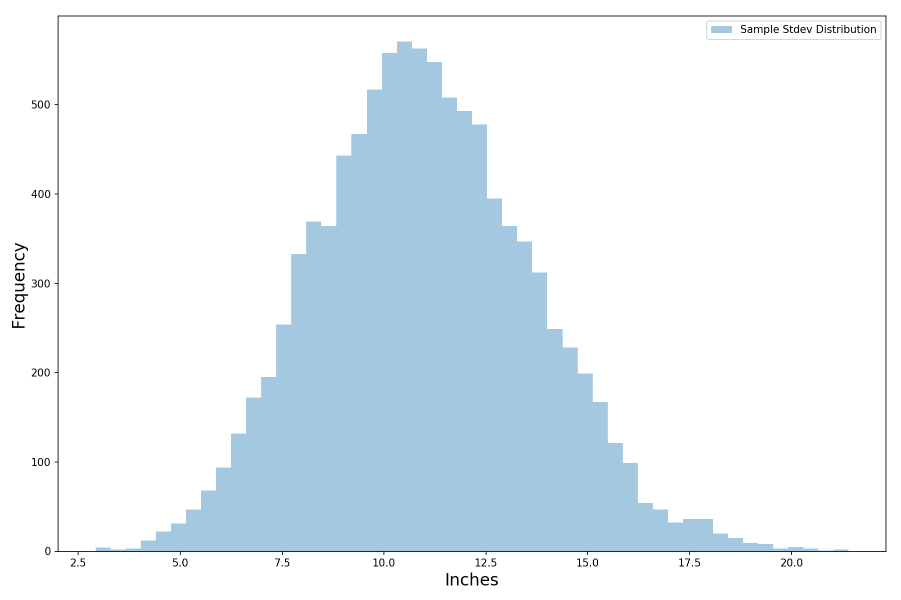
For the curious, the distribution of the sample standard deviations is also roughly normal (where a sample standard deviation is the standard deviation of a single survey of 10 people):
# Check out the distribution of the sample standard deviations
vol_dist = np.var(height_surveys, axis=1)**0.5
# Histogram that shows the distribution of sample stdev
fig, ax = plt.subplots(figsize=(12,8))
sns.distplot(vol_dist, kde=False,
label='Sample Stdev Distribution')ax.set_xlabel("Inches",fontsize=16)
ax.set_ylabel("Frequency",fontsize=16)
plt.legend()
plt.tight_layout()Which gives us the plot below. That’s a pretty wide range of standard deviations. Does that mean our estimate of standard error is not as reliable as we first thought?
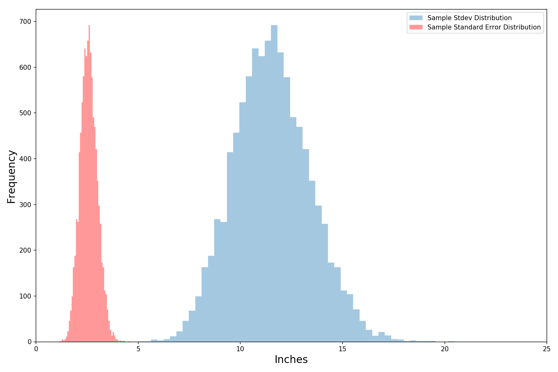
Let’s add the standard error distribution (in red) to the plot above (recall that the standard error is a function of the standard deviation). It’s lower (since standard error is standard deviation divided by the square root of the number of observations in each survey). The standard error also wiggles less for the same reason. Even so, that’s still more wiggle than we are comfortable with – but there’s an easy fix.

We can easily reduce the wiggle of our standard error distribution by including more observations. Let’s double it to 20 and see what happens – the red histogram has gotten significantly skinnier by just including 10 more people in our survey. Cool!
Finally, we can give a better answer to our friend (who was wondering whether the average height of the population was greater than 6 feet). We can do this one of two ways. First, we can just simulate it by generating a bunch of random variables (normally distributed of course). When I ran the code below, I got that 23% of the observations were 6 feet or taller.
# Simulation method for answering the question# Generate 10,000 random variables
inferred_dist = [sample_mean + np.random.normal()*
std_error for i in range(10000)]# Figure out how many are > than target
sum([1 for i in inferred_dist if i>=target])/len(inferred_dist)Or since we know that it’s normally distributed, we can use the cumulative density function to figure out the area under the curve for 6 feet or more (the area under the curve tells us the probability). The single line of code below tells us that the probability of being 6 feet or taller is 23%, the same as above.
1 - norm.cdf(target, loc=sample_mean, scale=std_error)So we should tell our friend that while there is uncertainty given how informal and small our sample was, it’s still more likely than not (given the data that we have) that people’s average height is less than 6 feet (we could also do a more formal hypothesis test, but that’s a story for another time). There are three points that I want you to keep in mind:
- The normal distribution and its helpful properties allow us to infer a lot about the statistical properties of the underlying population. However, if there is a lot of uncertainty around the correctness of our mean and/or standard deviation, then we are at the risk of garbage in garbage out. We should be especially careful when our sample is very small (rough rule of thumb is 30 or less, but this number depends a lot on the data) or not representative (biased in some way).
- When possible, always take more observations. Of course, there might be costs that limit your ability to do so. But where you can, more data will greatly increase your ability to make good inferences.
- And more generally, it’s helpful to think in terms of distributions. Despite how they appear, outcomes are rarely ever deterministic. When you see a value, you want to be concerned not only with what the value is but how it might vary (like for example the temperature in San Francisco). Expecting variance in the outcome prepares us for the unexpected (so cliche I know).
Conclusion
The thought process we just followed is very similar to hypothesis testing (or A/B testing). You can read more about it in this blog post.
But more generally, because so many things in the world follow it, the normal distribution allows us to model various phenomena as long as we have a reasonable estimate of the mean and standard deviation. If you want to learn more about how it’s used, you can check out the following articles:
- Learn how the normal distribution can be used to simulate investment and portfolio returns over many years.
- To hypothesis test whether stocks outperform cash.
- To simulate the performance of a business.
Thanks for reading. Cheers!


