Understand how your TensorFlow Model is Making Predictions
Exploring student loan data with SHAP
Introduction
Machine learning can answer questions more quickly and accurately than ever before. As machine learning is used in more mission-critical applications, it is increasingly important to understand how these predictions are derived.
In this blog post, we’ll build a neural network model using the Keras API from TensorFlow, an open-source machine learning framework. One our model is trained, we’ll integrate it with SHAP, an interpretability library. We’ll use SHAP to learn which factors are correlated with the model predictions.

About the Model
Our model will be predicting the graduation debt of a university’s graduates, relative to their future earnings. This debt-to-earnings ratio is intended to be a rough indicator of a university’s return on investment (ROI). The data comes from the US Department of Education’s College Scorecard, an interactive website that makes its data publicly available.
The features in the model are listed in the table below. More details on the dataset can be found in the data documentation.
+-------------------------+--------------------------------------+
|         Feature         |             Description              |
+-------------------------+--------------------------------------+
| ADM_RATE                | Admission rate                       |
| SAT_AVG                 | SAT average                          |
| TRANS_4                 | Transfer rate                        |
| NPT4                    | Net price (list price - average aid) |
| INC_N                   | Family income                        |
| PUBLIC                  | Public institution                   |
| UGDS                    | Number of undergraduate students     |
| PPTUG_EF                | % part-time students                 |
| FIRST_GEN               | % first-generation students          |
| MD_INC_COMP_ORIG_YR4_RT | % completed within 4 years           |
+-------------------------+--------------------------------------+
We derive the target variable (debt-to-earnings ratio) from the debt and earnings data available in the dataset. Specifically, it is the median debt accumulated at graduation (MD_INC_DEBT_MDN), divided by the mean earnings 6 years after graduation (MN_EARN_WNE_INC2_P6).
Scatter plots were created to visualize each feature’s correlation with our target variable. Each chart below shows the feature on the X-axis and the debt/earnings ratio on the Y-axis.
We’ll use a Sequential model with 2 densely-connected hidden layers and a ReLU activation function:
model = keras.Sequential([
    layers.Dense(16, activation=tf.nn.relu, input_shape=[len(df.keys())]),
    layers.Dense(16, activation=tf.nn.relu),
    layers.Dense(1)
Below we see a plot of the training process. The widening gap between the training and validation error indicates some over-fitting. The over-fitting is most likely due to the limited number of samples (1,117) in the dataset with all of the required features. Nonetheless, given that the mean debt-to-earnings ratio is approximately 0.45, a mean absolute error of 0.1 demonstrates a meaningful prediction.

To run the notebook directly in your browser, you can use Colab. It is also available in Github.
A Word about ML Fairness
The issue of college debt, which we are investigating in this blog post, has strong links to broader socio-economic issues. Any model and its training data should be carefully evaluated to ensure it is serving all of its users equitably. For example, if our training data included mostly schools where students attend from high-income households, the model’s predictions would misrepresent schools whose students typically have many student loans.
Where possible, data values have been filtered for middle-income students, to provide a consistent analysis across universities with students of varying household income levels. The College Scorecard data defines the middle-income segment as students with family household incomes between $30,000 and $75,000. Not all of the available data provides this filter, but it is available for key features such as the net price, earnings, debt, and completion rates.
With this thought process in mind, the analysis can be further expanded to other facets in the dataset. It is also worth noting that interpretability reveals which features contribute most to a model’s predictions. It does not indicate whether there is a causal relationship between the features and predictions.
Introduction to SHAP
Interpretability is essentially the ability to understand what is happening in a model. There is often a tradeoff between a model’s accuracy and its interpretability. Simple linear models can be straightforward to understand, as they directly expose the variables and coefficients. Non-linear models, including those derived by neural networks or gradient-boosted trees, can be much more difficult to interpret.
Enter SHAP. SHAP, or SHapley Additive exPlanations, is a Python library created by Scott Lundberg that can explain the output of many machine learning frameworks. It can help explain an individual prediction or summarize predictions across a larger population.
SHAP works by perturbing input data to assess the impact of each feature. Each feature’s contribution is averaged across all possible feature interactions. This approach is based on the concept of Shapley values from game theory. It provides a robust approximation, which can be more computationally expensive relative to other approaches like LIME. More details on SHAP theory can be found in the library author’s 2017 NeurIPS paper.
Using SHAP with TensorFlow Keras models
SHAP provides several Explainer classes that use different implementations but all leverage the Shapley value based approach. In this blog post, we’ll demonstrate how to use the KernelExplainer and DeepExplainer classes. KernelExplainer is model-agnostic, as it takes the model predictions and training data as input. DeepExplainer is optimized for deep-learning frameworks (TensorFlow / Keras).
The SHAP DeepExplainer currently does not support eager execution mode or TensorFlow 2.0. However, KernelExplainer will work just fine, although it is significantly slower.
Let’s start with using the KernelExplainer to draw a summary plot of the model. We will first summarize the training data into n clusters. This is an optional but helpful step, because the time to generate Shapley values increases exponentially with the size of the dataset.
# Summarize the training set to accelerate analysis
df_train_normed_summary = shap.kmeans(df_train_normed.values, 25)# Instantiate an explainer with the model predictions and training data summary
explainer = shap.KernelExplainer(model.predict, df_train_normed_summary)# Extract Shapley values from the explainer
shap_values = explainer.shap_values(df_train_normed.values)# Summarize the Shapley values in a plot
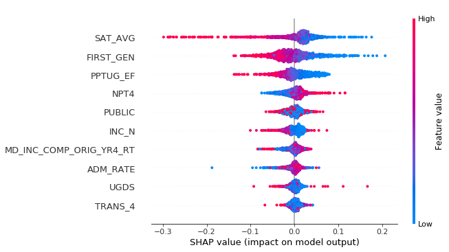
shap.summary_plot(shap_values[0], df_train_normed)
The summary plot displays a distribution of Shapley values for each feature. The color of each point is on a spectrum where highest values for that feature are red, and lowest values are blue. The features are ranked by the sum of the absolute values of the Shapley values.
Let’s look at some relationships from the plot. The first three features with the highest contribution are the average SAT score, % of first-generation students, and % part-time enrollment. Note that each of these features have predominantly blue dots (low feature values) on the right-side where there are positive SHAP values. This tells us that low values for these features lead our model to predict a high DTE ratio. The fourth feature in the list, net price, has an opposite relationship, where a higher net price is associated with a higher DTE ratio.
It is also possible to explain one particular instance, using the force_plot() function:
# Plot the SHAP values for one instance
INSTANCE_NUM = 0shap.force_plot(explainer.expected_value[0], shap_values[0][INSTANCE_NUM], df_train.iloc[INSTANCE_NUM,:])
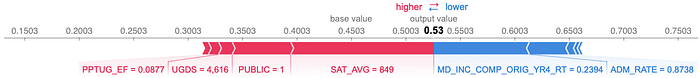
In this particular example, the college’s SAT average contributed most to its DTE prediction of 0.53, pushing its value higher. The completion rate (MD_INC_COMP_ORIG_YR4_RT) was the second most important feature, pushing the prediction lower. The values shown series of SHAP values can also be reviewed, across the whole data set, or a slice of n instances as shown here:
# Plot the SHAP values for multiple instances
NUM_ROWS = 10
shap.force_plot(explainer.expected_value[0], shap_values[0][0:NUM_ROWS], df_train.iloc[0:NUM_ROWS])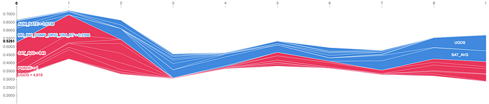
Watch Out for Correlated Features
SHAP will split the feature contribution across correlated variables. This is important to keep in mind when selecting features for a model, and when analyzing feature importances. Let’s calculate the correlation matrix and see what we find:
corr = df.corr()
sns.heatmap(corr)
Let’s cross-reference our top three features from the summary plot with the correlation matrix, to see which ones might be split:
- SAT average is correlated with the completion rate, and inversely correlated with admission rate and first-generation ratio.
- First-generation ratio is correlated with the part-time ratio, and inversely correlated with the completion rate.
Several of the correlated features were grouped in the top of the summary plot list. It’s worth keeping an eye on the completion rate and admission rate, which were lower in the list.
SHAP has a dependence_plot() function which can help reveal more details. For example, let’s look at the interaction between the first-generation ratio and the part-time ratio. As we observed in the summary plot, we can see that that the first-generation ratio is inversely correlated with its Shapley values. The dependency plot also shows us that the correlation is stronger when the university has a lower proportion of part-time students.
shap.dependence_plot('FIRST_GEN', shap_values[0], df_train, interaction_index='PPTUG_EF')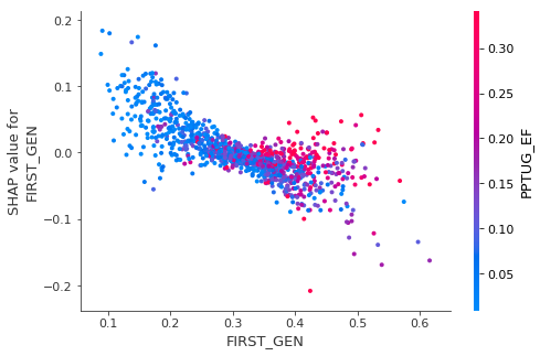
Conclusion
In this blog post, we demonstrated how to interpret a tf.keras model with SHAP. We also reviewed how to use the SHAP APIs and several SHAP plot types. Finally, for a complete and accurate picture, we discussed considerations about fairness and correlated variables. You now have the tools to better understand what’s happening in your TensorFlow Keras models!
For more info on what I covered here, check out these resources:
- Colab notebook to run the model from your browser
- GitHub repository with notebook
- Getting started with tf.keras
- SHAP GitHub repository
Let me know what you think on Twitter!