The Psychology behind Data Visualization Techniques
A short excursion into the world of human visual information processing
If you’re a data scientist, there’s a big chance that the question, “how do I most efficiently show the results of my work?” is on your mind a lot. After all, it doesn’t matter how elegant your code is or how innovative your approach is if you can’t effectively convey your findings to your audience.
As John Tukey, an American mathematician and theoretical statistician , said: “The greatest value of a picture is when it forces us to notice what we never expected to see.” — from John W. Tukey Exploratory Data Analysis, 1977
Brief History of Data Visualization
The idea of presenting information visually is old. For instance, people have been drawing maps of their surroundings for thousands of years. However, other forms of data visualization weren’t common simply because large data sets were rare. That all began to change in the late 18th and early 19th centuries when many countries began collecting and publishing information about their economies, population, and weather.
William Playfair, a Scottish political economist, is often regarded as the father of the data visualization field. Playfair is usually credited with inventing area charts, line charts or line graphs or time series plots, and bar charts or bar graphs. In 1786 he published The Commercial and Political Atlas; Representing, by Means of Stained Copper-Plate Charts, the Exports, Imports, and General Trade of England, at a Single View. To which are Added, Charts of the Revenue and Debts of Ireland, Done in the Same Manner by James Correy. His is the first known published work with statistical infographics.

Neurology and biology of cognition had not yet developed into fields of study; however, Playfair intuitively recognized that the brain processes images better than words.
In the 19th century, use of statistics and infographics flourished primarily in epidemiology and “moral statistics.” Rising crime and diseases were the two most important (and unpleasant) consequences of urbanization and progress, and these tools provided an effective way to convey important information to decision-makers and the public. One of the most iconic infographics of the 19th century is a “rose diagram” by a British nurse, Florence Nightingale. The chart unequivocally showed that the leading cause of death among British soldiers in the war was disease and not combat. Upon seeing such clear evidence of the importance of hygiene, the Queen and Parliament moved to set up a sanitary commission and death rates of soldiers subsequently began to fall. Nightingale became one of the first people to persuade the public and influence public policy with data visualization.

Until the second part of the 20th-century, data visualization techniques used by statisticians were part intuition and part art; there was absolutely no science behind them. However, that all began to change with several pioneering works in the field of psychology.
But before we get to that, let’s answer this question: Are people better at processing visual information than they are at processing verbal information? If so, why?
In short, they are. Danish physicist Tor Nørretranders’s “Bandwidth of Senses” infographic shows the result of his research on the speed of senses relative to computer terms. He concluded that the sense of sight is comparable to 1250 MB/s, or the same bandwidth as a computer network. The little semicircle in the bottom left corner is where our cognitive awareness of sensory experiences is.

Pre-attentive processing:
But why is that? The simple answer is found in neurophysiology, “pre-attentive processing.”
Cognition is handled by the cerebral cortex, which is a tool of reasoning; it is a sophisticated tool, but it hasn’t yet been polished by evolution and therefore it’s pretty slow. It requires more effort to process information. Raw visual information is processed by the thalamus, a much older part of the brain than the cerebral cortex. It takes only a few hundred milliseconds to process visual stimuli (much faster than we process text or numbers). So, processing visual data is faster, and it reduces the cognitive load. We’re not aware of the amount of data and the speed with which we process visual information. It’s subconscious. This phenomenon is known as “pre-attentive processing”.
“Pre-attentive processing is the subconscious accumulation of information from the environment. All available information is pre-attentively processed. Then, the brain filters and processes what’s important. Information that has the highest salience (a stimulus that stands out the most) or relevance to what a person is thinking about is selected for further and more complete analysis by conscious (attentive) processing.” — from Wikipedia.
Now let us go back to the subject of human’s visual cognition.
Visual Variables
In 1967, Jacques Bertin introduced the concept of visual variables. Bertin was not a psychologist; he was a cartographer. However, his work can effortlessly be attributed to his intuitive understanding of human psychology. Visual variables are “the differences in elements of a visual as perceived by the human eye” (wiki.gis.com). No matter what type of a visual you’re looking at, these are the fundamental ways in which graphic symbols can be distinguished.
The original set of the “retinal” variables included:
- Position
- Size
- Shape
- Lightness (value)
- Color hue
- Orientation
- Texture
Later researchers, including Joel L Morrison (JL Morrison — International Yearbook of Cartography, 1974) and Alan MacEachren added to the set a few more:
- Color saturation
- Arrangement
- Crispness
- Resolution
- Transparency
Bertin described four levels of perception of the variables, which have implications for their use in data visualization (initially, Bertin’s research results were primarily used in cartography). A variable can belong to several levels:
- Selective
- Associative/Dissociative
- Ordered
- Quantitative

A visual variable is said to be selective if, when applied, it generates different categories of symbols.
A visual variable is said to be associative if, when applied, it doesn’t change the visibility of an element. That is, it’s not possible to give more importance to an element using that visual variable.
A visual variable is said to be ordered if it can be used to represent a given ordering.
A visual variable is said to be quantitative when, apart from being ordered, it can be used to express ratios.
The levels of perception have implications for the effectiveness of data visualization. The following empirical rules apply:
- Avoid visual variables that are not selective (i.e., shape) if you want to highlight patterns to be readily recognized by your audience.
- Understanding associative variables essentially means being aware of what will break the perception of “sameness” in a map. For example, avoid using both color and size.
- When mapping numerical data, which has some order, employ ordered visual variables in your symbolization. On the other hand, avoid ordered variables for things that have no natural order.
- Differences of magnitude aren’t immediately perceptible by the reader without looking at a legend. Furthermore, be aware that even with size, visual estimation of quantitative differences is imperfect.
“We must remember that quantitative perception represents an accurate approximation but not a precise measurement,” — Bertin
A 1984 study by William Cleveland and Robert McGill (Graphical Perception: Theory, Experimentation, and Application to the Development of Graphical Methods) evaluated how well study subjects performed cognitive tasks, depending on the features of a graph presented to them. They ordered the following visual features from the most to least accurate:
- Position along a common scale (bar chart, dot plots)
- Positions along nonaligned, identical scales (small multiples)
- Length, direction, angle (pie chart)
- Area (treemap)
- Volume, curvature (3-D bar charts, area charts)
- Shading, color saturation (heat maps, choropleth maps)
By learning which visual elements are automatically emphasized by the brain and then incorporating those elements into visuals and dashboards, one can most effectively communicate the story behind the data.
- That said, it doesn’t mean that data scientists and statisticians need to use just bar charts and scatter plots. Cleveland and McGill wrote:
“The ordering (of the variables) does not result in a precise prescription for displaying data but rather is a framework within which to work.”
Applying Gestalt Principles to Data Visualization
The human brain is wired to see structure, logic, and patterns. It helps us make sense of the world. Even where there is none. Gestalt principles were developed by a group of German psychologists in the 1920s as a theory of how people perceive the world around them. Gestalt theory is the idea that the human brain will make sense of complex images consisting of various elements by subconsciously organizing the parts of the images into an organized system. Even if the parts are just pure unrelated collections of objects.

A human eye sees a triangle rather than circles, angles and dots. These images illustrates how our brains strive to fill in the gaps and bring order to the world around us.
Gestalt principles can aid data visualization, but they can also break it. The principle sets might be slightly different depending on the source. Wikipedia outlines one set of principles, Scholarpedia outlines another, and some design website use others. Some sources list just five of the principles, while others can go up to ten. However, the following graphic outlines the most commonly used principles:

They are:
- Law of Proximity
- Law of Closure
- Law of Similarity
- Law of Enclosure
- Law of Continuity
- Law of Figure and Ground
- Law of Symmetry
- Few refer to the principle of Focal Point as another gestalt law
Gestalt principles are not just academic terms; they can be widely used as pragmatic and helpful tools for creating visuals that are clear, informative, and appealing to your audience.
Law of Proximity
Law of Proximity
This principle states that people perceive visual elements related to how closely they are positioned to one another.
Recommendations to aid effective data visualization: Know what your visuals’ information priority is, and then create groupings through proximity to support that priority. Spatial proximity takes precedence over all other principles of grouping.
An example of data visualization using the Proximity principle is shown below. The bar chart represents the average investments in a field over the last three years by four countries. It groups data by country. Grouping by year would block an audience’s perception of countries’ investments.

Law of Closure
The principle of Closure states that when the human brain sees complex arrangements of visual elements, it organizes those elements into recognizable patterns. We like to see as simple of a figure as possible. In other words, when the human brain is confronted with an incomplete image, it will fill in the blanks to complete the image and make it make sense.
Recommendations to aid effective data visualization: This is cautionary advice; data scientists should be careful when showing graphs with breaks because the human mind tends to form complete shapes even if the shape is incomplete. An example of a bad application of this principle is shown below. There are some missing data in the series, and the plotting of the data reveals the gap. A human mind will readily close up the gap with a smooth line. However, the actual series looks far from smooth.

Law of Similarity
The principle of Similarly states that the human brain will group together things that appear similar (it also tends to assign them the similar function). The brain perceives items that are similar colors, shapes, sizes, or orientations as belonging to the same groups as like items.
Recommendations to aid effective data visualization: Use colors, shape, or size to group visual objects together to tell your story. The Similarity Principle can help your audience more readily identify which groups the displayed data belong with. In the plot below, observations in a dataset are colored based on the value of their location in two different zip codes. As a result, they are easily perceived as two separate groups.

Law of Enclosure
Sometimes this principle is referred to as Common Region Gestalt principle. It is one of the most recent Gestalt principles; Palmer introduced it in 1992. This principle addresses the fact that enclosing a group of objects brings our attention to them, they are processed together, and our mind perceives them as connected.
Recommendations to aid effective data visualization: Enclose objects that you want to be perceived as grouped in a container. It will also make them stand out. A good example of this principle’s usage is a visual created with the help of Plotly package. It allows for enclosing a time interval to visualize what was happening with employment numbers over a particular period of time to bring audience attention to it:

Law of Continuity
The Law of Continuity states that human brains tend to perceive any line as continuing its established direction. It asserts that a human eye follows lines, curves, or a sequence of shapes to determine a relationship between design elements. In other words, if there is a picture of several lines crossing one another, a person perceives the drawing only as crossing lines and not as sections of the page separated by these lines.
Recommendations to aid effective data visualization: The Continuity principle suggests arranging visual objects in a line to simplify grouping and comparison. A good example would be using bar chars ordered by y-value. In the first chart, the heights of the bars are not ordered by values, making it very difficult to compare them. In the second chart, viewers’ eyes follow a continuous path; it makes the whole chart more readable because of the uninterrupted downward direction. Sequential color palette helps to bring a viewer’s attention to the downward trend of the y-values.

Law of Figure-Ground
This principle states that the brain will unconsciously place objects either in the foreground or the background. The correct separation of background-foreground is an essential part of any visualization. Background subtraction is a “brain technique” which allows sequential (and even still) images’ foreground to be extracted for further processing. It works the same way as computer processing of images. In fact, computer background-foreground processing mimics a human brain. To be processed by your audience smoothly, a foreground object must be separated from its background by one of variables in a dataset.
Recommendations to aid effective data visualization: Ensure there is enough contrast between your foreground and background to make charts and graphs more legible and not misleading. It is better to choose colors and contrast levels that make your foreground image stand out. However, it is also essential that there is no color overload. If your visual includes color as an additional dimension (one of the variables is represented by color) choose a continuous color scale. Otherwise, you risk losing your audience’s attention; the image becomes too busy to separate foreground and background and digest the message you are trying to convey. In the image below, I used the dark foreground and very bright continuous scale to bring my audience’s attention to the correlations between the variables.

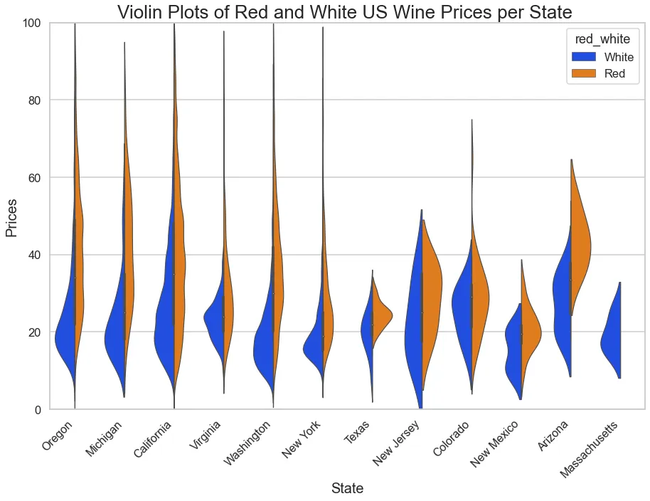
Law of Symmetry
The Law of Symmetry states that visual elements that are symmetrical to each other tend to be perceived as a unified group. People also prefer symmetry over asymmetry. Symmetric objects are associated with positive aspects such as stability, consistency, and order. On the other hand, asymmetric arrangements leave an impression — that something missing or out of balance and at the same time bringing a viewer’s attention to this disbalance and differences.
Recommendations to aid effective data visualization: This principle is not used frequently in data visualization; however, it might be compelling when creating “Before and After” visuals or comparing two similar groups of elements. An excellent example of applying the Symmetry principle is using violin plots to compare distributions of y-values in two separate groups.
Law of Focal Point
This principle is one of the more recent additions to the Gestalt principles set. The focal point principle states that things that visually stand out will be first to capture and hold a viewer’s attention, meaning that distinctive objects create a focal point in a visual presentation.
Recommendations to aid effective data visualization: Distinctive characteristics (e.g., a different color or a different shape) can be used to highlight and create focal points. An example illustrating the Focal Point principle is below. The bar plot shows average wine prices per country. The average US wine price is empathized by making it red and creating a focal point.

Summary
One cannot help but notice that Gestalt principles of visual perception and Visual variables theory are closely related. Both approaches describe how a human brain organizes our visual environment into patterns and groups using colors and sizes of objects, their orientation and texture, and contrast between them. Gestalt theory also addresses such object characteristics as symmetry and continuity. The reason for them being critical to human visual perception is our brain’s inclination to ‘predict’ based on a trend.
Knowing these principles and applying them help make data visualization more effective and easily understood.
Acknowledgements:
Tetiana Donska. The Mind’s Eye — A Look at Data Visualization Psychology https://medium.com/@arinbasu/you-can-use-footnotes-thus-babus%C2%B9-6c485c4eff1e
7 Gestalt principles of visual perception: cognitive psychology for UX https://web.archive.org/web/20181123225247/https://help.medium.com/hc/en-us/articles/215201097-How-can-I-add-a-footnote-to-a-post-