Hands-on Tutorials
Spotify API and Audio Features
One gal’s journey to make a playlist her mom can dance to
Tableau Public Dashboard (only looks good on desktop, honestly)
Jupyter Notebook
This is a follow-up to my previous post, Visualizing Spotify Data with Python and Tableau.

The most fun I’ve ever had dancing on a night out was when I went to an Indie Night on a Tuesday in London in 2015. I have frequently exercised while listening to Phoebe Bridgers. This morning I looked at the “Sad Girl Starter Pack” playlist on Spotify and thought “wow these songs are all bops!” Needless to say, I am not the best person to ask to DJ a party.
This summer, I was tasked with picking the music for a 12 hour car ride with my 66-year-old father, 62-year-old mother, 13-year-old dog, and 4-year-old nephew. The criteria? “Something I can dance to,” according to my mom. I knew this meant no Lana Del Rey, but beyond that I wasn’t sure. I landed on this Guardians of the Galaxy playlist, which was definitely a crowd pleaser. But I was curious what songs within my own library would be considered “danceable.”
Fortunately, after downloading my library from Spotify I was able to use Spotify’s API to pull a number of audio features about each song: Danceability, Energy, Instrumentalness, Popularity, Speechiness, and Tempo. I can now see which songs in my library score highest/lowest on these metrics, as well as how my most-played songs & artists fall on the spectrum.
See below for how you can too!

Step 1: Request Data
Request a copy of your data from Spotify here. Be patient and wait a few days.
Step 2: Prep Streaming/Library Data
Please refer to my previous article, Visualizing Spotify Data with Python and Tableau. Note the only change is that when we merge the two dataframes, we will drop all the streamed songs that are not in our library by filtering out the null values (see below).
# create final dict as a copy df_stream
df_tableau = df_stream.copy()

# left join with df_library on UniqueID to bring in album and track_uri
df_tableau = pd.merge(df_tableau, df_library[['album','UniqueID','track_uri']],how='left',on=['UniqueID'])

# drop all songs that aren't in our Library, aka library data values like track uri not filled in
df_tableau = df_tableau[df_tableau['track_uri'].notna()]
df_tableau.head()
Step 3: Create New Spotify Project
Log into your developer account here. In your dashboard, create a new project. Once created, you can retrieve your ‘Client ID’ and ‘Client Secret.’ We’ll use these in Step 4.
Step 4: Create Audio Feature Dataframe using Spotify’s API
First we’ll use our Client ID and Client Secret to generate an access token so we can pull data from Spotify’s API. Note: this token has to be regenerated after one hour. I figured out how to do this using the help of this post.
# save your IDs from new project in Spotify Developer Dashboard
CLIENT_ID = 'PASTE-YOURS-HERE'
CLIENT_SECRET = 'PASTE-YOURS-HERE'
# generate access token
# authentication URL
AUTH_URL = 'https://accounts.spotify.com/api/token'
# POST
auth_response = requests.post(AUTH_URL, {
'grant_type': 'client_credentials',
'client_id': CLIENT_ID,
'client_secret': CLIENT_SECRET,
})
# convert the response to JSON
auth_response_data = auth_response.json()
# save the access token
access_token = auth_response_data['access_token']# used for authenticating all API calls
headers = {'Authorization': 'Bearer {token}'.format(token=access_token)}
# base URL of all Spotify API endpoints
BASE_URL = 'https://api.spotify.com/v1/'Now we’ll pull the metrics associated with each track_uri in our library and add them to a dictionary. I’ve chosen the six metrics listed above, but check out Spotify’s console to find out how to pull the metrics you’re interested in.
# create blank dictionary to store audio features
feature_dict = {}

# convert track_uri column to an iterable list
track_uris = df_library['track_uri'].to_list()

# loop through track URIs and pull audio features using the API,
# store all these in a dictionary
for t_uri in track_uris:

    feature_dict[t_uri] = {'popularity': 0,
                           'danceability': 0,
                           'energy': 0,
                           'speechiness': 0,
                           'instrumentalness': 0,
                           'tempo': 0}

    r = requests.get(BASE_URL + 'tracks/' + t_uri, headers=headers)
    r = r.json()
    feature_dict[t_uri]['popularity'] = r['popularity']

    s = requests.get(BASE_URL + 'audio-features/' + t_uri, headers=headers)
    s = s.json()
    feature_dict[t_uri]['danceability'] = s['danceability']
    feature_dict[t_uri]['energy'] = s['energy']
    feature_dict[t_uri]['speechiness'] = s['speechiness']
    feature_dict[t_uri]['instrumentalness'] = s['instrumentalness']
    feature_dict[t_uri]['tempo'] = s['tempo']
We’ll convert this dictionary to a dataframe (df_features) and save df_tableau and df_features as csv files that we can load into Tableau.
# convert dictionary into dataframe with track_uri as the first column
df_features = pd.DataFrame.from_dict(feature_dict, orient='index')
df_features.insert(0, 'track_uri', df_features.index)
df_features.reset_index(inplace=True, drop=True)

df_features.head()
# save df_tableau and df_genre_expanded as csv files that we can load into Tableau
df_tableau.to_csv('MySpotifyLibraryStreams.csv')
df_features.to_csv('AudioFeaturesTable.csv')
Step 5: Loading Data into Tableau
Connect to your Excel file (MySpotifyLibraryStreams.csv) as a data source. This should pull up your AudioFeaturesTable.csv file on the left hand side as well. Drag the latter file over into the right hand side and add a relationship between the two tables. Make sure you create the relationship based on track_uri.

Step 6: Editing Fields in Tableau
We’ll add a few calculated fields and one parameter to our data table.
#1: Create the calculated field Minutes Played:

#2: Create aggregate calculated fields for each feature (i.e. Danceability (by min)), so that when we visualize the data we can calculate a weighted average by Minutes Played instead of the count of streams (because maybe you listen to 5 milliseconds of The A-Team every single time you start your car…). Repeat for each feature you’re interested in:

#3: Create a parameter AND calculated field Audio Feature
For detailed instructions, I referenced this post from Tableau. The result should look like the below:


You’ll then want to click your newly created parameter and select “Show Parameter” so that you can toggle between the variables and show the results in the same graph.
Step 7: Create Visualizations
Download the dashboard to see how I created the visualizations below. They are all linked and can therefore filter each other down for better data exploration!
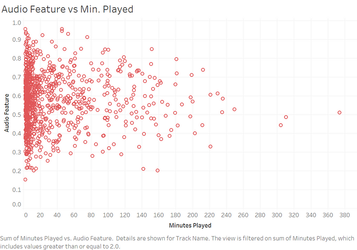
- Audio Feature vs Min. Played: scatterplot of each song’s minutes played vs. score for the selected audio feature
- Avg. of Audio Features: displays the average (weighted by minutes played) of each audio feature; note, when the dashboard is filtered, this average will recalculate
- Most Played Artists: bubble chart where size of circle indicates minutes played, while color represents how the songs I listen to by that artist score on the selected audio feature (blue = low, red = high)
- Artists: sorted high to low based on how the songs I listen to by that artist score on the selected audio feature; color represents how many minutes played (blue = low, red = high)
- Songs: sorted high to low based on how they score on the selected audio feature; color represents how many minutes played (blue = low, red = high)
Note that for each tab I filtered by sum(Minutes Played) ≥ 2, to weed out songs that I’ve never fully listened to this year (i.e. just skipped when they came on).

In Conclusion
It turns out that I don’t particularly like very danceable or very un-danceable songs. The R² on the chart below is atrociously low, so I guess I’m just #unpredictable! Maybe that’s why it’s so hard for me to understand what my mom means when she asks for a song she can dance to… because I can dance to any song (see: Benito Skinner’s incredible series “yOu CaN’t dAnCe tO fOlkLoRe” and “yOu CaN’t DaNce tO eVeRmOre…”).
Instead, I guess I’ll have to rely on the ranking Spotify has given me. Gotta get my mom into Tierra Whack! On the other hand, I learned that apparently Bleachers is not a very danceable band, although I whole-heartedly disagree, though I will concede that Phoebe Bridgers would be tricky to dance to.

This same analysis can be done across all of the other audio features included in the dashboard — Energy, Instrumentalness, Popularity, Speechiness, and Tempo. That’s what I found most useful about this project: learning how to create a parameter in Tableau that would allow me to toggle between different variables within the same charts. For example, the scatterplot below is the same as the one for Danceability, above, just filtered for Speechiness instead. You can see that I don’t really listen to songs that score high on Speechiness, which I assume would be associated with certain rap styles. If so, that scatterplot is pretty accurate, because I don’t listen to much rap. It would be interesting to compare these scatterplots to those of my friends with different preferred genres!

This was a fun way to explore my music taste. I hope you use this guide to learn more about yours too!

