Revamping My Pitch Quality Metric
A full breakdown of Ethan’s new and improved metric from start to finish
Author’s Note: The metric discussed in this article (QOP) will be called xRV (expected Run Value) in future work.
For information about QOS+, a sister metric of the one described in this article, click here or scroll all the way to the bottom of this article.
Earlier this year, I created a model to try to quantify the quality of an MLB pitch. The idea was that each pitch can be given an expected run value based on its zone location, its release point, and some of its pitch characteristics. Though I was initially happy with the results of my metric (originally introduced here) and the subsequent analysis I was able to do (here, here, here, and here), I acknowledged that there was room to improve from a modeling standpoint.
In the last few days, I decided to completely rebuild my pitch quality metric from the ground up using a much more statistically sound model building process. This article will describe that process in detail and be accompanied by my reproducible code, found here.
Question
For this project, I began by asking
How many runs would we expect to be scored on each individual pitch of the 2020 season?
In order to answer this question, I decided to use the linear weights framework which gives every pitch outcome (ball, strike, single, home run, out, etc.) a run value based on how valuable that event has been in previous games. The idea is that pitchers who throw more pitches that are likely to get good outcomes (strikes and outs on balls in play) should be rewarded and pitchers who throw more pitches likely to lead to bad outcomes (balls and baserunners on balls in play) should be punished.
Previous Method Issues
What was so wrong with the previous metric, Expected Run Value (xRV), that I had to change it? A few things. Firstly, it was made using a model called k-nearest neighbors which is rightfully known for not being a very rigorous with large, high dimensional models like this one. In that model, I used the 100 nearest neighbors, an arbitrary value that I chose for no particular reason. I did no feature selection and used only the eye test to evaluate whether the metric was good enough. I concluded that it was, and I was wrong as evidenced by its poor RMSE score (more on this later). It was a good first step but I knew I could do better, so I did. The result was an improved metric whose blueprint is contained entirely within this article.
New Method
Before getting into the weeds, I want to give an overview of how this new metric, which I am calling Quality of Pitch (QOP for short), is calculated. I grouped every pitch of the season into one of 16 categories based on the pitcher handedness, batter handedness, and pitch type. I will go into details on these groups later. For each group, I made a separate Random Forest model on a subset of pitches from that category, confirmed the model was useful, and then applied that model to all the pitches in that category. Each pitch in the dataset was in only one category and thus only got predictions from one of the 16 models.
Finally, I brought the predictions from all 16 models back together and evaluated the quality of the model by Root Mean Squared Error (RMSE). The model showed significant improvement over the first iteration of this metric that I originally made back in March.
Into the weeds we go.
Data Acquisition
All the data used for this project came from the publicly available BaseballSavant.com via Bill Petti’s baseballR package using the following function and parameters:
data = scrape_statcast_savant(start_date = “2020–07–23”,
       end_date = “2020–09–05”, player_type = “pitcher”)
This method only tends to grab 40,000 pitches at a time, so I broke it up into more function calls with smaller date ranges and used the rbind() command to combine all of the dataframes into one.
Data Cleaning and Feature Creation
This publicly available dataset unfortunately does not include the linear weight value of each event like I needed to answer my research question, so I calculated the linear weights from scratch. I am sure the linear weight values for 2020 exist somewhere else on the internet that I could go find and join into the dataset, but I already had the code from a previous project and I did not want to have to rely on any outside source for any part of this project except for the initial data acquisition. Fair warning that this code, which again can be found on my GitHub here, is a bit messy but ultimately does the job.
I want to note that I made the choice to assign pitches resulting in a strikeout with the same run value as a typical strike (not a strikeout) and pitches resulting in a walk were given the run value of a typical ball. Because this metric is meant to be context neutral and ball-strike count will not be a feature in this model, I felt this change was necessary both to make and to note here.
Once I had the linear weight value for every row in the data, I grouped all pitches into four pitch type groups according to the following table:

All pitches with other pitch types like Knuckleballs, Eephuses, etc. were deleted from the dataset. About 250 pitches were lost during this step leaving me with only about 170,000 remaining. (Note: the data used in this article is through games played on September 5th)
Finally, I created three new variables that quantified the velocity and movement difference between each Offspeed pitch and that pitcher’s average Fastball velocity and movement. I did this because I wanted the option to include these variables in my final model later on if they proved useful.
Feature Selection and Importance
Like I said earlier, this metric is really a combination of 16 different Random Forest models. Every pitch thrown in 2020 fell into one of 16 categories, shown here:

Although I am creating 16 total models, there will only be two model equations: one for Fastballs and one for Offspeed pitches.
Fastball Feature Selection
After subsetting down to just Right vs. Right Fastballs and taking a random sample of 10% of this data, I ran the Boruta feature selection algorithm with all possible features. (Using all the data would take far too long and would yield similar results, so I used this smaller subset instead.) Boruta is a tree-based algorithm that is especially well-suited for feature selection in Random Forest models.
library(Boruta)Boruta_FS <- Boruta(lin_weight ~ release_speed + release_pos_x + release_pos_y + release_pos_z + pfx_x + pfx_z + plate_x + plate_z + balls + strikes + outs_when_up + release_spin_rate,
       data = rr_fb_data_sampled)print(Boruta_FS)
The algorithm found all the above variables to be significant at the 0.01 level except for balls, strikes, and outs in the inning which makes sense due to my context neutral method of calculating linear weights, the response variable.
So the features in my final Fastball model are pitch velocity, release point, spin rate, and plate location. Because I am using Random Forests, I don’t need to worry about potential covariance between features like movement and spin rate. Here are the final features in the model, sorted by their importance to the prediction of linear weight run value according to Boruta.

In plain language, these are the variables in order that are most important for the quality of Fastballs. Vertical movement being #1, velocity being #2, and extension being #3 should not be a surprise and definitely passes the smell test.
For the Offspeed model, I followed a very similar procedure, subsetting down to a random 10% of Right vs Right Offspeed pitches for feature selection purposes. I used Boruta again with the same potential features, but this time also included the variables I created earlier: the velocity and movement differences between each pitch and the pitcher’s typical Fastball.
Boruta_OS <- Boruta(lin_weight ~ release_speed + release_pos_x + release_pos_y + release_pos_z + pfx_x + pfx_z + plate_x + plate_z + balls + strikes + outs_when_up + release_spin_rate + velo_diff + hmov_diff + vmov_diff, data = rr_os_data_sampled)print(Boruta_OS)
Here are the results:

I have a decision to make. Keep the raw velocity and movement values or use those based off of a pitcher’s Fastball? This table shows that it does not really matter which one we chose as both sets of variables have very similar importance scores. For that reason, I am just going to use the variables containing raw values. Personal preference choice here but again, it shouldn’t impact the accuracy of the metric much at all compared to the alternative.
Also, even though Boruta found strikes to be significantly important, I am going to exclude this variable because it does not really make sense in our context neutral situation, in my opinion. So the final variables for the Offspeed equation are…

…the same as the variables in the Fastball equation with the exception of release extension. Nice that it worked out that way. Notice the difference in the order of variable importance though. Movement appears to be the most important feature of an Offspeed pitch by far, which again makes sense (especially since this mixes Changeups, Sliders, and Curveballs all together).
Model Validation and Evaluation
As keen observers pointed out, I did absolutely no validation of my original pitch quality model, which is an issue! How did I know if it was good? I pretty much didn’t. I’m not making that mistake again! Looking back, the RMSE of my previous metric was 0.21. This is bad considering 0.21 was the standard deviation of the response column, linear weight. I am looking to improve upon that number with a smaller final RMSE with this new metric.
To validate this metric, I used a methodology I had never used before which involved nesting of models within a dataframe to train and test all of my 16 models at once. I borrowed heavily from this StackOverflow post and my version of the code can be seen on my GitHub here.
As is customary, I trained each model with 70% of the data and applied it to the other 30%, my test set.
Fastball Training and Validating
#Fastball Training and Validating
fbs_predictions <- fb_nested %>%
  mutate(my_model = map(myorigdata, rf_model_fb))%>%
  full_join(new_fb_nested, by = c("p_throws", "stand", "grouped_pitch_type"))%>%
  mutate(my_new_pred = map2(my_model, mynewdata, predict))%>%
  select(p_throws,stand,grouped_pitch_type, mynewdata, my_new_pred)%>%
  unnest(c(mynewdata, my_new_pred))%>%
  rename(preds = my_new_pred)rmse(fbs_predictions$preds, fbs_predictions$lin_weight)
Offspeed Training and Validating
os_predictions <- os_nested %>%
  mutate(my_model = map(myorigdata, rf_model_os))%>%
  full_join(new_os_nested, by = c("p_throws", "stand", "grouped_pitch_type"))%>%
  mutate(my_new_pred = map2(my_model, mynewdata, predict))%>%
  select(p_throws,stand,grouped_pitch_type, mynewdata, my_new_pred)%>%
  unnest(c(mynewdata, my_new_pred))%>%
  rename(preds = my_new_pred)rmse(os_predictions$preds, os_predictions$lin_weight)
My validation RMSE for the Fastball models was 0.105 and the validation RMSE for the Offspeed models was 0.099, which are both much better than I expected and a sign that this metric could be a real improvement over my previous metric in terms of accuracy and predictive power.
Knowing what we know about the model’s performance on the validation set, I feel comfortable applying these models to every pitch in 2020 so far. In doing this, I am giving every pitch in 2020 its expected run value.
When I do this and combine the predictions, my final overall RMSE is 0.145, a massive improvement upon the 0.21 RMSE of my previous metric!
I can confidently say that this model outperforms my previous pitch quality model in its quantification of the expected run values of MLB pitches.
Limitations
I want to reiterate the purpose and capabilities of this model in order to shed some light on its flaws. As George Box’s saying goes, “all models are wrong, but some are useful.” This model assigns a value to each pitch in the 2020 MLB season based on the likelihood of outcomes for that pitch in a vacuum. Though it appears to do that fairly well, this metric does not account for
- Pitch sequencing, the effect of previous pitches on the current pitch
- Strengths and weaknesses of the opposing batter
- Game situation (score, inning, pitch count)
- At bat situation (count, baserunners, number of outs)
As with any model, understanding the limitations and appropriate use cases is as important as understanding the mechanics of the model itself. Perhaps in future iterations some of these features could be integrated into the model and could potentially improve its performance.
Results
Unlike some of my past articles, which have included full breakdowns of the results of the previous pitch quality model, I am going to keep this section brief so that the focus will remain on the process of this metric’s creation and not argument about its final leaderboard.
With that being said, here are a few interesting insights from the model. Keep in mind, all units on QOP are “expected runs prevented per 100 pitches” and that all leaderboards are accurate through games played on September 5th.
Fastball QOP Leaders so far in 2020

Changeup QOP Leaders so far in 2020

Slider QOP Leaders so far in 2020

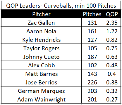
Curveball QOP Leaders so far in 2020
Writing this up and making the code public was really important to me and kind of put a bookend on my very active summer of research. I hope someone will be able to take this and improve upon it in order to further the understanding of the game of baseball in the public sphere!
As always, thanks for reading and if you have any questions, feedback, or dream job offers 😅, please let me know on Twitter @Moore_Stats!
QOS+ Details
Quality of Stuff+ (QOS+ for short) is very closely related to the metric outlined in this article, QOP. I collaborated on this metric with Eno Sarris of The Athletic for his biweekly Stuff & Command article.
Here are the relevant differences between QOS+ and QOP:
- QOS+ does not include plate location as a feature in its Fastball or Offspeed model equations so as to isolate the effect of a pitcher’s “stuff” on the expected run values of his pitches
- QOS+ uses velocity and movement values relative to the pitcher’s typical Fastball in its Offspeed model
- QOS+ is scaled differently than QOP with 100 being league average and 110 being one standard deviation better than league average
The leaderboards of QOS+ and QOP are expected to be different with the QOS+ leaderboard giving more preference to pitchers with good “stuff” than QOP which also accounts for pitchers’ command.

