I’m a big fan of Grafana’s heatmaps for their rich visualization of time-based distributions. Paired with Prometheus Histograms we have incredible fidelity into Rate and Duration in a single view, showing data we can’t get with simple p* quantiles alone. Additionally histograms, entirely based on simple counters, can easily be aggregated over label dimensions to slice and dice your data. This isn’t possible with StatsD-style timers which require read-time aggregation on already computed percentages creating inaccurate results.
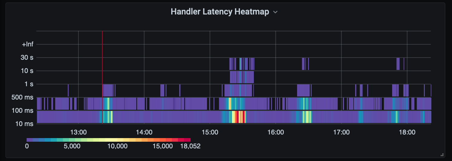
Unfortunately histograms often confuse people accustomed to the StatsD-style timers producing some form of quantiles and visualizing them on line charts. The same data is represented below and one may assume something bad happened at 15:30, with all else appearing normal.
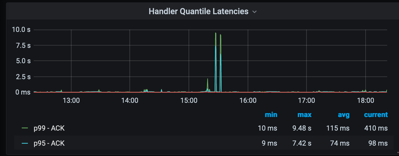
With histograms you get a lot more than standard quantiles. Heatmaps provide a powerful way to visualize that data. In the above heatmap view we see a set of processes timing out at the 30s, which we don’t get in the quantile view, and our spike was due to a flood of requests causing timeouts. This is story is represented in a single visualization.
The Problem With Quantiles
Quantiles in normal StatsD pipelines are at best rough indicators to performance and at worse outright lies. This is the unfortunate default for popular tools like Datadog which use StatsD timers extensively with tagged dimensions (akin to Prometheus labels) which are not well supported in their tools. For instance, users are often confused when they see differences in their p50 values going from avg to something else when rolling up your query in the over section (if you don’t know what this is, you’re not alone):

This happens when you are unknowingly aggregating a StatsD timer over several tag dimensions, like a get_by_key timer with a containeror customertag. Datadog needs to combine these values, and by default averages them. But how do you average a p50? It’s a poor average, because you already calculated your summary. So perhaps the max p50 makes sense, to be safe? But why is it so high compared to the average? To give Datadog credit they do suggest using distributions for this need, but that can be costly.
You could forego tags, but lose critical fidelity in your system. Another alternative is to visualize all p50 metrics for get_by_key across all dimensions, which may hard to read in a graph, if you have hundreds of dimensions. The Prometheus docs explain errors with quantiles further, and it’s unfortunate popular tools don’t educate their users in this area. People tend to trust what they see, and may not know that it is wrong.
Setting Up Prometheus Histograms
Emitting histograms is straightforward with the various Prometheus client libraries. The tricky part is determining your buckets. In the above example we have six buckets:
// defaultHistogramBoundaries are the default boundaries to use for                        // histogram metrics                        defaultHistogramBoundaries = []float64{
     10,
     100,
     500,
     1000,
     10000,
     30000,
}
You may need more or less depending on your use case. One truth is that you will want a bucket aligned with your SLO target. In our case, 10s and 30s are key default boundaries. We don’t care if something is 12s or 33s, just that it is over 10s or over 30s. This helps us say definitively say what percent of our requests are under 10 seconds.
Ideally your metrics backend can handle large sets of metrics, as these buckets will be multiplied by your label dimensions. This is referred to as supporting high-cardinality metrics. The current gold-rush of Observability companies are built on how cost-effective they can store and read large sets of metrics. StatsD metrics have the same problem, and most often you’re paying for metrics you never read. At least you can aggregate Prometheus buckets and won’t be dropping UDP packets as you do with StatsD.
Creating Your Grafana Heatmap
There are a few things you need to do get beautiful heatmaps in Grafana. First, query your buckets!

In our query we are summing the rate for handler_execution_time_milliseconts_bucket metric and grouping by le, the bucket label for histograms. We are also using the new $__rate_interval feature in Grafana 7.2 to pick the best interval for our time window, making server side aggregation efficient. We are also setting the format to heatmap so Grafana will properly handle bucket inclusion in the resulting metrics (i.e. the "le 100" bucket includes "le 10" values, and we want just the count of distinct "le 10" values).
Next we want to set our Y-axis to the appropriate scale, in our case milliseconds:
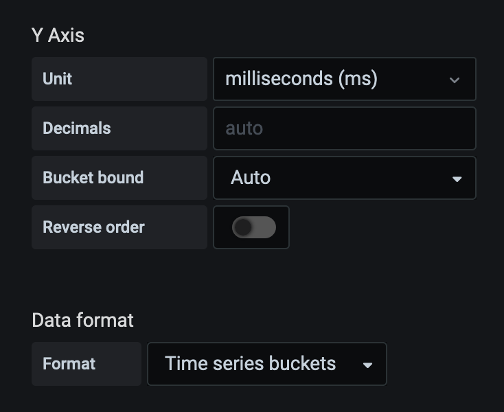
You noticed our metric name ended with _milliseconds (although I wish this was just _ms ). With timers it’s helpful to be explicit about the unit value. We also set the Data Format to Time series buckets otherwise you’ll just get random squares on your heatmap.
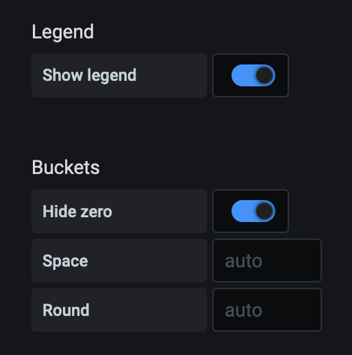
Two more critical updates are turning on Hide Zero and Show Legend . You’ll have a lot of zero values and showing them will add noise to your graph. The legend is useful to understand what values the colors represent:
This Grafana this blog post to use histograms and heatmaps covers some other features of histograms not covered in this article.
Quantiles With Histograms and SLOs
If you must have quantiles Prometheus supports the histogram_quantile function. This is helpful if you want to easily visualize multiple dimensions in a single graph: say, success vs failure latencies or the p50 per container. It can also be helpful for simplified alerting, but one benefit of histograms is we have more effective SLO definitions and can compute Apdex scores. In the simplified case we can define an SLO to be 99% of all requests must respond in under 10s:
sum(rate(handler_execution_time_milliseconds_bucket{le="10"}[$__rate_interval])) by (handler)
/
sum(rate(handler_execution_time_milliseconds_bucket[$__rate_interval])) by (handler)
Because these are all counts there is no risk of calculating an average of a p99 across label dimensions getting a pseudo result. We get an accurate total count across all series dimensions. Additionally, and one benefit of Prometheus, is that it does not require an aggregation tier as you have with StatsD.
So, go forth, bucket, and visualize!