
Welcome back to my series on Customer Lifetime Value Prediction, which I’m calling, "All the stuff the other tutorials left out." In part one, I covered the oft-under-appreciated stage of historic CLV analysis, and what you can already do with such rearwards-looking information. Next, I presented a tonne of use-cases for CLV prediction, going way further than the typically limited examples I’ve seen in other posts on this topic. Now, it’s time for the practical part, including everything my Data Science team and I learned while working with real-world data and customers.
Once again, there’s just too much juicy information for me to fit into one blog post, without turning it into an Odyssey. So today I’ll focus on modelling historic CLV, which, as part one showed, can already be very useful. I’ll cover the Stupid Simple Formula, Cohort Analysis, and RFM approaches, including the pros and cons I discovered for each. Next time I’ll do the same but for CLV prediction methods. And I’ll finish the whole series with a data scientists’ learned best practices on how to do CLV right.
Sounds good? Then let’s dive into historic CLV analysis methods, and the advantages and "gotchas" you need to be aware of.
Method 1: The Stupid Simple Formula
Perhaps the simplest formula is based on three elements: how much a customer typically buys, how often they shop, and how long they stay loyal:

For instance, if your average customer spends €25 per transaction, makes two transactions monthly, and stays loyal for 24 months, your CLV = €1200.
We can make this a little more sophisticated by factoring in margin, or profit. There are a couple of ways to do this:
Stupid Simple Formula V1: With Per-Product Margins
Here you calculate an average margin per product over all products in your inventory, and then multiply the stupid simple formula result by this number to produce an average Customer Lifetime Margin:

For example, if you take the figures from above and factor in an average product margin of 10%, your average CLV = (€25 2 24) * 0.1 = €120.
How to calculate the average product margin depends on the cost data you have, which will likely come from a variety of data sources. A simple way to start is just to take the standard catalog price minus Cost of Goods Sold (COGS), since you’ll probably have this information in your inventory table. Of course, this doesn’t consider more complex costs, or the selling price when an item is on sale, or the fact that different transactions include different items, which can have very different margins. Let’s look at an option which does…
Stupid Simple Formula V2: With Per-Transaction Margins
Version two replaces average transaction value in the original formula with average transaction margin:

For example, €5 margin per transaction 2 transactions per month 24 month lifespan = an average CLV of €240.
This variation requires transaction level margins, based on price minus costs for each item in a transaction. The benefit here is that you can use the actual sales price, rather than catalog price, thus factoring in any sales or discounts applied at the final checkout. Plus, you can include Cost of Delivery Services (CODS), i.e. shipping, and Cost of Payment Services (COPS), i.e. fees to payment system providers, like Visa or PayPal. All this leads to more accurate and actionable insights.

Pros and Cons of the Stupid Simple Formula
On the positive side:
- The formula is conceptually simple, which can facilitate better collaboration between data scientists and domain experts on how to calculate it and what to do with it.
- Plus, it can be as easy or complex to implement as you want, depending on how you calculate margin
There are two major downsides, however. Firstly, the formula isn’t particularly actionable:
- It produces a single, average value, which is hard to interpret and influence: even if you make some changes, recalculate, and find that the average changes too, you’ll have no idea if it was related to your actions.
- It averages out sales velocity, so you lose track of whether customers are all spending at the beginning of their lifetime or later.
- And it doesn’t help understand customer segments and their needs.
Secondly, the formula can be unreliable:
- Being an average, it’s easily skewed, such as if you have big spenders or a mix of retail and consumer clients.
- In non-contractual situations, where the customer isn’t bound by a contract to keep paying you, you never really know when that customer ‘dies.’ Thus, it’s hard to estimate a value for the average lifetime component.
- The formula assumes constant spending and churn per customer. It fails to consider customer journeys and phases where they’ll need more or less of your products.
Method 2: Cohort Analysis
This technique involves applying the average CLV formula to individual customer segments. You can segment customers any way you like, such as per demographic, acquisition channel or, commonly, per the month of their first purchase. The aim is to answer questions like:
- What’s an average customer worth after 3, 6, 12 months?
- When do they spend the most during their lifetime? __ For example, do they spend big at first and then drop off, or is it the inverse?
- How does acquisition funnel affect CLV? For example, sign-ups due to a promotion could win a lot of short-term, non-loyal customers, while those from a refer-a-friend scheme might result in lifelong fans. Similarly, an in-store acquisition could drive more loyalty than a forced online registration at the checkout.
- How do demographic groups differ in their average CLV? For example, do shoppers in affluent suburbs spend more? The answer won’t always match expectations, and whenever that happens, there are usually good insights to be found if you dig in deep enough.
Below we see a classic cohort analysis by acquisition month. The horizontal axis shows Cohort Group, indicating the earliest transaction month we have in the data. This probably indicates acquisition month (although some customers may have existed before the start of data collection). The vertical axis shows Cohort Period: the number of months since the earliest transaction in the data.
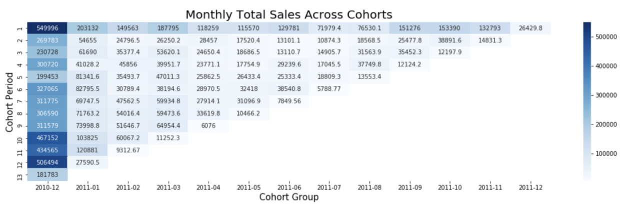
How do you read this? The leftmost column shows people who joined in December 2010 (or were already customers at that time). The darker colours reveal that these customers spent a lot in their first month (top left cell) and their 10th-12th months (bottom right), i.e. September to November, 2011. What could this mean? Collaboration between data scientists and marketers could help decode this trend: maybe it’s because the company saved Christmas for these customers in 2010, and they’re making a happy return in 2011. Maybe it’s just because they were already customers before the start of data collection. Meanwhile, customers acquired in July and August tend to be low spenders. Why? And what strategies can be employed to boost the average CLV for customers acquired during other times of the year?
Exactly the same kinds of investigations can and should take place over other types of segmentations, too.

Method 3: "RFM" Approaches
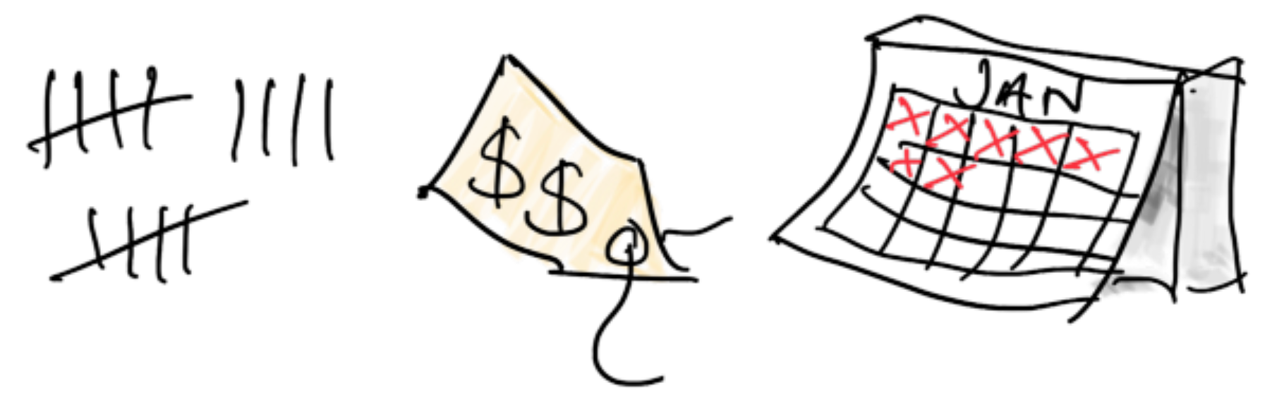
RFM approaches are based on calculating the following metrics for each customer:

This enables us to categorise customers based on these metrics and explore distinct customer groups, assigning meaningful business names to them. For instance, those with top Recency, Frequency, and Monetary Value scores earn the title of "Top Prio," or "VIPs." Having figure out who they are, the next thing you’ll want to know is: what’s the size of this group, as a proportion of your overall customer base? Meanwhile, customers with high Frequency and Monetary Value but low Recency have spent significantly but only over a short time. They might be considered "Churn Risks", especially if you add an additional metrics – time since last purchase – and it turns out to be high.
The simplest way to discover these groups is to use percentiles: Sort the customers by Recency and split them up – into tiers for the top 20%, the middle 50%, and the bottom 30%, for example. Repeat for the other metrics. Then define all possible combinations of tiers, label the resulting groups, and plot the size of each group as a percentage of your overall customer base. This is demonstrated below. Creating such a graph makes it really clear that only a small percentage of the overall customer base are "VIPs," while a much larger portion are "Going Cold" or even "Churn Risk". Such insights can help you devise strategies to gain more loyal customers and fewer at risk ones.
There are quite a few categories in this graph, resulting from the combinations of three metrics and three tiers each. For more granularity, you could define more tiers per metric. You can also experiment with how you do the segmentation: I mentioned a 20–50–30 split, but you could use other numbers, and even different strategies per metric. For example, since Frequency is a great indicator of customer loyalty, you might want to rank and split into the 5-10-85th percentiles, if you think that’ll help you most accurately pinpoint the best customers.
What if you aren’t sure about how to split your customers, or you want a more data-driven approach? You could try using unsupervised machine learning (ML) algorithms, such as k-means, to discover clusters of customers. This adds the complexity of using ML and of figuring out the number of clusters that truly represents the underlying data distribution (some recommend the elbow method for this, but boy do I have bad news for them). If you have the data science capacity though, going data-driven might produce more accurate results.
Pros and Cons of RFM Approaches
On the positive side:
- RFM approaches are intuitive, which makes communication and collaboration between data scientists and domain experts easier.
- Hand-labelled groups are highly sentient and tailored to business needs. You can work with Marketing to define them, as it’s marketing who’ll no doubt be acting on the results.
Cons:
- It can be difficult to know how many R, F, & M levels to define: is high-medium-low granular enough? This depends on the businesses’ needs and how much operational capacity it has to tailor it’s marketing strategies, customer service, or product lines, to suit different groups.
- The question of how to combine the R, F and M scores is also tricky. Imagine you’ve ranked customers by Recency and split them into three tiers, where top-tier customers are assigned 3, middle tier get 2, and the rest get 1. You repeated this for Frequency and Monetary Value. You now have a couple of options:

- With Simple concatenation, a customer who scored R=3, F=3 and M=3 gets a final score of 333, while an all-round bottom tier customer gets 111. Using simple concatenation with three tiers per metric produces up to 27 possible scores, which is a lot (to verify this yourself, count the unique values in the "Concat." columns above). And the more tiers you add, the more combinations you’ll get. You might end up with more groups than you can deal with, and/or create groups that are so small, you don’t know what to do with them, or you can’t rely on any analyses based on them.
- Summing up will provide you with fewer groups: now your all-round bottom-tier customer scores 1+1+1 = 3, your top tier customer gets 3+3+3 = 9, and every other score will land in this 3-9 range. This might be more manageable, but there’s a new problem. Now the R, F, and M metrics are being treated equally, which may be inappropriate. For example, a bad Recency score is a big warning sign you don’t want to overlook, but using summation, you can no longer see its individual contribution.
- Adding weighting can tackle these issues: For example, if you found that Frequency was the best indicator of a regular, high CLV shopper, you might multiply F by some positive number, to boost its importance. But this introduces a new challenge, namely, which weighting factors to use? Figuring out some values which result in a fair and useful representation of the data is no easy feat.
Wrapping Up. Also known as, NOW can we get to the Machine Learning?
Phew. As you can see, modelling historic CLV is no easy feat. Yet I truly believe it’s worth it, and wish more data science projects would focus on truly getting to know the data so far, before they jump into Machine Learning and making predictions.
Nevertheless, I know that’s what some of you are here for. So next time – I promise – I’ll cover the pros and cons of CLV prediction methods. Until then, start exploring that past data! Build up some intuitions for it; it’ll help you in the next step.
Or just hit me up on Substack or X, so I know you’re waiting.


