How You Should Be Looking at Conversion Rates
Conversion rates appear simple, but under the hood, there are easy traps you can fall into. Luckily, one plot can help.
Conversion rates. There are fewer metrics that I hear more often than the conversion rate. This isn’t too surprising as it’s such a simple metric that can be applied to almost any situation where you are trying to get something or someone from point A to point B.
- How many of those who do A, then go on to do B?
- How many of our favorite basketball players’ 3-point shots actually go in?
- How many of our site visitors end up signing up and creating an account?
To answer questions like these, a conversion rate can help us out. To calculate this magic metric, all you need is two numbers and a division sign. Super simple, right?
- Conversion rate = # who do B / # who do A
- 3-point conversion for our favorite basketball player = # of 3-point qualifying shots that went in the hoop / # of 3-point qualifying shots taken
- Average website signup conversion = # who sign up and create an account / # of unique website visitors
However, when answering the question, “What is the conversion rate between A and B?”, doing the above math may be simple, but it hides a lot of information that many overlook when working with conversion rates. And I’m not just talking about our casual reader, I have seen many professionals who frequently work with numbers and conversions (marketing managers, analysts, and even data scientists) also fall for the traps that exist hidden in this single number.
These two traps are volume and time.
Don’t worry if this doesn’t make sense right away, we’ll go over what these traps are, and what questions to ask to help you account for them in the data. By the end of the article, we’ll have a single plot that answers all these questions, helps us avoid these pitfalls by making them transparent, and is easy to understand. Easily the best single view of conversion.
The Volume Trap
When dividing our two numbers to get our conversion rate, we lose information about the numbers we started with and how large they are. This is important because the smaller the numbers the more likely our conversion rate is just a result of random chance. For example, if you were to measure our favorite basketball player’s 3-point conversion rate and got 100% you’d be pretty impressed. But if I told you that this measurement only consisted of a single shot you’d be much less impressed. Getting a single 3-point throw of one could easily just be luck. Instead, what if I told you that they had an 87% 3-point conversion rate out of 100 shots taken. You would be much more impressed as scoring 87 of 100 is pretty good.
The trick here is that when seeing a conversion rate is to ask “How large are the numbers that created that rate?” Similarly, when you are displaying the conversion rate its easy to add the raw numbers i.e. 30% (30/100). With the raw numbers, most can make a pretty good gut call as to whether it’s enough. But If we wanted to dive deeper into understanding the noise, getting the conversion rate over time and seeing the typical spread would give you enough for a more rigorous statistical analysis. Speaking of time, while the trap of volume is pretty straightforward — as most understand this principle of statistics — things are about to get much more complicated with our next trap.
The Time Trap
Time is much trickier and generally much less understood. Time plays two key roles here, the time it takes to get between point A and point B and how the conversion rate changes over time.
How long does it take to get from point A to point B?
For our 3-point conversion example, the time between the two actions is negligible as seconds after the shot is made (point A) we know if the ball got in the hoop or not (point B). This conversion is not only quick but also consistent; because to the laws of physics, all shots will take about the same amount of time to get from the shooter’s hand to the hoop — there will never be a 3-point shot that takes 10 minutes. However, this is often not the case and we should be asking ourselves: “How long does it take for most to convert?”
For our second example of conversion — the rate between landing on our site and signing up for an account — there is a lot of variability in time. Some visitors show up immediately and sign up as the first thing they do, others explore around for a bit before signing up an hour later, while a few will browse for a while and then come back after a week to make their account. Because there are no laws of physics limiting time, there will always be that one visitor who shows up years later to signup. With such variety, we can’t just divide the total number of signups by the total number of unique visitors because some visitors have had more time in which they could convert than others — we aren’t treating them all equally with respect to time.
To solve this we need to control for the time when making our conversion calculation. The simplest way to do this is to time box conversion for each visitor. Instead of asking, “What is the conversion between A and B?”, we should instead ask, “What is the conversion between A and B in X days?” When calculating our new metric, we need to be careful to only count visitors who have been around for the full-time period in both the numerator and the denominator and only visitors who have converted within the time period in the numerator.
For our example, let’s say that after looking at the distribution, we decide to measure conversion within 7 days from the first time someone visits the site. So for each visitor, we’ll then track when they first show up and then wait 7 days before checking if they signed up when adding them to our calculation.
How does conversion change over time?
Now that we can answer the (appropriately time-boxed) question “What is the conversion rate between A and B within X days?”, the next logical question is “Well, how has this conversion changed over time and are we improving?”
To answer this, we need to first set up our data in a way that we can compare conversion apples-to-apples across time. Luckily, our conversion-within-X-days metric does most of the heavy lifting for us as it doesn’t care when our first action happened, just that it has been X days since then. Grouping, or cohorting, our visitors based on which month they first visited our website and then calculating our 7-day conversion for each of them will give us the answer. With these numbers, understanding improvement is pretty straightforward (higher conversion number for recent cohorts = better). From here you can use this data to set a conversion goal and monitor our progress toward that goal.
At this point, you or someone else, will eventually ask, “How are we trending to our next goal? Are we on track?” To answer this question, we have a couple of options. One is to make smaller cohorts (weekly instead of monthly) and see their conversion in X days. This does have its limitations as if you go too small you might run into problems with our first trap (volume) and it still doesn’t directly tell you the progress of your most recent full cohort. The other is to reduce the time frame (i.e. 3 days instead of 7), here we also run into issues. Remember that we picked X-days specifically at the point where most visitors converted, and thus, there are times when the conversion of some visitors doesn’t indicate the conversion of most visitors.
While neither option is perfect, nor is predicting the future (which is what we are effectively trying to do here). Looking at both options, together will give us better insight into how we are progressing toward our goals.
One plot to rule them all
Looking back, we have gone through quite a collection of questions. They act as a rather good summary of where we started and what we’ve learned:
- How many of those who do A, then go on to do B?
- What is the conversion rate between A and B?
- How large are the numbers that created that rate?
- How long does it take for most to convert?
- What is the conversion rate between A and B within X days?
- How has conversion changed over time and are we improving?
- How are we trending toward our next goal? Are we on track?
Luckily, there is a single plot that can answer all of these questions. Just plot the cumulative percent conversion over time. Each line on this plot will then represent a different group cohorted by the time they first did action A (darker shades indicate more recent cohorts). I’ll realize that describing a plot in words isn’t very helpful, so instead check out an example plot below.
Reading a single point on the graph as an example, the Feb cohort had just 25% conversion at 25 days.
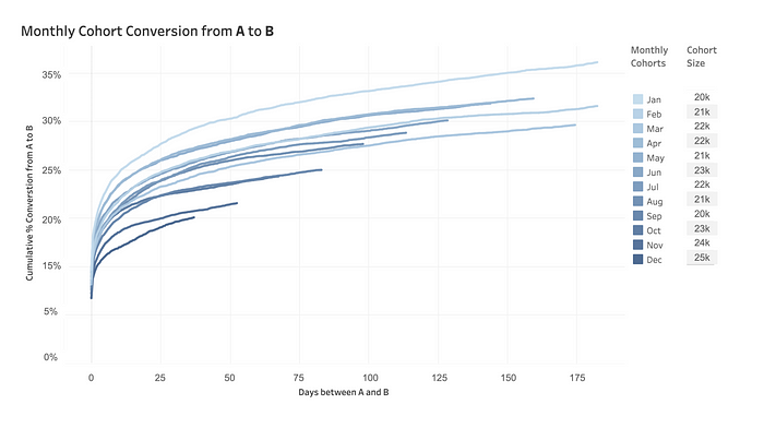
- How long does it take for most to convert? — Easy, it starts to “elbow” around 15 days
- What is the conversion rate between A and B in 25 days? — Between about 23% and 26% for cohorts between February and August. January, however, had a record conversion!
- How many convert on the same day? — About 7%, pretty consistently too.
- We made updates to the website in late September, has conversion improved since then? — No, the worst conversion is after the changes we made, and it’s getting worse over time!
- If we make additional changes, what should our goal be? — We should start by aiming for where we started (23%-26%) and ideally, we’d shoot for above 26% conversion (in 25 days).
To account for the trap of volume, you may have noticed that I incorporated the size of each cohort within the legend. This not only provides insight into the noise we might expect but also the interaction between metrics A and B, as they are often linked. As the number in A goes up, the conversion to B often changes. Understanding why is an exercise in identifying what makes one cohort different than another.
I hope this helps demonstrate how this plot tells us so much about conversion and why we should utilize it. In addition to what our conversion rate actually is, it also provides the necessary context to avoid the common traps. It allows for additional insight into how long it takes to convert, how things are changing over time, and how we are trending — all things needed for a good metric!
If that wasn’t enough, this plot is very intuitive. A short explanation about what points A and B are and highlighting that each line is its own cohort defined by point A must fill in the rest of the dots themselves after reading the axis labels. From my experience, even those who don’t consider themselves as very “data-savvy”, pick up this plot rather quickly. Once stakeholders or team members understand one of these plots, you can switch A and B around for any two metrics and everyone will immediately be able to pick up all the important takeaways from the new plot. Between this consistency and flexibility, this plot
My only confusion is why out-of-the-box analytics products like Amplitude or BI tools like Tableau, don’t allow you to easily create this kind of plot. I can only assume it's for my own job security 🤷♂️.
Thanks for reading.

