How to make an animated GIF map in Python using Folium and Imageio
A visual analysis of Brazilian Higher Education history
Recently, I have been cleaning and analyzing data from Brazilian Higher Education Institutions (HEI). The Brazilian “National Institute for Educational Studies and Research Anísio Teixeira (INEP)” keeps a large repository of microdata from Basic and Higher Education students, teachers and institutions, as also as data from the external evaluation that measure courses quality and students learning development.
There is a large number of studies (academic or not) analyzing Basic Education (Primary and Secondary) data in Brazil. During my MA in Economic Theory, I investigated the impact of social quotas in HEI aimed at students from public high schools in school choice at the end of middle school.
Studies analyzing higher education data are less common, especially outside Brazilian universities. In light of this phenomenon, I started to organize, descript, and translate data and information about Brazilian higher education. This series of posts is a first attempt to spread the use of higher education Brazilian data outside Brazil.
In this post, I highlight one of the outputs produced in the broader study. Namely, the code for creating a group of choropleths maps images from different years and turning into a Gif.
The Product
At the begging, my main goal was to have a visual representation of the geographical distribution of higher education offer across years in Brazil. I had a guess that large portions of Brazil still do not have access to higher education courses. Also, considering a well-known (at least for Brazilians) process of expansion of public higher education institutions in the last 2 decades, which happened with higher intensity in small and medium cities, I imagined that this ‘higher education access map’ had improved a lot recently.
To reach this goal, I choose to make a choropleth map for each decade, dating from the year that the first still ongoing higher education course was founded. Fortunately (or not), the final product showed that my previous guesses were right.
Library Import
Two main libraries are used in this project:
- The first is Imageio. This library was used to append a collection of .png files in one animated gif. For further information about the library click here. Below is a short description available on Imageio website:
“Imageio is a Python library that provides an easy interface to read and write a wide range of image data, including animated images, volumetric data, and scientific formats.”
- The second is the amazing Folium library. Folium “makes it easy to visualize data that’s been manipulated in Python on an interactive leaflet map.’’. Basically, with Folium you can easily create a map centered in any location you want, customize its style and add makers, colors, and other features based on locations inputs or in a GeoJson file.
Additionally, other libraries were used to extract a .zip (zipfile), open HTML files and take a screenshot (webdriver), read a Json file (json), crop images (Image), define a color scale (braca.colormap), manage data frames (pandas), among others. Here is the complete list:
The Data
The Brazilian Higher Education Census brings annual data for every institution, course, student, and teacher. It’s a public and very rich dataset, not so broadly explored yet. For making this product, I used the course data from the 2018 microdata.
The code below extracts the microdata file from INEP website, unzip and organizes it in the project folder and reads the course data in a pd.dataframe.
The ‘Cleaning’
Actually, for this analysis, no significant cleaning in the course data frame was needed. Only two columns are used for making the map:
- ‘CO_MUNICIPIO’, which represents the id for the municipality where the course is offered; and
- ‘DT_INICIO_DE_FUNCIONAMENTO’, which represents the date when the course started to be offered.
Before keeping only the two columns described above, I dropped on-line courses from the database (about 8,3% of all courses)
From ‘‘DT_INICIO_DE_FUNCIONAMENTO’ I created a new column, ‘FOUNDATION_YEAR’, which indicates only the year when the course started to be offered, excluding the month and day of foundation.
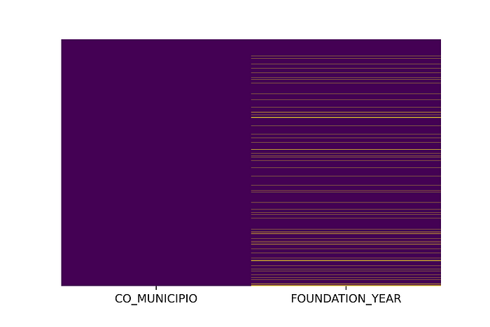
A quick ‘nan’ value check shows that FOUNDATION_YEAR has 2.700 nan values (5,1% of the data frame). The heatmap (Figure — 1) shows that these missing values are well distributed across municipalities. My choice here was to simply drop all these nan values. One outlier was also dropped. A course that supposedly started in 2917
The code for cleaning our course data frame is described below.
The GeoJSON File
In order to make a choropleth map, we need a JSON or shapefile for geographical regions. The GeoJSON for Brazilian municipalities is available on this Git. A small but interesting adaptation of this work could be using state or microregion borders, instead of municipalities.
The code below reads the GeoJSON file using the json library
Since municipalities without any higher education course are not represented in our course data frame, it will be necessary to include then. Otherwise, these municipalities will be missing when we get to ‘paint’ the map.
The code below creates a dictionary with all municipalities id’s, according to the GeoJSON file, for future use.
Setting the colormap scale
I choose to apply np.log in the total number of courses for each year. I did it because some municipalities as São Paulo (Bralizan largest city) have a much higher number of courses than small cities (which in general offer less than a dozen courses). The log function helps us to achieve a more homogenous colormap.

Creating a choropleth map for each decade since the first course was founded
Here is a step by step to create and color a map using Folium. Any doubt or suggestion for improving code and descriptions quality is welcome.
Turning Map Zoom Control off
Folium maps come with zoom control, similar to Google Maps functionality. Considering that we are going to create one image for each decade, and not an interactive HTML, I opted to take out this Zoom Control using the code below. Basically the fileinput function opens each HTML code, replace ‘zoomControl: true’ for ‘zoomControl: false’, and save the file with the same name.
Converting HTML files into PNG
To create a Gif it is necessary images and not HTML files. Unfortunately, Folium generates only HTML maps. The code below opens all these HTML, once at a time, takes a screenshot, and saves it as a .png file.
It’s important to choose a delay that guarantees that the browser will have time to load the map before the screenshot is taken.
Cropping images for better visualization
The screenshots captures a lot of empty space outside the map. I used .crop function from PIL Image to resize the images and keep only the “heart” of our files.
Finally(!), creating our Gif Map using Imageio
Imageio makes it very simple to append .png files and turn them into an animated gif, with configurable frames per second (fps). To keep my project folders neat, I also removed all png after the Gif was created.
Final result
Ok. That’s it! :) Here is the final result:

Going beyond
With the ‘DM_CURSOS’ database, from the Higher Education Census microdata, we can go much beyond. For example, it’s possible to differentiate private and public courses, on-line and in-class, and get the total number of students in each municipality, instead of the total number of courses.
Latter I will try to create a higher education offer index for each municipality, comparing the number of seats offered in public and private institutions and the number of students enrolled in the last year of high school.
If you want to know a bit more about higher education data in Brazil, I invite you to read these posts about the data available for Brazilian Higher Education and the analysis that I already employed using it. If you have any suggestions, feel free to contact me.

