Data visualization with D3.js for beginners
Getting started visualizing data with D3.js
Have you ever walked into a packed stadium or a musical show and tried to guess how many people were surrounding you? Were you way off? Analyzing high-volume data can be overwhelming. But, when you take abstract data points and convert them into an accurate, sizable visual, you will be able able to see things analytically.

This is the era of information where we have more than enough data, but only few know what to do with those data. People rely on their sight far more than on anything else. That’s why data presented visually is more convincing than plain numbers. Excellent visualization can grab attention of the people, while endless columns and rows of numbers can only confuse them. To make these visualizations and analytics possible we need frameworks or libraries to existing languages to make this possible. That where D3.js comes in to play.

D3 stands for Data-Driven Documents. If you are planning to create custom visualizations on the web, chances are that you’d have already heard about D3.js. A web based visualization library that features a plethora of APIs to handle the heavy lifting of creating advanced, dynamic and beautiful visualization content on the web.
D3.js is a JavaScript library for manipulating documents based on data. D3.js helps you bring data to life using HTML, SVG, and CSS. D3’s emphasis on web standards gives you the full capabilities of modern browsers without tying yourself to a proprietary framework, combining powerful visualization components and a data-driven approach to DOM manipulation.
The main task that’s done by D3 is that it allows to bind any kind of data you want to DOM and then making the data-driven transformations to it resulting in easy to build and interactive data visualizations in your application.
The Github repository of D3 and the API documentation which is used by D3 is also good sources if you are interested to have a deep dive.
Let’s start using D3.js now. You can open your IDE or editor and create a file named index.html just to play around with D3.js. Using this library for our application is as easy as adding the link directly to get the latest release as below in index.html you created:
<script src="https://d3js.org/d3.v5.min.js"></script>So now you’re ready to use D3.js and all of it’s features in your sample application.
Selection of elements
Selection means selecting the html element from their name or css selectors. (eg: h2, p ) Then after selecting the elements we can use D3 to manipulate and transform those html elements the way we want. Selections allow powerful data-driven transformation of the document object model (DOM): set attributes, styles, properties, HTML or text content, and more. Using the data join’s enter and exit selections, you can also add or remove elements to correspond to data.
Imagine we have a simple html page as following.
<html>
    <head>
        <title>My sample HTML page</title>
    </head>
    <body>
        <h1>D3.js</h3>
        <p>I'm using D3.js here !</p>
        <p>We all are using D3.js here !</p>
        <script src="https://d3js.org/d3.v5.min.js"></script>
        <script>
             d3.select('h1').style('color', 'green');
             d3.selectAll('p').style('font-size', '30px');
        </script>
    </body>
</html>
There are few important thing that you should notice here. So there are two keywords used here. Both of those use the element name as the parameter. First one d3.select() method returns the first selection of DOM element matching the given parameter. So in the above example it will be <h1>D3.js</h3>. The second method is d3.selectAll() which returns all the html elements corresponding to the given parameter. If it does not find any <p> tags, it will return an empty selection. In the given example <p>I’m using D3.js here !</p> and <p>We all are using D3.js here !</p> both will be returned.
Further you can get a look at the manipulations that are done as well after selecting the DOM elements. We can change the styling or even the text displayed. So in our example, when this is rendered the header “D3.js” would be in green color.
You can look in to more details on selection here.
Dynamic properties and Data binding
Another main concept of D3 is mapping a set of data to the DOM elements in a dynamic manner. Here we can introduce a datasets and then we can update, append and display the DOM elements using those datasets, realtime.
let dataset = [1,2,3,4,5]
d3.selectAll(‘p’)      //Select 'p' element
.data(dataset)         //data()puts data into waiting for processing
.enter()               //take data elements one by one
.append(‘p’)           //for each data item appending <p>
.text(‘Sample text’);  //add sample text to each
This will render the text “sample text” 5 times in the front end. This is only a simple example to show that we can use data to manipulate the elements dynamically and real time. There are a lot of things that can be done using this same concept.
Data visualization
Since we are now quite comfortable with the basic concepts of D3 we can go for the data visualization components which consists of various types of graphs, data tables and other visualizations.
Scalable Vector Graphics (SVG) is a way to render graphical elements and images in the DOM. As SVG is vector-based, it’s both lightweight and scalable. D3 uses SVG to create all its visuals such as graphs. The great thing about using SVGs is we don’t have to worry about distortion in scaling the visuals unlike in other formats. Basically D3 helps us to bridge the gap between the data and the relevant visualizations to give the users meaningful information.
Let’s start with creating a simple Bar chart using D3.js. You need two files named index.html, script.js and style.css as below to try this out.
index.html
<html><head><link rel=”stylesheet” href=”style.css”><title>My sample D3.js App</title></head><body><h1>Bar Chart using D3.js</h1><svg width=”500" height=”800" class=”bar-chart”></svg><script src=”https://d3js.org/d3.v5.min.js"></script><script src=”script.js”></script></body></html>
script.js
var dataset = [28, 40, 56, 50, 75, 90, 120, 120, 100];var chartWidth = 500, chartHeight = 300, barPadding = 5;var barWidth = (chartWidth / dataset.length);var svg = d3.select(‘svg’).attr(“width”, chartWidth).attr(“height”, chartHeight);var barChart = svg.selectAll(“rect”).data(dataset).enter().append(“rect”).attr(“y”, function(d) {return chartHeight — d}).attr(“height”, function(d) {return d;}).attr(“width”, barWidth — barPadding).attr(“fill”, ‘#F2BF23’).attr(“transform”, function (d, i) {var translate = [barWidth * i, 0];return “translate(“+ translate +”)”;});
style.css
.bar-chart {background-color: #071B52;}
The resulting bar chart would like something like this.
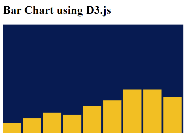
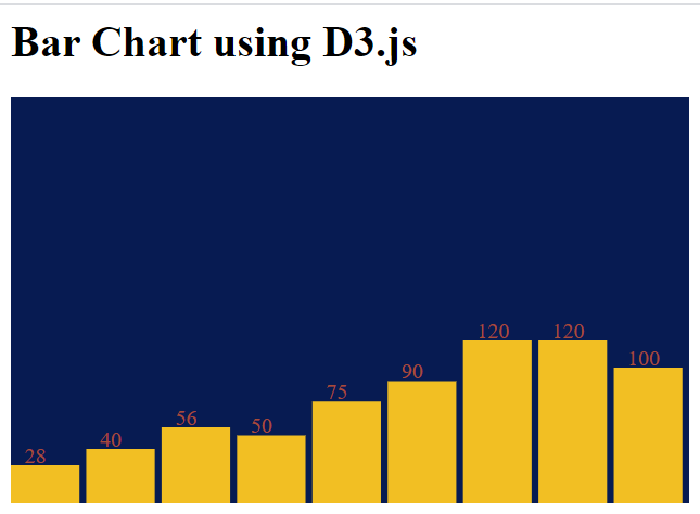
This shows the visualization but there is no precise information other than the trend. So our next task is to add some labels so that the values of each bar will be visible giving more information on visuals.
For that you can add following code snippet add the end of the script.js file.
script.js
var text = svg.selectAll(“text”).data(dataset).enter().append(“text”).text(function(d) {return d;}).attr(“y”, function(d, i) {return chartHeight — d — 2;}).attr(“x”, function(d, i) {return barWidth * i + 10;}).attr(“fill”, “#A64C38”);
This will result something like below showing the values.
Now what are going to do is add scaling to our chart. You can have various values in your data set; some can be really small and some can be really large. So for better visualizations with consistency it’s important to have scaling in your chart.
If we rearrange our dataset as below you can see how the bar chart is rendered.
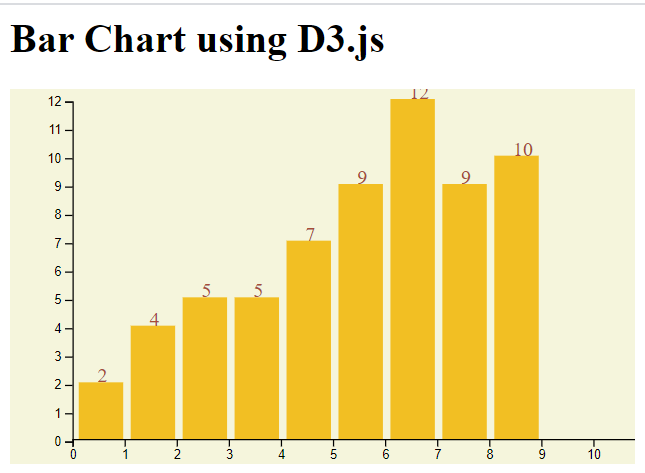
var dataset = [2, 4, 5, 5, 7, 9, 12, 9, 10];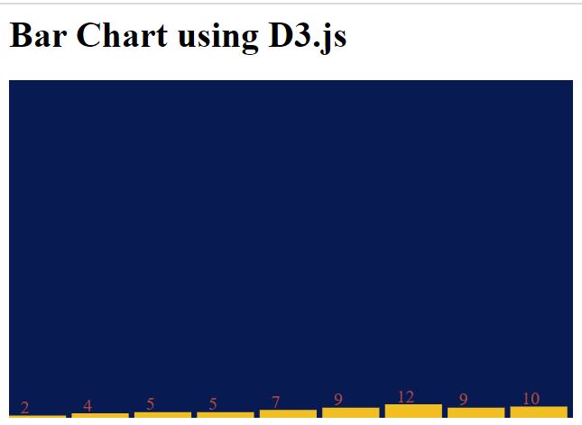
So this way we can barely see the bars in the chart. So we have to scale it up according to the chart height. If you have larger values in your dataset it will be not shown the accurate height within the given chart height. So the solution for this is scaling accordingly. For that we can use a scaler like this and change the bar chart.
script.js
var dataset = [2, 4, 5, 5, 7, 9, 12, 9, 10];var chartWidth = 500, chartHeight = 300, barPadding = 5;var barWidth = (chartWidth / dataset.length);var svg = d3.select(‘svg’)
.attr(“width”, chartWidth)
.attr(“height”, chartHeight);var yScale = d3.scaleLinear()
.domain([0, d3.max(dataset)])
.range([0, chartHeight])var barChart = svg.selectAll(“rect”)
.data(dataset)
.enter()
.append(“rect”)
.attr(“y”, function(d) {
return chartHeight — yScale(d);})
.attr(“height”, function(d) {
return yScale(d);})
.attr(“width”, barWidth — barPadding)
.attr(“fill”, ‘#F2BF23’)
.attr(“transform”, function (d, i) {
var translate = [barWidth * i, 0];
return “translate(“+ translate +”)”;
});var text = svg.selectAll(“text”)
.data(dataset)
.enter()
.append(“text”)
.text(function(d) {
return d;})
.attr(“y”, function(d, i) {
return chartHeight — yScale(d) — 2;})
.attr(“x”, function(d, i) {
return barWidth * i + 10;})
.attr(“fill”, “#A64C38”);
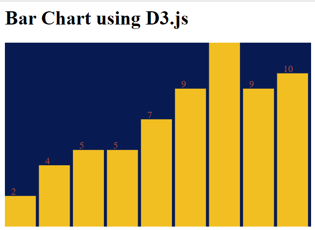
So now it’s quite obvious that axes are missing out in our chart. So it’s really simple to add axes to our graph using D3.js. You can create x-axis and y-axis using x-scale and y-scale in D3.js. You can create a scaled graph with labels using following code snippet.
script.js
var dataset = [2, 4, 5, 5, 7, 9, 12, 9, 10];var chartWidth = 500, chartHeight = 300, barPadding = 6;var barWidth = (chartWidth / dataset.length -14);var svg = d3.select(‘svg’)
.attr(“width”, chartWidth)
.attr(“height”, chartHeight);var xScale = d3.scaleLinear()
.domain([0, d3.max(dataset)])
.range([0, chartWidth]);var yScale = d3.scaleLinear()
.domain([0, d3.max(dataset)])
.range([0,chartHeight — 28]);var yScaleChart = d3.scaleLinear()
.domain([0, d3.max(dataset)])
.range([chartHeight — 28, 0]);var barChart = svg.selectAll(“rect”)
.data(dataset)
.enter()
.append(“rect”)
.attr(“y”, function(d) {
return chartHeight — yScale(d) — 20;})
.attr(“height”, function(d) {
return yScale(d);})
.attr(“width”, barWidth — barPadding)
.attr(“fill”, ‘#F2BF23’)
.attr(“transform”, function (d, i) {var translate = [barWidth * i +55, 0];
return “translate(“+ translate +”)”;});var text = svg.selectAll(“text”)
.data(dataset)
.enter()
.append(“text”)
.text(function(d) {
return d;})
.attr(“y”, function(d, i) {
return chartHeight — yScale(d) — 20;})
.attr(“x”, function(d, i) {
return barWidth * i + 70;})
.attr(“fill”, “#A64C38”);var x_axis = d3.axisBottom().scale(xScale);var y_axis = d3.axisLeft().scale(yScaleChart);svg.append(“g”)
.attr(“transform”, “translate(50, 10)”)
.call(y_axis);var xAxisTranslate = chartHeight — 20;svg.append(“g”)
.attr(“transform”, “translate(50, “ + xAxisTranslate +”)”)
.call(x_axis);
style.css
.bar-chart {background-color: beige;}
So like above simple bar chart we can create many types of graphs we want. The best thing here is the control we have over what we create. Unlike other ready-made graphs which has are limited-customizable, we can have the freedom of creating our own graphs using SVGs in D3.js.
D3 solves the cause of the problem: efficient manipulation of documents based on data. This avoids proprietary representation and affords extraordinary flexibility, exposing the full capabilities of web standards such as HTML, SVG, and CSS. With minimal overhead, D3 is extremely fast, supporting large datasets and dynamic behaviors for interaction and animation.
You can have a look at the already created complex and attractive graphs at D3.js graph gallery.
Whereas most people will refer to D3.js as a data visualization library, it’s not. D3 is more of a framework comprising different parts such as jQuery parts (which help us select and manipulate DOM elements), Lodash parts, animation parts, data analysis parts, and data visualization parts.
Try data visualizations with D3.js and share the results with me!