How To Make Your Graph Look Astonishingly Beautiful Quickly
So, you just finished retrieving, processing, and analyzing your data. You grab your data and you decide to graph it so you can show others your findings. You click ‘graph’ and……

Ya looks kinda boring. What we want is something a little more fun and dynamic. Something like… this:

Yes! Now that looks awesome! So let’s see how we can do quickly get this animation going.
Prerequisites
Okay here’s what you’ll need to get started:
- Data for a bar graph (duh!)
- Adobe Illustrator (Don’t worry we don’t need it for anything complicated)
- Adobe After Effects
Step 1: Make Your Excel Graph Look Better
So, let’s just do a few things to make our graph look better. We can start by making the text a bit larger and let’s change the graph style while we’re at it.
Now for the style, I don’t want the y-axis and instead, I just want the total numeric value at the top of each bar in our graph. We can do it in excel pretty easily,
- Select the graph
- Click on the ‘brush icon’
- Under ‘Style‘ we can find the graph style we’re looking for. For me, it was the second one but it may be different for you.

Next just make the font size larger and change the font to whatever tickles your fancy. Remove any background lines (you can just select and delete them). And maybe make the bar wider. After I was done editing my graph looked like this.
Don’t worry about the text being too light right now, later on, I’ll be adding a darker background color to make things pop more.
Experiment, and play with the kind of design you want to have, feel free to be as creative as you want.
Step 2: Break the Excel Chart Into Components in Adobe Illustrator
Create a new project in Adobe Illustrator and set the size to 1920 by 1080. Then simply copy-paste the graph you just made from Excel into Illustrator.
The image will copy in as a vector image meaning you can resize it without having to worry about quality loss. Resize your image until it fits the way you want it to on your canvas. See below for reference on how it’s been sized.

Split Each Bar Into Their Own Layer
If you open the ‘Layers‘ panel (you can click f7 or Window -> Layers to open it up) you should see ‘Layer 1‘. If we open it up, we should see a Layer called ‘‘ with all the bars that we need.

Right now they’re all stuck together.
- Select that ‘‘ -> Right-click on the bar -> Select ‘Release Clipping Mask‘. That will create a ‘Compound Path‘ Layer.
- Select this layer and again right-click on the bar and select ‘Release Compound Path‘. Now we have all the bars separated.

Create five new layers (one for each bar) and drag each bar layer into the new layer. Rename the new bar layers to make it easier to use in After Effects later.

Split the Bar Values Into a New Layer
Create one more layer called ‘Values’ and just move all the numeric bar values into that layer. Make sure not to move any of the Year values, we just want the bar values there.
Remove Unnecessary Layers
Now we’re basically done. The last thing we’ll need to do is remove any sub-layers in Layer 1 that we don’t need.
An easy way to do this is to click on the little ‘eye‘ icon next to the layer. If something disappears from Illustrator then we want to keep that. If it looks like nothing disappeared then we can remove it. The point of this is to delete the white background so we can add on our own later in After Effects. If you want to keep the white background feel free to move on to the next step.
Once that’s done rename ‘Layer 1‘ to ‘Axis‘ so it’s easier to identify in After Effects.
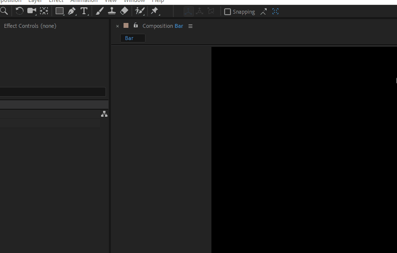
Step 3: Animating In After Effects
Create a new After Effects project and set the size to 1920 by 1080. My duration was set to 5 seconds but you can set it 3 seconds if you want to. Next, we need to import the Illustrator file that we just created. We can do this by double-clicking the Project Panel and selecting our AI file.
Make sure that Import Kind is set to Composition and Footage Dimension is set to Layer Size. We can then just click on the new composition that after-effects automatically created for us and start working on it. You should also see all our layers in the Composition Panel.

Each layer has an anchor point. These anchor points are the points at which the effects we apply take place. We’ll need to move these anchor points to the bottom of each bar so that the Animation starts from that point.
To do this
- Select a specific bar object (example: bar 1)
- In the toolbar select the anchor tool.
- Then just move the anchor to the center bottom of the bar. Repeat this for each bar. You can see an example below for how I did it.

Scaling the Bar From 0% to 100%
Once we have our anchors set at the correct position we can start animating. This part is really simple.
In the Composition Panel: Bar Layer (ex: Bar 1) > Transform > Scale.
- Unlink the scale by clicking the chain icon on the scale option. This unlinks the width from the height.
- Click on the stopwatch icon next to the Scale option. This creates a keyframe for our animations.
- Set the height to 0%. On the Scale options, the height is the second value.
- Move the scrubber on the timeline to 7 Frames (or however long you want the animation to last) and adjust the height back to 100%. This will automatically create a new keyframe for us and animate our growing bar from 0% to 100% of its original height, over 7 frames.

Add The Bounce Animation
The bounce animation makes it so that when our bar reaches the top it will overshoot and then go back down. This makes the animation look a lot smoother and more lively.
To do this click on the stopwatch icon next to Scale while holding down the ALT key. A text area will open on the timeline. Copy-paste the following there.
// Inertial Bounce - Created by Animoplex: www.animoplex.com
// Original Version: http://www.graymachine.com/top-5-effects-expressions/
// Modified expression for a smoother bounce effect and easier editing. Use this on any property with two keyframes to get a nice bounce effect that is based on velocity of the value change. Perfect for a scale from 0 to 100 or a speedy rotation that needs some extra life. Adjust amp, freq and decay values to tweak the effect. Amp is intensity, freq is bounces per second, and decay is the speed of decay, slow to fast.
// Variation Aamp = 5.0; freq = 2.0; decay = 4.0;n = 0;
if (numKeys > 0) {
n = nearestKey(time).index;
if (key(n).time > time) { n--; }
}
if (n == 0) { t = 0; }
else { t = time - key(n).time; }
if (n > 0 && t < 1) {
v = velocityAtTime(key(n).time - thisComp.frameDuration/10);
value + v*(amp/100)*Math.sin(freq*t*2*Math.PI)/Math.exp(decay*t);
}
else { value; }
Congratulations! The hard part is over, now we just need to do some copy-pasting and fix up a few things. You should now have something that looks like this:

Copy Paste Motion Effect to Other Bars
If you close the dropdown menu for the component we were just working on and select it again you can type the letter ‘U’ on your keyboard to just view properties you’ve changed.
- Do that and select the two keyframes we just made.
- Ctrl+C or Cmd+C to copy them.
- Select each of the other bar components and paste them to each one.

Shift Timing of Bars
Having all the properties open for all the bars we just animated. We see that the animation for each bar takes place at the same time. To fix this we just need to shift the keyframe animation for each bar to start when the last one animation ended.
‘Bar 5‘ for me was my first bar on the graph and ‘Bar 1‘ was my last. So for me, I just need to shift them like shown below but you may need to shift them differently.

Animate The Bar Values
The values being there at the beginning of the animation is pretty weird. Instead, a better look would be for them to appear near the end of the animation.
- Click on the ‘Values’ component > Transform > Opacity
- Click the stopwatch and set the keyframe to 0%
- We want to not start animating until near the end of the animation so position your time scrubber halfway between the start and end of the last bar animation. You can manually create a keyframe by selecting the diamond icon on the far right of the Opacity property.
- Move the scrubber to the end of the last bar animation and set the opacity to back to 100%. Now the values will appear near the end of the animation.

Add Background Color
- Layer > New > Solid…
- Pick your favorite color.
- In the Composition Panel drag your background to the bottom to see your graph again.
You’re Done!
Marvel at your beautiful creation.
If you liked this consider reading some more cool stuff like How to Handle Missing Data in Python
Or How salmon can use a magical force to return home!