Data Driven Growth with Python
Churn Prediction
Churn Prediction with XGBoost Binary Classification
This series of articles was designed to explain how to use Python in a simplistic way to fuel your company’s growth by applying the predictive approach to all your actions. It will be a combination of programming, data analysis, and machine learning.
I will cover all the topics in the following nine articles:
3- Customer Lifetime Value Prediction
4- Churn Prediction
5- Predicting Next Purchase Day
9- A/B Testing Design and Execution
Articles will have their own code snippets to make you easily apply them. If you are super new to programming, you can have a good introduction for Python and Pandas (a famous library that we will use on everything) here. But still without a coding introduction, you can learn the concepts, how to use your data and start generating value out of it:
Sometimes you gotta run before you can walk — Tony Stark
As a pre-requisite, be sure Jupyter Notebook and Python are installed on your computer. The code snippets will run on Jupyter Notebook only.
Alright, let’s start.
Part 4: Churn Prediction
In the last three sections of Data Driven Growth series, we have discovered tracking essential metrics, customer segmentation, and predicting the lifetime value programmatically. Since we know our best customers by segmentation and lifetime value prediction, we should also work hard on retaining them. That’s what makes Retention Rate is one of the most critical metrics.
Retention Rate is an indication of how good is your product market fit (PMF). If your PMF is not satisfactory, you should see your customers churning very soon. One of the powerful tools to improve Retention Rate (hence the PMF) is Churn Prediction. By using this technique, you can easily find out who is likely to churn in the given period. In this article, we will use a Telco dataset and go over the following steps to develop a Churn Prediction model:
- Exploratory data analysis
- Feature engineering
- Investigating how the features affect Retention by using Logistic Regression
- Building a classification model with XGBoost
Exploratory Data Analysis
We start with checking out how our data looks like and visualize how it interacts with our label (churned or not?). Let’s start with importing our data and print the first ten rows:
df_data = pd.read_csv('churn_data.csv')
df_data.head(10)
Output:

A better way to see all the columns and their data type is using .info() method:

It seems like our data fall under two categories:
- Categorical features: gender, streaming tv, payment method &, etc.
- Numerical features: tenure, monthly charges, total charges
Now starting from the categorical ones, we shed light on all features and see how helpful they are to identify if a customer is going to churn.
As a side note, in the dataset we have, Churn column is string with Yes/No values. We convert it to integer to make it easier to use in our analysis.
df_data.loc[df_data.Churn=='No','Churn'] = 0
df_data.loc[df_data.Churn=='Yes','Churn'] = 1
Gender
By using the code block below, we easily visualize how Churn Rate (1-Retention Rate) looks like for each value:
df_plot = df_data.groupby('gender').Churn.mean().reset_index()
plot_data = [
    go.Bar(
        x=df_plot['gender'],
        y=df_plot['Churn'],
        width = [0.5, 0.5],
        marker=dict(
        color=['green', 'blue'])
    )
]plot_layout = go.Layout(
        xaxis={"type": "category"},
        yaxis={"title": "Churn Rate"},
        title='Gender',
        plot_bgcolor  = 'rgb(243,243,243)',
        paper_bgcolor  = 'rgb(243,243,243)',
    )
fig = go.Figure(data=plot_data, layout=plot_layout)
pyoff.iplot(fig)
Output:

Gender breakdown for the churn rate:

Female customers are more likely to churn vs. male customers, but the difference is minimal (~0.8%).
Let’s replicate this for all categorical columns. To not repeat what we did for gender, you can find the code needed for all below:
Now we go over the features which show the most significant difference across their values:
Internet Service

This chart reveals customers who have Fiber optic as Internet Service are more likely to churn. I normally expect Fiber optic customers to churn less due to they use a more premium service. But this can happen due to high prices, competition, customer service, and many other reasons.
Contract

As expected, the shorter contract means higher churn rate.
Tech Support

Customers don’t use Tech Support are more like to churn (~25% difference).
Payment Method

Automating the payment makes the customer more likely to retain in your platform (~30% difference).
Others
Let’s show some of the other features’ graphs here for the reference:


We are done with the categorical features. Let’s see how numerical features look like:
Tenure
To see the trend between Tenure and average Churn Rate, let’s build a scatter plot:
df_plot = df_data.groupby('tenure').Churn.mean().reset_index()plot_data = [
    go.Scatter(
        x=df_plot['tenure'],
        y=df_plot['Churn'],
        mode='markers',
        name='Low',
        marker= dict(size= 7,
            line= dict(width=1),
            color= 'blue',
            opacity= 0.8
           ),
    )
]plot_layout = go.Layout(
        yaxis= {'title': "Churn Rate"},
        xaxis= {'title': "Tenure"},
        title='Tenure based Churn rate',
        plot_bgcolor  = "rgb(243,243,243)",
        paper_bgcolor  = "rgb(243,243,243)",
    )
fig = go.Figure(data=plot_data, layout=plot_layout)
pyoff.iplot(fig)

Super apparent that the higher tenure means lower Churn Rate. We are going to apply the same for Monthly and Total Charges:
Output:


Unfortunately, there is no trend between Churn Rate and Monthly & Total Charges.
Feature Engineering
In this section, we are going to transform our raw features to extract more information from them. Our strategy is as follows:
1- Group the numerical columns by using clustering techniques
2- Apply Label Encoder to categorical features which are binary
3- Apply get_dummies() to categorical features which have multiple values
Numerical Columns
As we know from the EDA section, We have three numerical columns:
- Tenure
- Monthly Charges
- Total Charges
We are going to apply the following steps to create groups:
- Using Elbow Method to identify the appropriate number of clusters
- Applying K-means logic to the selected column and change the naming
- Observe the profile of clusters
Let’s check how this works for Tenure in practice:
Cluster profiles:

We have 3 clusters with 7.5, 33.9 and 63 as their average Tenure.
Churn Rate for each cluster:

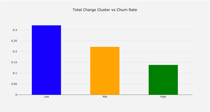
This is how it looks after applying the same for Monthly & Total Charges:
Monthly Charge:


Total Charge:


Categorical Columns
Label Encoder converts categorical columns to numerical by simply assigning integers to distinct values. For instance, the column gender has two values: Female & Male. Label encoder will convert it to 1 and 0.
get_dummies() method creates new columns out of categorical ones by assigning 0 & 1s (you can find the exact explanation in our previous article)
Let’s see both in practice:
#import Label Encoder
from sklearn.preprocessing import LabelEncoder
le = LabelEncoder()
dummy_columns = [] #array for multiple value columnsfor column in df_data.columns:
    if df_data[column].dtype == object and column != 'customerID':
        if df_data[column].nunique() == 2:
            #apply Label Encoder for binary ones
            df_data[column] = le.fit_transform(df_data[column])
        else:
            dummy_columns.append(column)#apply get dummies for selected columns
df_data = pd.get_dummies(data = df_data,columns = dummy_columns)
Check out how the data looks like for the selected columns:

As you can see easily, gender & Partner columns became numerical ones, and we have three new columns for TenureCluster.
It is time to fit a logistic regression model and extract insights to make better business decisions.
Logistic Regression
Predicting churn is a binary classification problem. Customers either churn or retain in a given period. Along with being a robust model, Logistic Regression provides interpretable outcomes too. As we did before, let’s sort out our steps to follow for building a Logistic Regression model:
- Prepare the data (inputs for the model)
- Fit the model and see the model summary
And the summary looks like below:

We have two important outcomes from this report. When you prepare a Churn Prediction model, you will face with the questions below:
1- Which characteristics make customers churn or retain?
2- What are the most critical ones? What should we focus on?
For the first question, you should look at the 4th column (P>|z|). If the absolute p-value is smaller than 0.05, it means, that feature affects Churn in a statistically significant way. Examples are:
- SeniorCitizen
- InternetService_DSL
- OnlineSecurity_NO
Then the second question. We want to reduce the Churn Rate, where we should start? The scientific version of this question is;
Which feature will bring the best ROI if I increase/decrease it by one unit?
That question can be answered by looking at the coef column. Exponential coef gives us the expected change in Churn Rate if we change it by one unit. If we apply the code below, we will see the transformed version of all coefficients:
np.exp(res.params)
As an example, one unit change in Monthly Charge means ~3.4% improvement in the odds for churning if we keep everything else constant. From the table above, we can quickly identify which features are more important.
Now, everything is ready for building our classification model.
Binary Classification Model with XGBoost
To fit XGBoost to our data, we should prepare features (X) and label(y) sets and do the train & test split.
#create feature set and labels
X = df_data.drop(['Churn','customerID'],axis=1)
y = df_data.Churn#train and test split
X_train, X_test, y_train, y_test = train_test_split(X, y, test_size=0.05, random_state=56)#building the model & printing the score
xgb_model = xgb.XGBClassifier(max_depth=5, learning_rate=0.08, objective= 'binary:logistic',n_jobs=-1).fit(X_train, y_train)print('Accuracy of XGB classifier on training set: {:.2f}'
       .format(xgb_model.score(X_train, y_train)))
print('Accuracy of XGB classifier on test set: {:.2f}'
       .format(xgb_model.score(X_test[X_train.columns], y_test)))
By using this simple model, we have achieved 81% accuracy:

Our actual Churn Rate in the dataset was 26.5% (reflects as 73.5% for model performance). This shows our model is a useful one. Better to check our classification model to see where exactly our model fails.
y_pred = xgb_model.predict(X_test)
print(classification_report(y_test, y_pred))
We can interpret the report above as if our model tells us, 100 customers will churn, 67 of it will churn (0.67 precision). And actually, there are around 220 customers who will churn (0.45 recall). Especially recall is the main problem here, and we can improve our model’s overall performance by:
- Adding more data (we have around 2k rows for this example)
- Adding more features
- More feature engineering
- Trying other models
- Hyper-parameter tuning
Moving forward, let’s see how our model works in detail. First off, we want to know which features our model exactly used from the dataset. Also, which were the most important ones?
For addressing this question, we can use the code below:
from xgboost import plot_importance
fig, ax = plt.subplots(figsize=(10,8))
plot_importance(xgb_model, ax=ax)
We can see that our model assigned more importance to TotalCharges and MonthlyCharges compared to others.
Finally, the best way to use this model is assigning Churn Probability for each customer, create segments, and build strategies on top of that. To get the churn probability from our model, utilize the code block below:
df_data['proba'] = xgb_model.predict_proba(df_data[X_train.columns])[:,1]Our dataset looks like below at the end:

Now we know if there are likely to churn customers in our best segments (recall part 2 and part 3) and we can build actions based on it. In the next article, we are going to focus on predicting the next purchase day of customers.
You can find the Jupyter Notebook for this part here.
I’ve started to write the more advanced and updated version of my articles here. Feel free to visit, learn more and support.


