
High dimensional data sets provide one of the largest challenges in all of Data Science. The challenge is quite straightforward. Machine learning algorithms require the data set to be dense in order to make accurate predictions. Data spaces get extremely vast as more and more dimensions are added. Vast data spaces require extremely large data sets to maintain density. This challenge can either result in inaccurate predictions from models (For instance, I described how the k-nearest neighbors algorithm can be rendered useless with high dimension data spaces in k-Nearest Neighbors and the Curse of Dimensionality) or data sets that are too large for computers to reasonably handle.
Fortunately data scientists have identified a solution to this problem. It’s called dimensionality reduction. The essence of dimensionality reduction is simple: You search the data set for trends that imply the data set is acting along a different dimension than your original assumption, then you transform your data accordingly. In this way you can reduce the number of dimensions in your data set.
How does dimensionality reduction work?
Dimensionality reduction works by identifying the dimensions that truly matter in your data set. Once the really important dimensions have been identified, you can transform your data set so that the points are represented along these dimensions instead of the dimensions that they were originally presented with.
Let’s discuss this in terms of an example. In k-Nearest Neighbors and the Curse of Dimensionality I presented the somewhat tongue in cheek example of the Garden Gnome Demarcation Line. In this example pretend that you’re studying the locations of garden gnomes in a city, and plotting them. You start off by identifying the latitude and longitude of each garden gnome in the city, then plot them in a 2 dimensional graph. The two dimensions are North-South and East-West, represented in miles from the center of the city. This is a perfectly reasonable way to present the data and, with only two dimensions, would suffice perfectly.
However, pretend that you’re a perfectionist and want to present the data using as few dimensions as possible. You also notice that the garden gnomes, for some odd reason, form a nearly perfect line running from the North-East corner of the city to the South-West corner of the city. The data set isn’t a cloud of garden gnome locations, it’s a line. Noticing this, you realize that you could plot the location of each garden gnome in terms of distance from the city center in the NorthEast-SouthWest direction. And this representation would only require one dimension.
The next step is then to perform the transformation. You need to calculate the distance of each point from the center of the city along the new axis, and declare that your new data set. The new distance can be done algebraically. And once that’s done, the resulting profile can be plotted showing your data set in a single dimension.
What does that process look like?
We’ll walk through this process using the prior example of the Garden Gnome Demarcation Line. I’ll do all of this work in python, using the capabilities of pandas and numpy. For detailed instructions on how to use those tools, I highly recommend reading Python for Data Analysis by Wes McKinney (Wes is the creator of pandas, so you can bet he knows what he’s talking about. I’ll be generating plots using the python package bokeh. A useful introduction to that package can be found in Hands on Data Visualization with Bokeh.
I’ve constructed my data set in a pandas dataframe called GardenGnomeLocations. It has an index for 31 entries, and columns representing the location of each garden gnome along the North-South and East-West axis. The columns are named ‘NorthSouth (mi)’ and ‘EastWest (mi)’.
Figure 1 presents the original data set, showing the location of each garden gnome in the city along the North-South and East-West axes. Each circle represents the location of a garden gnome relative to the city center. Notice the previously described trend presented in the data; the location of the garden gnomes is, for some mysterious reason, a straight line running from the North-East corner of the city to the South-West corner of the city.

Upon noticing that trend it becomes clear that the location of garden gnomes can really be presented using a single dimension, a single axis. We can use this knowledge to create a new axis, the NorthEast-SouthWest axis (Or, as I enjoy calling it, the Garden Gnome Demarcation Line). Then the data can be presented in a single dimension, as the distance from the city center along that axis.
To perform this translation, we use the pythagorean theorem on each data point. To calculate the distance of each garden gnome from the city center along our new axis, we need to use a for loop, the pandas.loc function, the math.sqrt function, and some algebraic expressions. The code calculating the new distance and adding it to the ‘Distance (mi)’ column in the data frame is as follows:
for i in GardenGnomeLocations.index: GardenGnomeLocations.loc[i, 'Distance (mi)'] = math.sqrt(GardenGnomeLocations.loc[i, 'NorthSouth (mi)'] ** 2 + GardenGnomeLocations.loc[i, 'EastWest (mi)'] ** 2) if GardenGnomeLocations.loc[i, 'NorthSouth (mi)'] < 0: GardenGnomeLocations.loc[i, 'Distance (mi)'] = -1 * GardenGnomeLocations.loc[i, 'Distance (mi)']The for loop at the top of the code block tells the script to perform this calculation for each row in the GardenGnomeLocations dataframe, and to use the variable i to keep track of it’s location in the dataframe. The second line performs the actual calculation and stores the data in the appropriate location in the dataframe. You’ll note that the equation boils down to c = sqrt(a² + b²), which is the common form of the pythagorean theorem. The first term, GardenGnomeLocations.loc[i, ‘Distance (mi)’] tells python that the value we’re about to calculate should be placed in row i of column ‘Distance (mi)’ in the GardenGnomeLocations dataframe. The other side of the equation uses the corresponding data from the ‘NorthSouth (mi)’ and ‘EastWest (mi)’ columns to calculate the result. Keep in mind that the pythagorean theorem will only return absolute values of the distance. To overcome that, we add the final two lines of code. The first determines whether the values of the original data point were positive or negative. The second then multiplies the distance by -1, to make it negative, if the original values were negative.
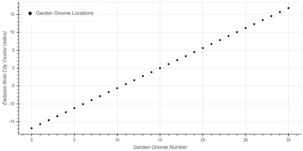
Plotting this data results in Figure 2. The data looks very similar, because this plot presents it in 2 dimensions, but notice the axes in this case. Instead of presenting each plot using the location in the North-South and East-West axes, Figure 2 shows the location of each gnome only in terms of the distance from the city center. In one dimension.
This reduction to a single dimension makes the data set much easier to use. Fewer points are needed to ensure that the data set is dense enough to return accurate predictions. Fewer data points means reduced computational time for the same quality results. And some algorithms, like the k-nearest neighbors algorithm, are much more likely to return useful results than with higher dimensions.
This transformation does make it harder to interpret the data, however. Originally the data was easily understood; each data point referred to the location of the garden gnome in terms we commonly use. We could fine the distance North/South, and the distance East/West and simple use that. Now instead we have a distance from the city center, but the data doesn’t clearly state the direction. In order to make sense of this data, we must retain all prior data sets and algorithms. In that way we can later translate the data from the new axis back to the original axis, so it can be easily understood and used.
Is it really that simple?
Unfortunately, no it isn’t really that simple. This was an overly simplified, somewhat comical, example meant to demonstrate the fundamental concepts. In reality no data set will operate along a perfectly shaped line like this data set did, and it won’t be possible to transform the data by simply using the pythagorean theorem. Real data sets will look more like clouds of data with vague trends hidden in them, and you’ll need to use a technique called principal component analysis to transform the data. This technique is beyond the scope of this introductory article, but Joel Gros does an excellent job of demonstrating how to implement it in Data Science from Scratch.
Wrapping It Up
Highly dimensional data sets provide a serious challenge for data scientists. As the number of dimensions increases, so does the data space. As more and more dimensions are added, the space becomes extremely large. This large space makes it hard for most Machine Learning algorithms to function because gaps in the data set present areas that the models cannot match. Some algorithms, such as the k-nearest neighbors algorithm, are especially sensitive because they require data points to be close in every dimension which gets very rare when there are many dimensions.
The obvious solution to the dimensionality problem is larger data sets. This can be used to maintain data density; however, very large data spaces require very large data sets. These data sets can get too large, overwhelming the ability of computers to perform the necessary calculations. In that case, the solution is to apply dimensionality reduction.
Dimensionality reduction is the practice of noticing when data points align along different axes from the ones that are originally used, and transforming the data sets to present them along those axes instead. We demonstrated this using the example of garden gnomes spread throughout the city. Originally they were plotted on the intuitive North-South and East-West axes. However, after inspecting the data, it became clear that they were oriented along a separate axis running from the North-East corner of the city to the South-West corner. Translating the data set accordingly reduced the data set from one dimension to two. While this is a small example, the principal can be applied to much larger data sets.


