An Easy Way to Draw Spider Charts on Tableau — Part I
Are you tired of Pie charts? Try Spider charts!

A spider chart is also called radar chart, it can be used to describe data with 3 or more dimensions with quantitative measures. Basically, whenever you want to analyze data using a pie chart, you can consider if you want to try a more advanced radar chart.
Tableau is one of the most popular data visualization tools now, but it doesn’t have a built-in spider chart to work with. I read many articles written about how to build a radar chart on Tableau and I worked out this very easy and simple method after trying many other complicated methods.
In this article, I will use the data set of Canada University Ranking 2015 posted on Kaggle as an example trying to compare universities in Canada by 6 dimensions: employment, faculty, publication, influence, broad and patents.

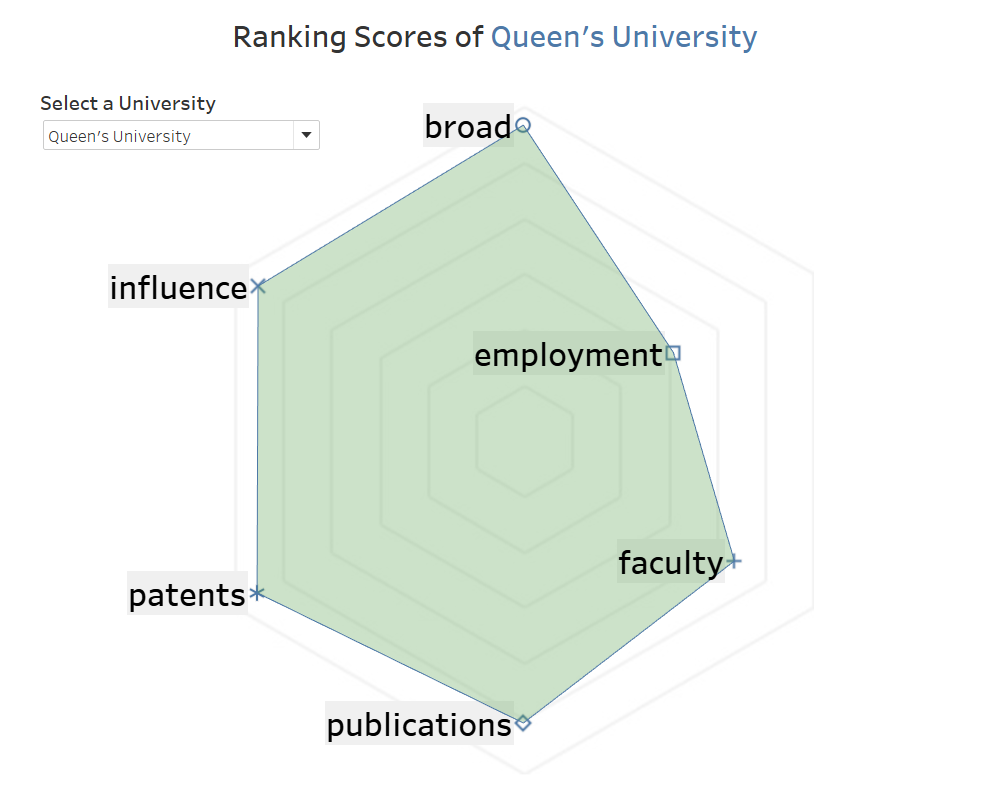
Let’s have a look at the radar chart I created on Tableau firstly. You can also find the radar chart I created on Tableau from here.👈
>>> Step 1: Pivot Data
Holding [Ctrl] select all the 6 qualities > right-click > click [Pivot]

Make sure dimension [Quality] names in a column and value [Score] of dimensions in another column.

>>> Step 2: Create Calculated Fields
№1. [Path]

[Path] field tells Tableau the sequencing by which the ‘web’ should walk.
CASE [Quality]
WHEN 'employment' THEN 1
WHEN 'broad' THEN 2
WHEN 'influence' THEN 3
WHEN 'patents' THEN 4
WHEN 'publications' THEN 5
WHEN 'faculty' THEN 6
END
№2. [X-axis]
We’ll use Trigonometry to indicate the direction of each corner of our “spider web”, X-axis is cos value of an angel and Y-axis is sin value of the coordinating angel.
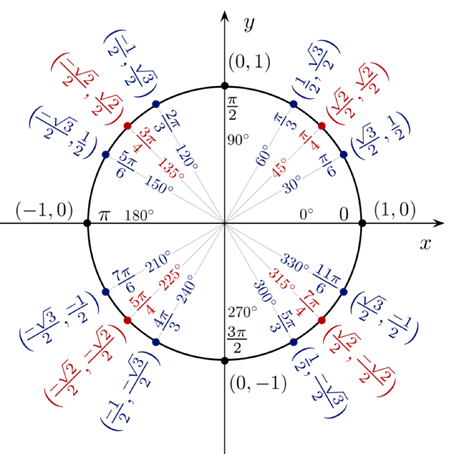
For example, we want ‘employment’ to sit at 30° direction, then X-axis of ‘employment’ is [Score]*cos 30° = [Score]*(SQRT(3)/2) and Y-axis will be [Score]*sin 30° = [Score]*(1/2)
Because we have 6 dimensions dividing 360°, so each dimension will sit at 30°, 90°, 150°, 210°, 270° and 330°.
CASE [Quality]
WHEN 'employment' THEN [Score]*(SQRT(3)/2)
WHEN 'broad' THEN 0
WHEN 'influence' THEN [Score]*(-SQRT(3)/2)
WHEN 'patents' THEN [Score]*(-SQRT(3)/2)
WHEN 'publications' THEN 0
WHEN 'faculty' THEN [Score]*(SQRT(3)/2)
END
№3. [Y-axis]
CASE [Quality]
WHEN 'employment' THEN [Score]*(1/2)
WHEN 'broad' THEN [Score]*1
WHEN 'influence' THEN [Score]*(1/2)
WHEN 'patents' THEN [Score]*(-1/2)
WHEN 'publications' THEN [Score]*(-1)
WHEN 'faculty' THEN [Score]*(-1/2)
END
>>> Step 3: Filter a University
Drag [University] filed into ‘Filters’ box and I selected ‘Queen’s University’ for example.

>>> Step 4: Build a Polygon
- Drag [X-axis] into ‘Columns’
- Drag [Y-axis] into ‘Rows’

3. Drag [Quality] into ‘Details’
4. Drag [Path] into ‘Path’

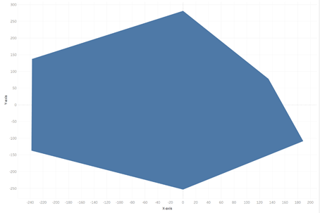
Then we got this graph, hummmm… 😒looks like “stupid”? Don’t worry! We’ll format it at the end.
>>> Step 5: Draw Points & Labels
- Duplicate an Y-axis
- Change one of the two charts to ‘Shape’
- Drag [Quality] into ‘Label’
- Drag [Quality] into ‘Shape’

5. Right-click the [Y-axis] of ‘Shape’ chart > click ‘Dual Axis’ > select ‘Synchronize Axis’
Then we will get this chart.

>>> Step 6: Formatting
There are a bunch of formatting we need to do:
- change axes to fixed same length and width. (here, X: -300, +300, Y: -300, +300)
- choose a color you like for the Polygon, make it transparent and maybe add a border for it.
- change font of labels.
- remove all the borders and all the lines.
- add [University], [Quality] and [Score] into ‘Tooltip’

Finally, we got the radar chart. Yay!!!!🥳 But wait… it seems a little bit different from a normal radar chart? — we didn’t provide a “web” for it!
Don’t worry! I will show how to manually draw a background “web” for our “spiders” in next article An Easy Way to Draw A Spider Chart on Tableau — Part II.👈 Different from other articles showing how to draw it using Tableau coding, I will use a little bit of “trick” there to make the process easier and simpler.
Please feel free to contact me if you have any questions about this article! I look forward to talking about data science and data visualizations with you! 🙋♂️