A short Python tutorial using the open-source Plotly “Dash” library (Part I)

Of late, I’ve become a major fan of Plotly’s “Dash” Python library for data visualization projects. Using Dash, it is possible to create beautiful graphs and figures, then easily distribute them as lightweight web apps, without ever needing to write a single line of HTML or Javascript. I don’t think it’s hyperbolic to say that within the next 18 months, the Dash library will be one of the most important Python data-visualization libraries available — and it’s all open-source (MIT Licensed).
On a recent project, I’ve been working with some of the more intermediate features of Dash, and wanted to create a few tutorials to share some of the things I’ve learned. Today, I want to focus on learning how to create dynamic data tables in Dash (based off of the original Plotly code here). In subsequent tutorials we’ll look at more advanced features, such as using Dash callback functions to enable/disable certain components of our base app.
For the purposes of this tutorial, we’ll use data on 2011 US agriculture exports per state and a second dataset on the 2014 population for every US state, both available on Github.


Let’s say we want to figure out a way to visualize the beef, pork, and poultry exports of each state (in later tutorials, we’ll look at cross-referencing the export data with the State’s population). We’ll walk through each part of the app step-by-step — if you’re in a hurry, jump to the final code embed at the end for the final product.
First, we need to import the necessary Python modules and then load the data.
Important note: ‘dash_table_experiments’ is not fully stable yet, and as such is not included by default when installing the Dash libraries. To install using pip, simply type: ‘pip install dash-table-experiments’ in your activated environment.
Next, we need to define the layout of our app. I’ve been particularly fond of the dynamic Dash ‘datatables’ lately, so let’s define one of these tables in our layout using the code below.
Make note of the IDs of the components we created above, because next we need to write two app callbacks to enable the dynamic properties of the table. The first callback waits for the user to click on one of the bars in the subplots, and then highlights that row in the table. Conversely, the second callback creates and updates the bar plots based on rows selected by the user in the table. After the callbacks, we append calls to external CSS files for styling purposes, and then finally run the app.
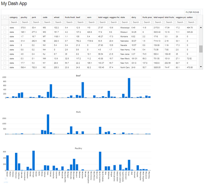
Now, if I want to find out the top beef exporting states, I can easily sort the table and the graphs will dynamically update. Not exactly a surprise, but we can quickly see Texas, Nebraska and Kansas are the top three beef producer’s in the US.

In the next tutorial, we’ll look at how to use more advanced callbacks in order to cross-reference the agricultural data with the state population data. Until then, here is the final code for this app!