6 Advanced Visualizations in Tableau
An overview of advanced visualizations in Tableau, including step-by-step examples
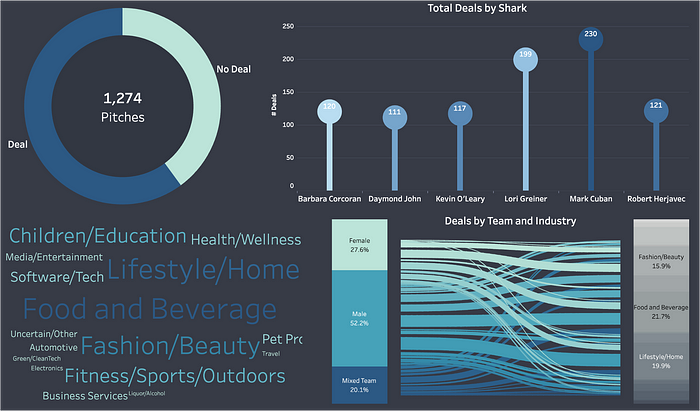
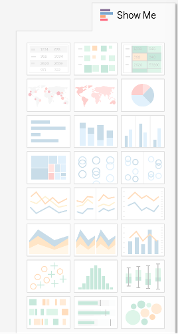
Tableau is a data visualization tool used to create data visualizations, dashboards, and stories. When I first started using this tool, I often used the Show Me feature to create data visualizations. This feature allows users to create common visualization types, such as bar charts and line graphs.
While the standard visualizations are great, there are times when an advanced technique is needed. Recently I created a dashboard visualizing deals made on the show Shark Tank. Below are some advanced visualization techniques used in that dashboard, with step-by-step guidance on how to recreate the visuals — either with the same dataset or a different one! This list can also be a great way to learn about different visualization types and brainstorm how to incorporate them in other tools!
This post goes through the following 6 data visualization techniques.
The final dashboard can be viewed here. Additional information regarding the dataset can be found here.
Note: Several of the visualizations utilize a field, Number of Records. Before creating any visualizations, create a new field, Number of Records, and set the value equal to 1. To view the dataset with all calculated fields, download the dataset from the dashboard linked above, or download the dataset here.
Donut Charts
Donut charts, like pie charts, show parts to a whole relationship. They are different in that there is a hole in the center of the circle, like a donut.
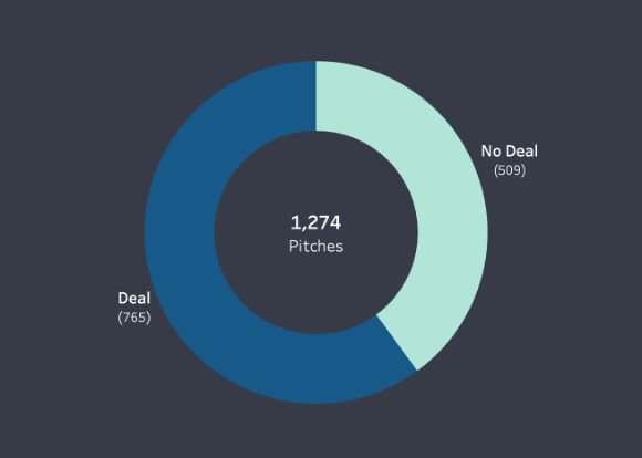
The donut chart in the Shark Tank dashboard shows the total pitches made, segmented based on Deal or No Deal.
To create this donut chart, start by creating a pie chart in a new worksheet.
From the Data Pane, add the Number of Records (i.e. Number of Pitches) to the Columns shelf, and Got Deal to the Rows shelf.
Note: Make sure to convert the Got Deal measure to a dimension, as shown in the image below.
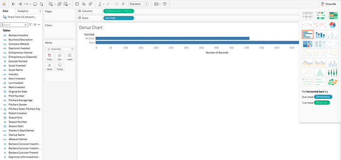
Select the pie chart visualization type from the Show Me tab. This will generate the base visualization for the donut chart.
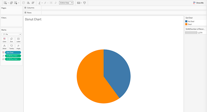
On the Rows shelf, add two new measures. Type AVG(0) on the Rows shelf twice. (i.e. AVG(0) AVG(0)). Once added to the Rows shelf, you will see two pie charts.
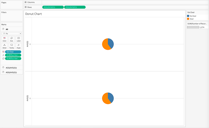
Select Dual Axis on the second measure on the Rows shelf to overlap the two pie charts.
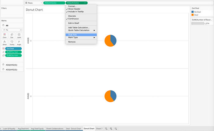
The two pie charts will now overlap one another. Adjust the size of each pie chart to create the donut shape. Under the Marks card, select Size and increase the size of the pie charts by moving the slider to the right.
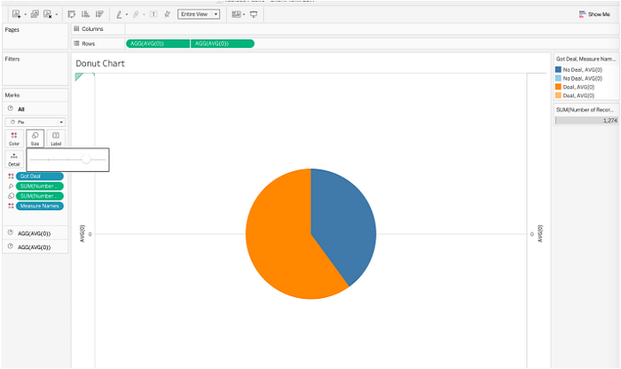
To create the inner donut, adjust the second, or bottom pie chart. On the Marks card, navigate to the card for the second measure, and remove all fields. In this case, there are 4 fields to remove.
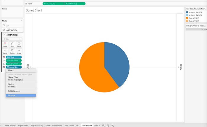
Removing these fields will result in a gray circle in the center. This is the center of the donut chart. Adjust the size on the Marks card to adjust the size of the donut.
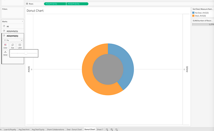
Use the Marks card to adjust the color of the center of the donut chart.
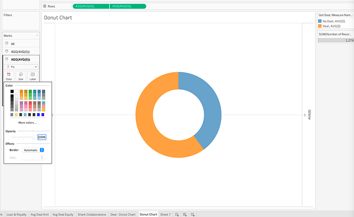
Use the first pie chart, the second tile under the Marks card, to adjust the labels and colors of the donut chart.
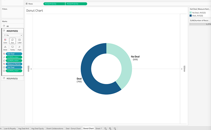
Add text to the center of the donut chart by moving a measure to Label on the All Marks card.
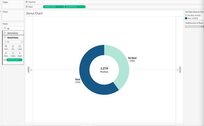
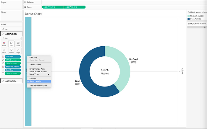
Right click on the headers, and uncheck Show Header to remove axis headers.
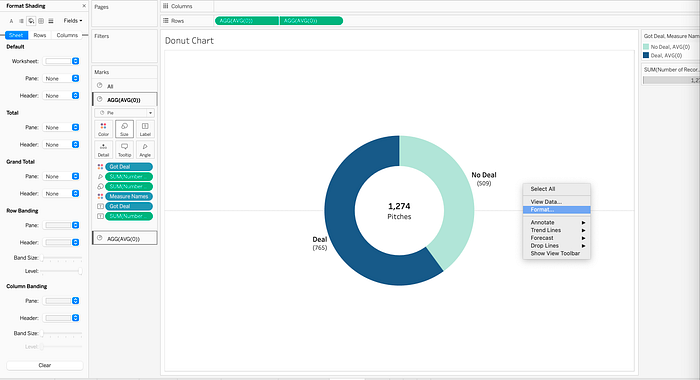
Right click anywhere on the worksheet and select Format to open the Format pane. Use the Format pane to hide gridlines, adjust the border, change the background color, and more.
The following image shows the final donut chart, after formatting with the Marks card and Format pane.
Sankey Diagrams
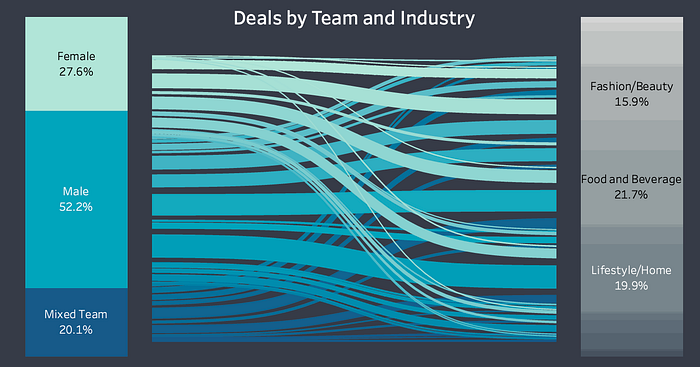
Sankey diagrams display flows from one entity to another. The sankey diagram in the Shark Tank dashboard displays the flow of deals from pitchers gender (i.e. team composition) to industry.
Step 1: Self-Union
To create a Sankey diagram, upload the dataset, and then create a self-union of the data source. The following image shows the dataset loaded, with a total of 1274 records and 50 fields.
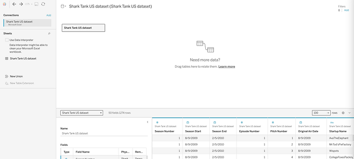
To create a self-union, move Shark Tank US dataset from Sheets, onto the Shark Tank US dataset on the canvas. Notice the number of rows doubles from 1274 to 2548.
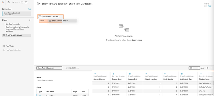
The self-union creates two fields — the Table Name field will be used later in this exercise.

Step 2: Create New Fields & Bins
To develop this Sankey diagram, create seven calculated fields and one bin. Open a new worksheet and create the following calculations. Note: Field names listed in bold below, followed by the respective calculation.
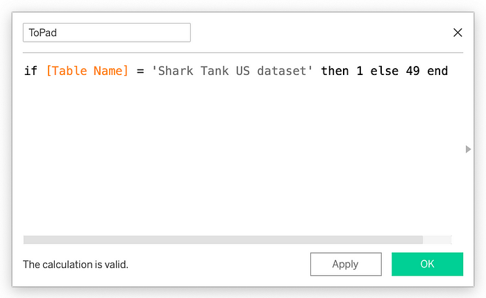
- ToPad: if [Table Name] = ‘Shark Tank US dataset’ then 1 else 49 end
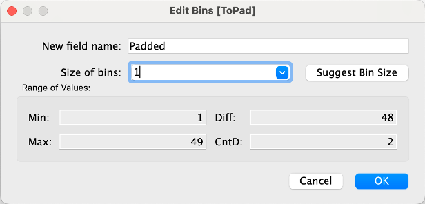
- Padded: Right click on the ToPad field and select Create → Bins to create a new Bin called Padded. Set the Size of bins equal to 1.
- t: (INDEX() — 25) / 4
- Rank 1: RUNNING_SUM(SUM([Number of Records]))/TOTAL(SUM([Number of Records]))
- Rank 2: RUNNING_SUM(SUM([Number of Records]))/TOTAL(SUM([Number of Records]))
- Sigmoid: 1 / (1 + exp(1)^-[t])
- Curve: [Rank 1] + (([Rank 2]-[Rank 1])*[Sigmoid])
- Deal Sizing: WINDOW_AVG(SUM([Number of Records]))
Note: Rank 2 is a duplicate of Rank 1
The following image shows an example of how to create the calculated field, ToPad, in Tableau.
The following image shows how to create a bin on ToPad called Padded, with a bin size of 1.
Step 3: Develop Sankey Visualization
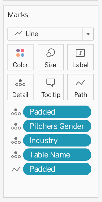
Move t to the Columns shelf, Curve to the Rows shelf, and Padded to Detail on the Marks card.
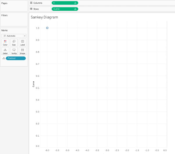
Move Industry, Pitchers Gender, and Table Name to Details on the Marks Card.
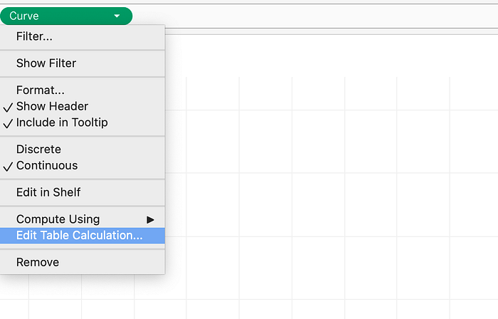
Select Edit Table Calculation on the Curve measure, on the Rows shelf.
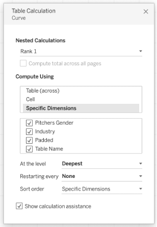
For Rank 1, update the table calculation as follows:
- Select Compute Using Specific Dimensions
- Check the following fields: Pitchers Gender, Industry, Padded, Table Name
- Ensure Pitchers Gender is at the top, as this will be on the left of the Sankey diagram
For Rank 2, update the table calculation as follows:
- Select Compute Using Specific Dimensions
- Check the following fields: Industry, Pitchers Gender, Padded, Table Name
- Ensure Industry is at the top, as this will be on the right of the Sankey diagram

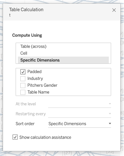
For t, update the table calculation as follows:
- Select Compute Using Specific Dimensions
- Check the following fields: Padded
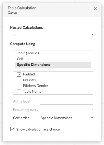
Now, select Edit table calculation from the drop-down options on the t measure, on the Columns shelf. For t, update the table calculation as follows:
- Select Compute Using Specific Dimensions
- Check the following fields: Padded
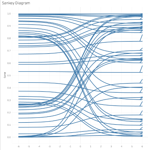
The sankey diagram will take start to take shape on the worksheet.
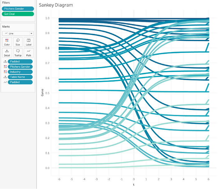
Add color to the Sankey Diagram by changing the Mark type of the Industry and Pitchers Gender fields on the Marks card, as seen in the image below. Add Got Deal and Pitchers Gender to the Filters card, to filter the dataset to show the number of deals.
Edit the X & Y axis range. To edit an axis, right-click on the axis and select Edit Axis.
For the Y axis (Curve) change the range to start at 0.
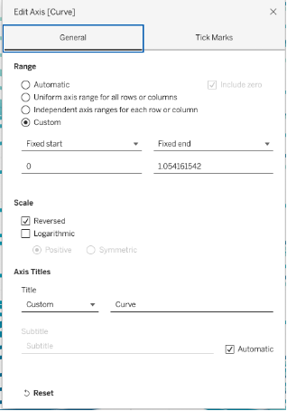
For the X axis (t) change the range to -5 to 5.
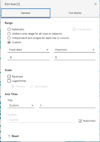
Hide the headers on each axis for a cleaner visual. (Note: To do this, right click on the header, and uncheck Show Header)
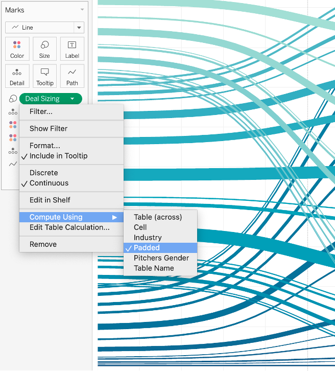
Move Deal Sizing to Size on the Marks card and increase the size to increase thickness of the lines on the diagram. The thickness of these lines reflects the number of deals flowing from Pitchers Gender to Industry. On Deal Sizing, select Compute using Padded, as seen in the following image.
Step 4: Create Ends of Sankey Diagram
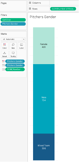
The sankey diagram requires two bar charts, one for each end (Pitchers Gender and Industry). Open a new worksheet, and create a bar chart. The below image shows a bar chart for Pitchers Gender. Note: the color scheme used for Pitchers Gender was used in the main portion of the Sankey diagram.
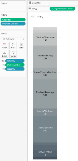
Repeat for the Industry field, but this time select the Gray color palette.
Now it’s time to put it all together! Create a new dashboard and add the three worksheets together, as seen below. Adjust the background color and borders using the Format pane.
Step 5: Add dashboard actions
Add the following dashboard actions to enable hovering capabilities for the Sankey Diagram.
To add a dashboard action, from the main menu, select Dashboard → Actions → Add Action → Highlight.
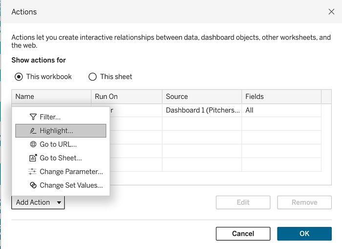
For Pitchers Gender, add the following Highlight Action.
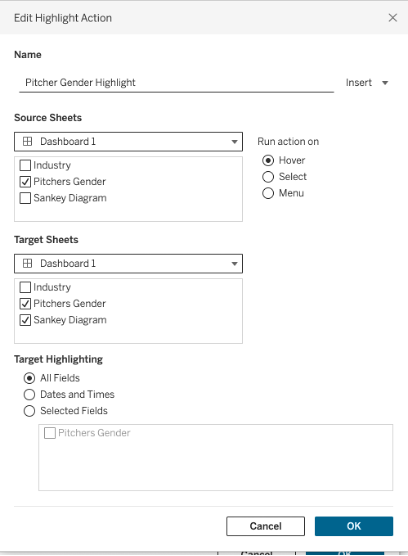
This will allow the user to hover over the chart on the left and see where the deals are moving to on the right.
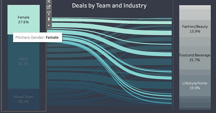
Create another highlight action for Industry. Again, select Dashboard → Actions → Add Action → Highlight.
Enter the following information to create the Hover Highlight Action for Industry.
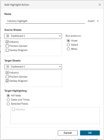
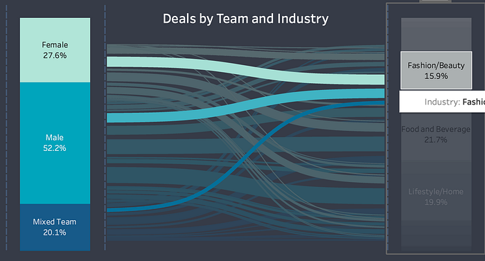
The user can now hover over Industry, and see the proportion of Pitchers Genders making deals.
Word Clouds
Word clouds display the most common words in a text, with the most frequent words appearing the largest. The words are arranged in the shape of a “cloud”, hence the name of the visualization type, word cloud. Word clouds are useful in some cases, such as visualizing word frequency within a text column.
To create a word cloud, one dimension (categorical variable) and one measure (numerical variable) is required. This section shows how to recreate the word cloud from the Shark Tank Deals dashboard. This word cloud displays the number of deals within each industry.
To start, open a new worksheet. Move Industry onto Text on the Marks card, and Number of Records (i.e. Number of Pitches) onto Size. Additionally, move Industry to Color.
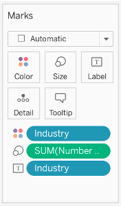
This will result in a heat map as seen below. To transform this visual into a word cloud, on the Marks card, change the visualization type to Text.
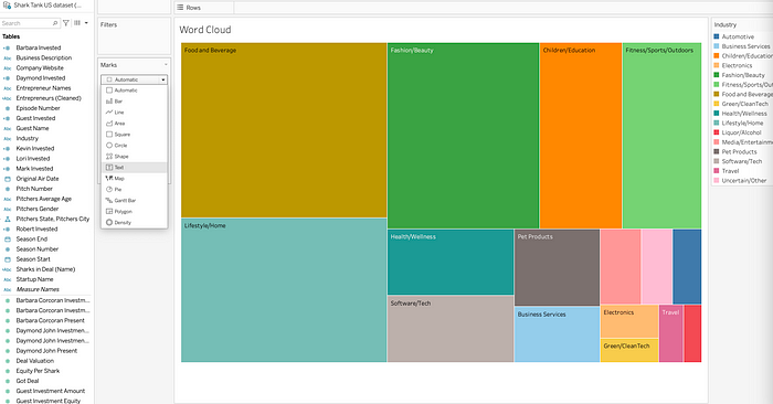
This results in a word cloud. Use the Marks card to make changes to the format.

Lollipop Charts
Lollipop charts are similar to bar charts. They display frequency across different categories. Where lollipop charts differ from bar charts is in the visual display. While bar charts use rectangles to display values for each category, lollipop charts add a circle to the top of each bar. This type of visualization can be useful when creating a infographic or dashboard.
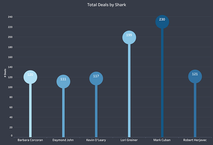
The lollipop chart in the Shark Tank dashboard displays the number of deals by shark.
To begin, add Got Deal and Measure Names to the Columns shelf. Convert Got Deal to a discrete dimension by selecting the options on the field.

Add Measure Values to the Rows shelf twice. Don’t worry, in a few more steps the lollipop chart will start to take shape!
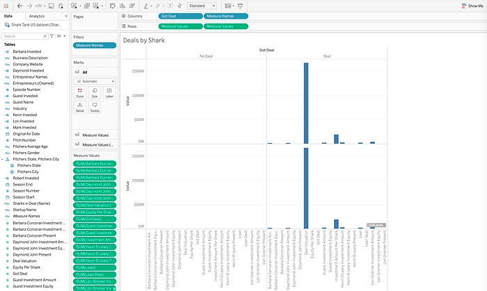
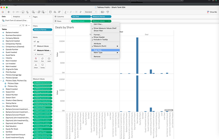
On the second Measure Values field, select Dual Axis.
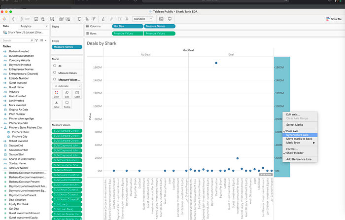
Right click on one of the y axes, and select Synchronize Axis.
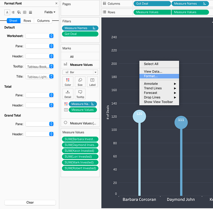
On the Measure Values card, add the following fields: Barbara Invested, Daymond Invested, Kevin Invested, Lori Invested, Mark Invested, Robert Invested. Change each of these fields to Measure (Sum), as seen in the following image. Remove any other fields from the Measure Values card not in this list.
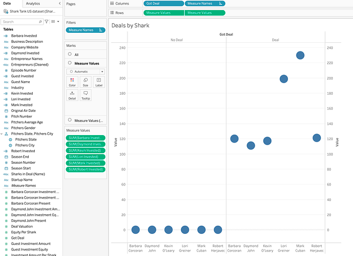
Add Got Deal to the Filters card. Filter for Got Deal = 1, equivalent to “Got Deal”.
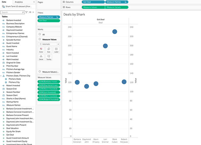
On the Marks card, change the chart type on the Measure Values card to Bar, and adjust the size.
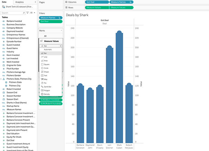
On the second Measure Values card, change the type to Circle, and adjust the size using the Size tile.
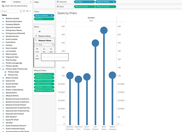
Move the Measure Values pill to Text tile on the Measure Values Marks card, to add labels to the circles on the chart.
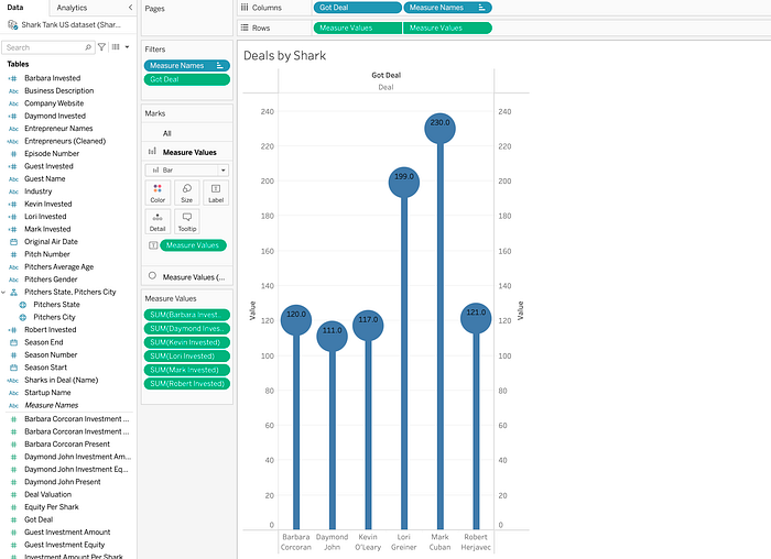
Right click on the y-axis, and uncheck Show Header, to remove the additional header. Use the Format pane to change the background color, format axes, and modify the text labels. To open the Format pane, right click on the worksheet and select Format.
The following image shows the final lollipop chart.
Radial Chart
Radial charts are another way to display categorical information. Radial charts can be a great alternative to bar charts.
In the Shark Tank dashboard, the radial chart displays deals by the number of Sharks in the deal. To create a radial chart in Tableau, one dimension and one measure is required. Additionally, 9 calculated fields and 1 bin will be created in the process. The following steps outlines how to recreate this chart.
Step 1: Self-Union
To create a radial chart, upload the dataset, and then create a self-union of the data source. The following image shows the dataset loaded, with a total of 1274 records and 50 fields.

To create a self-union, move Shark Tank US dataset from Sheets, onto the Shark Tank US dataset on the canvas. Notice the number of rows doubles from 1274 to 2548.

The self-union creates two fields — the Table Name field will be used later in this exercise.

Step 2: Create New Fields & Bins
9 calculated fields and 1 bin is needed to create this radial chart. Open a new worksheet and create the following calculations in order. Note: Field names listed in bold below, followed by the respective calculation.
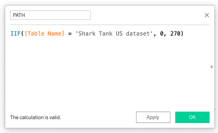
- Path: IIF([Table Name] = ‘Shark Tank US dataset’, 0, 270)
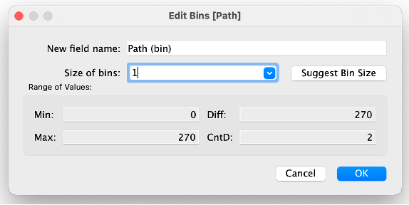
- Path (Bin): — Right click on the Path field and select Create → Bins to create a new Bin called Path (Bin). Set the Size of bins equal to 1.
- Index-1: INDEX()-1
- Total Cat. Deals: WINDOW_SUM(SUM([Number of Records]))/2
- Total Deals: WINDOW_SUM(SUM([Number of Records]))/2
- Percent Calc: [Total Cat. Deals]/[Total Deals]
- Rank Calc: RANK_UNIQUE([Total Cat. Deals], ‘asc’)
- Size Calc: [Percent calc]/WINDOW_MAX([Percent calc])
- X: SIN(RADIANS([Index-1])*[Size calc]) * [Rank calc]
- Y: COS(RADIANS([Index-1])* [Size calc]) * [Rank calc]
The following image shows an example of how to create the calculated field, PATH, in Tableau.
The following image shows how to create a bin on PATH called Path (bin), with a bin size of 1.
Step 3: Create Visualization
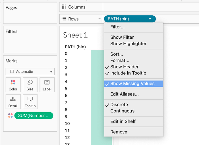
Move Number of Sharks in Deal to the Colors tile on the Marks card, and Path(bin) to the Rows shelf. Check Show Missing Values on the Path(bin) field.
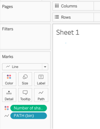
On the Marks card, change the mark type to Line. Move Path(Bin) from the Rows shelf to Path on the Marks Card. Make sure Number of Sharks is a dimension and not showing the sum.
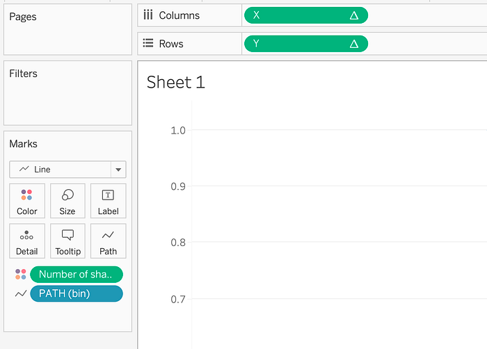
Move X to the Columns shelf, and Y to Rows shelf.
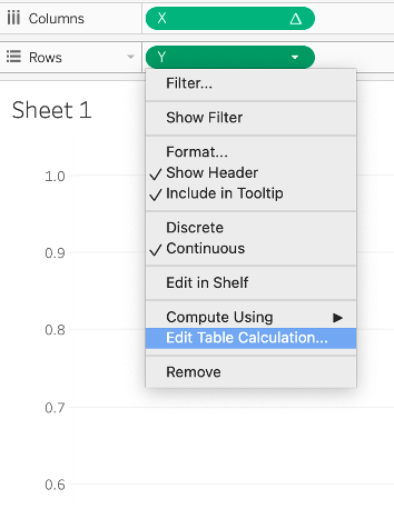
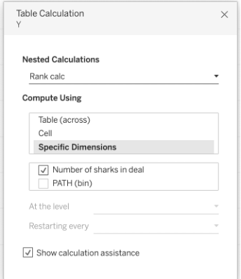
Select Edit Table Calculation on Y.
For Index-1, update the table calculation as follows:
- Select Compute Using Specific Dimensions
- Check the following fields: PATH(bin)
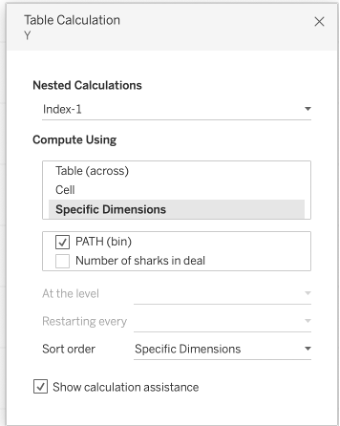
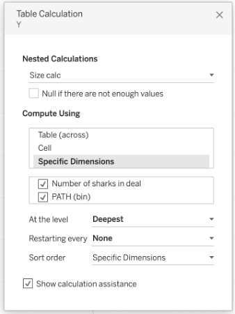
For Size calc, update the table calculation as follows:
- Select Compute Using Specific Dimensions
- Check the following fields: Number of sharks in deal, PATH(bin)
- Ensure Number of sharks in deal is at the top
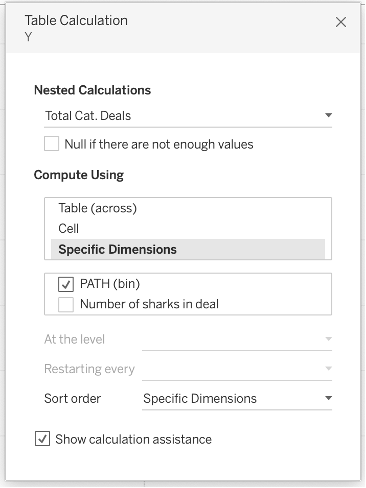
For Total Cat. Deals, update the table calculation as follows:
- Select Compute Using Specific Dimensions
- Check the following fields: PATH(bin)
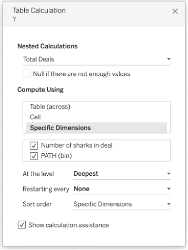
For Total Deals, update the table calculation as follows:
- Select Compute Using Specific Dimensions
- Check the following fields: Number of sharks in deal, PATH(bin)
- Ensure Number of sharks in deal is at the top
For Rank calc, update the table calculation as follows:
- Select Compute Using Specific Dimensions
- Check the following fields: Number of sharks in deal
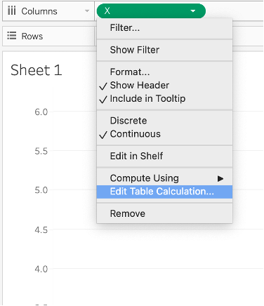
Select Edit Table Calculation on X.
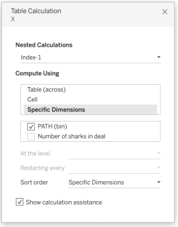
For Index-1, update the table calculation as follows:
- Select Compute Using Specific Dimensions
- Check the following fields: PATH(bin)
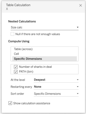
For Size calc, update the table calculation as follows:
- Select Compute Using Specific Dimensions
- Check the following fields: Number of sharks in deal, PATH(bin)
- Ensure Number of sharks in deal is at the top
For Total Cat. Deals, update the table calculation as follows:
- Select Compute Using Specific Dimensions
- Check the following fields: PATH(bin)
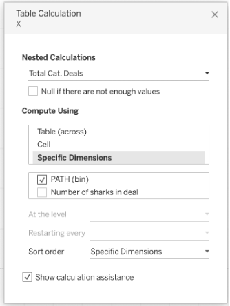
For Total Deals, update the table calculation as follows:
- Select Compute Using Specific Dimensions
- Check the following fields: Number of sharks in deal, PATH(bin)
- Ensure Number of sharks in deal is at the top
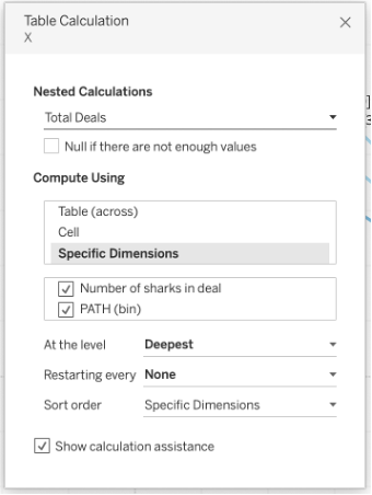
For Rank calc, update the table calculation as follows:
- Select Compute Using Specific Dimensions
- Check the following fields: Number of sharks in deal
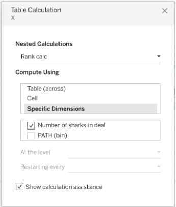
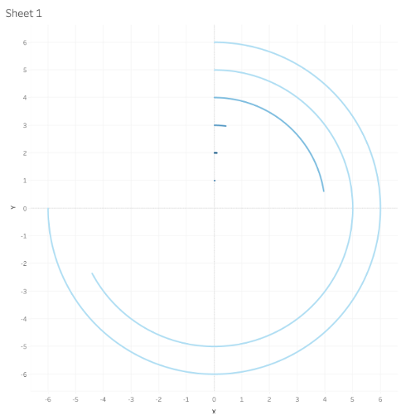
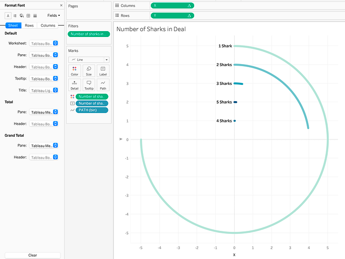
Once the table calculations are updated, the base of the radial chart begins to take shape.
Step 4: Additional Formatting
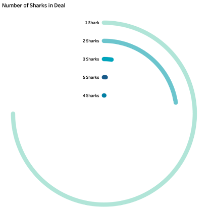
Use the Marks card to format the visual — adjusting line thickness, color, and labels. The below image shows labels added to the beginning of each line, and a new color palette assigned. Use the Format pane on the left to remove borders and adjust the background as well.
The following image shows the final radial chart.
Nested Bar Chart
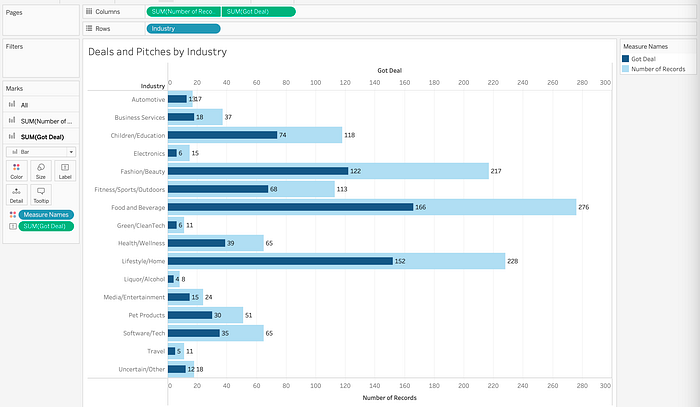
Another advanced visualization technique in Tableau is the nested bar chart. A nested bar chart is a way of stacking bar charts that allows you to compare two numerical values for a category. While this visualization type didn’t make it to the final dashboard, the following example shows how to create a nested bar chart using this data. The following nested bar chart displays the number of deals and number of pitches by industry.
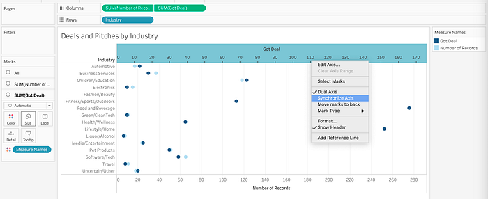
Start by creating two bar charts on a worksheet. Move Industry to the Rows shelf, and Number of Records (i.e. total pitches) and Got Deal to the Columns shelf.
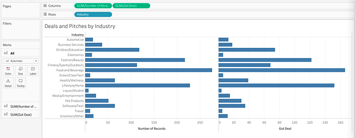
From the drop-down options on Got Deal, select Dual Axis.
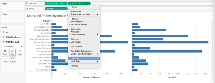
Right click one of the x-axes, and select Synchronize Axis.
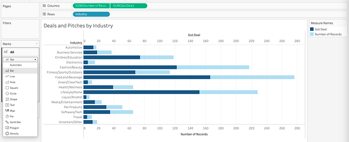
On the All Marks card, change the type to Bar.
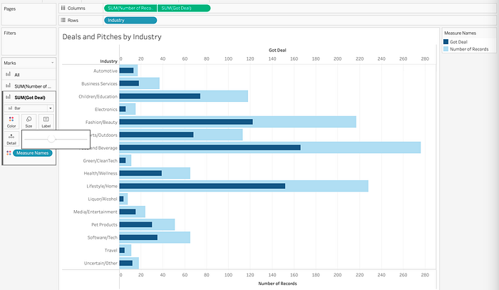
Adjust the size of the bars with the Number of Records and Got Deal Marks card. Make the Got Deals bar (navy blue) smaller than the Number of Records bar (light blue), as seen in the following image.
Use the Marks card to add labels and format the visual as needed. The following image shows the final nested bar chart.
And that covers 6 advanced visualizations in Tableau! While these examples are in Tableau, keep in mind these visualizations can be created in other tools as well — so use them as inspiration as you develop your next data visualization!
The final dashboard is available here for viewing or downloading source materials.
Payal is a Data & AI specialist. In her spare time, she enjoys reading, traveling, and writing on Medium. If you enjoy her work, follow or subscribe to her list, and never miss a story!
The above article is personal and does not necessarily represent IBM’s positions, strategies, or opinions.
References
[1]: Thirumani, Satya. “🦈 Shark Tank Us Dataset 🇺🇸.” Kaggle, 28 Aug. 2023, www.kaggle.com/datasets/thirumani/shark-tank-us-dataset. (CC0: Public Domain license)


