USE COLOR MEANINGFULLY
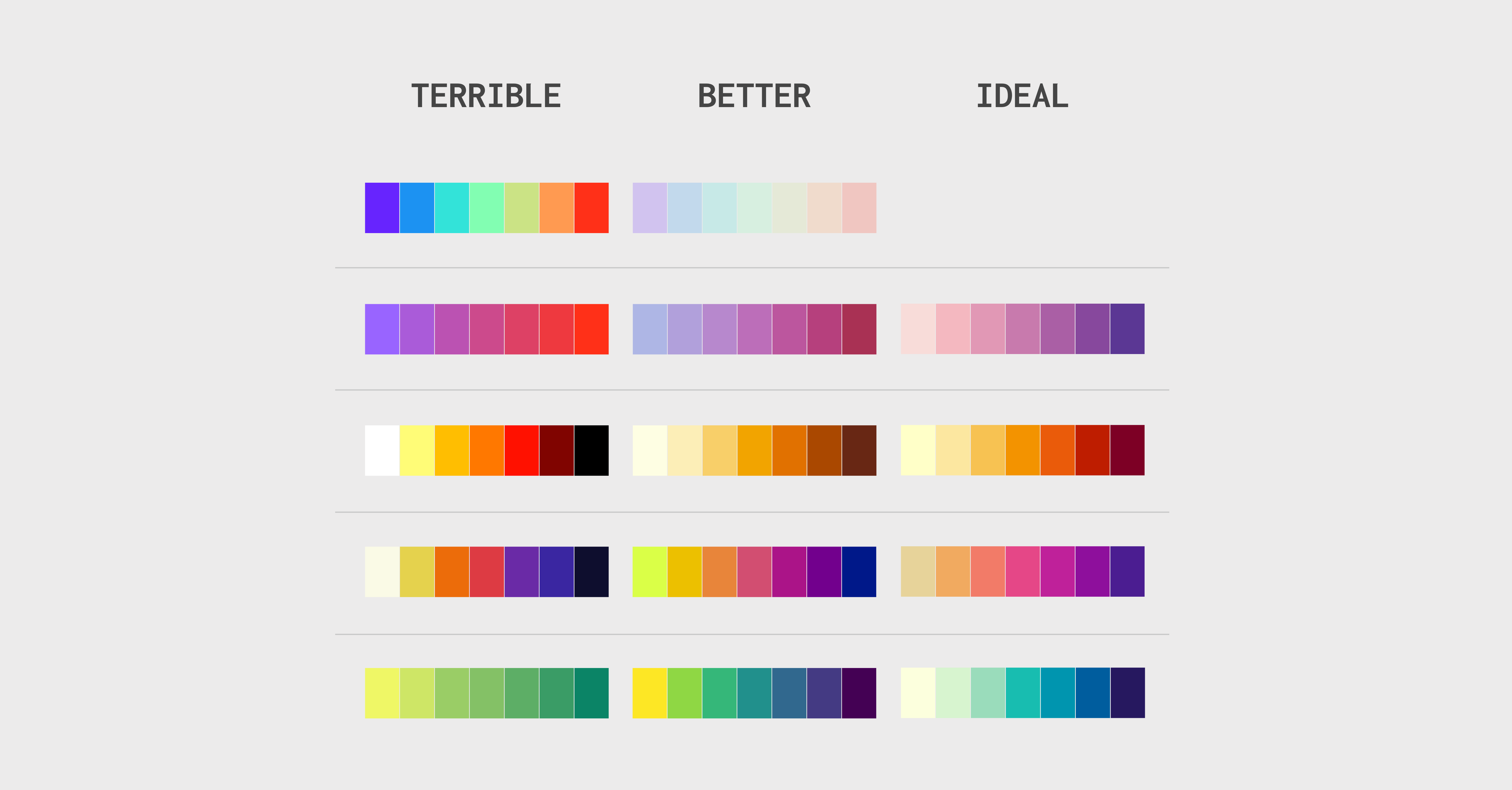
There are three color palettes used in data visualization: categorical, sequential, and diverging. Each one has its proper use and goes with a different data type. So if you are not sure what the differences are, I recommend taking a step back and checking this article first.
The sequential palette follows the order that correlates with perceived color lightness, also known as luminance or luminosity. Therefore, this palette is suited to data ranging from low to high values. It goes with an ordinal (e.g., Likert scale), interval (e.g., temperature), or ratio scale (e.g., profit value). Usually, palettes go from a light color representing lower values to a dark color representing higher values.
The luminance is a result of all three perceptual dimensions of the color: hue, saturation (or chroma), and lightness (or brightness) [1]. Because of this complex correlation, a linear change in color’s luminance can be achieved in three different ways. Depending on which perceptual dimension we change, we distinguish three types of sequential palettes:
- Greyscale – if only lightness has changed
- Single hue – both lightness and color richness have changed
- Multi hue – hue, color richness, and lightness have changed
1) Keep the change in luminance linear
Colors in a sequential palette follow the order that visually represents the change in value. Therefore the color change, more precisely the luminosity change, must be adequate to the value change. When we create a scale, we should keep equal intervals. The only exemption is the logarithmic scale. Instead of increasing in equal increments (linearly), each interval is increased by a factor of the logarithm base (exponentially).
Logarithmic scales deserve a separate article, so let’s focus for now only on linear ones. For those scales, the change in luminance must be linear, and the difference between the luminosity of each step should be equal. This significantly impacts accuracy in assessing the difference between two points.
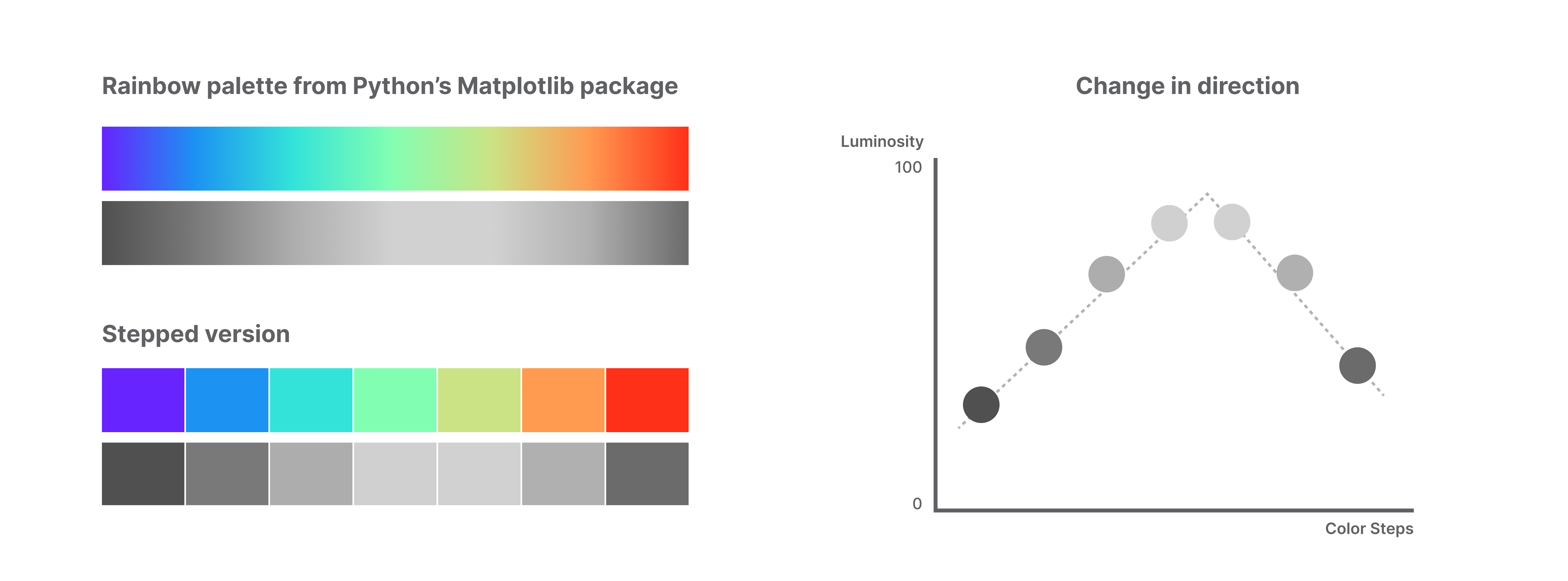
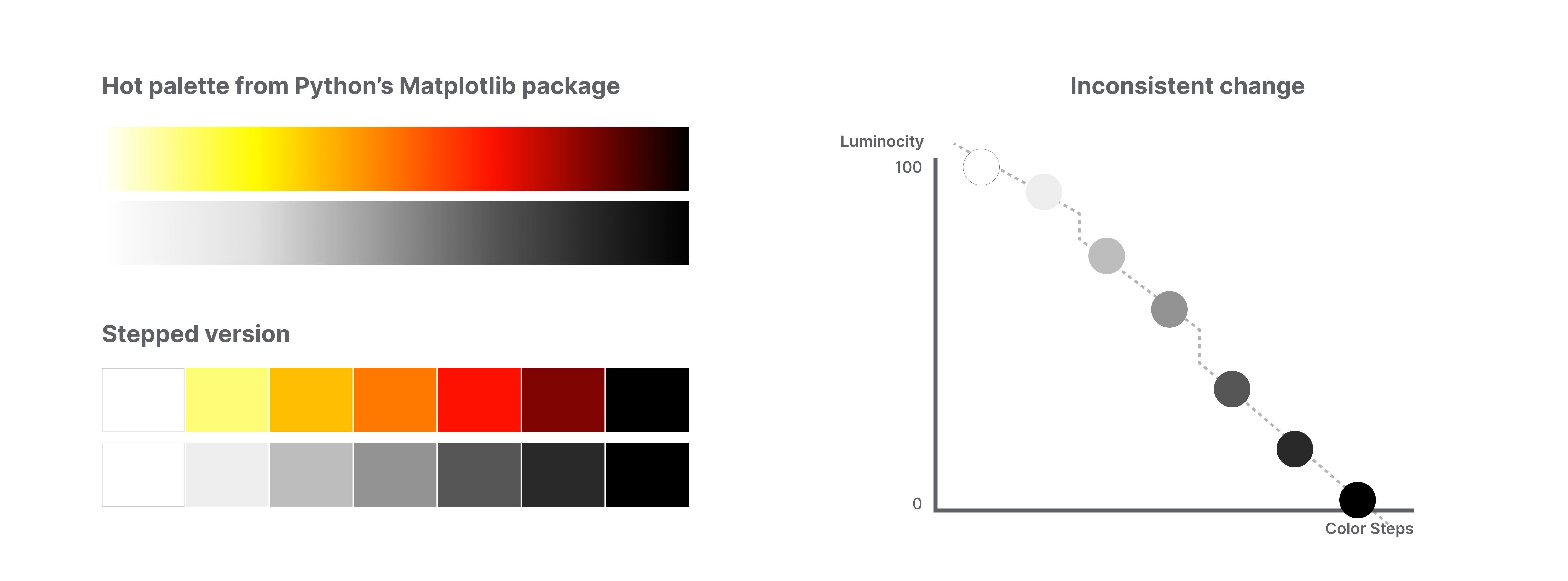
We can find default palettes in many programs or packages that might be mistakenly classified as sequential. To avoid misuse of the Palette, check how the luminosity changes. If luminosity changes the direction, stays constant, or changes inconsistently, look for another palette.
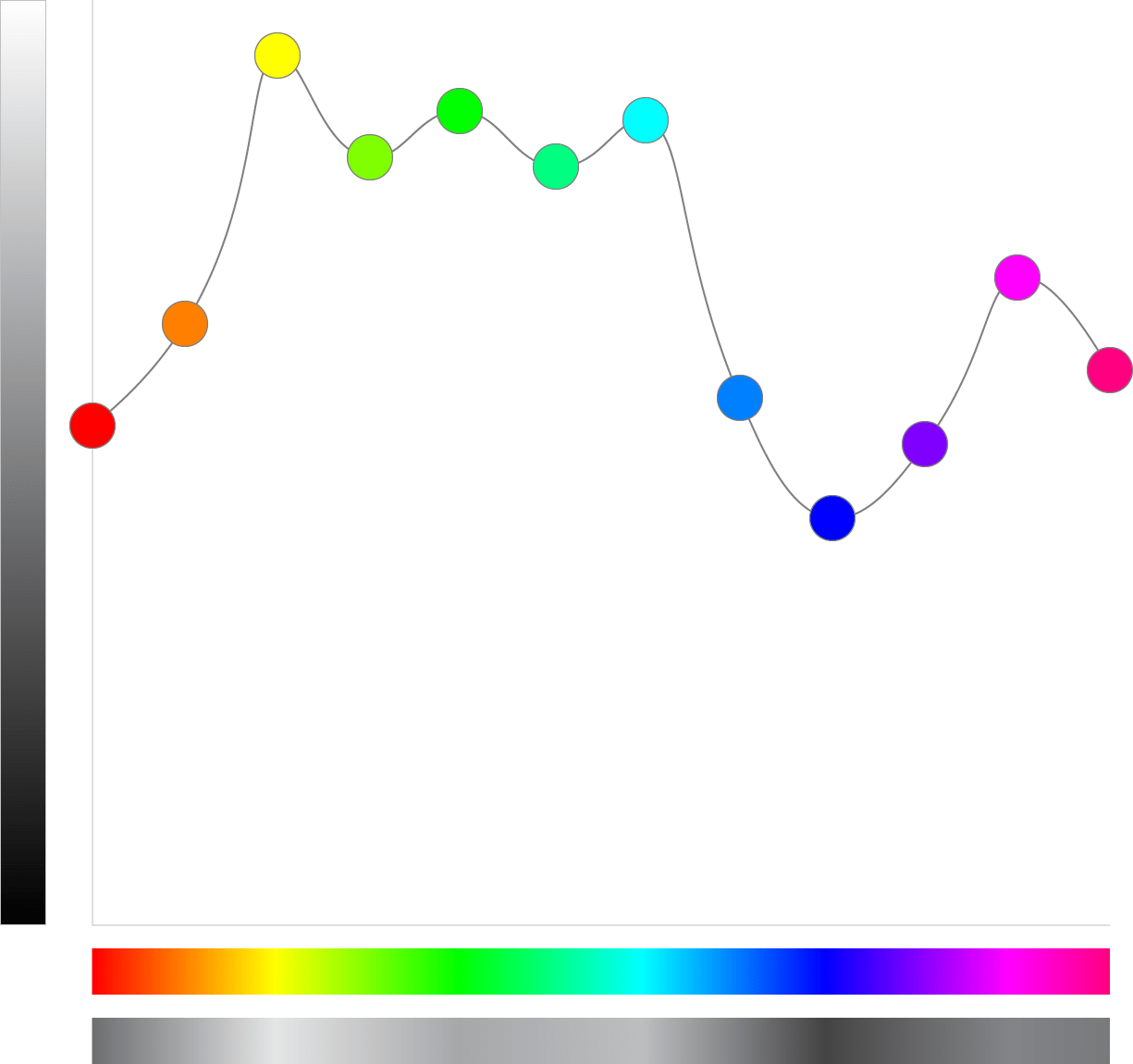
Inconsistency in the direction of change in luminance
A rainbow palette is the perfect example of a palette with inconsistent changes in luminosity vector. Having many distinct hues causes sudden jumps in luminance value and direction. And, like in the example below, the lightest point falls somewhere in the middle.
No change in luminance
When the gradient has a constant luminance, it’s only an imitation of a sequential palette. The lack of change in luminosity gives each step the same perceptual weight and makes it harder to assess the value or direction of the change. Because color’s luminance depends on hue, saturation, and lightness, we must carefully pick the start and end colors. A good start is to avoid pairing colors with the same or very similar perceived brightness. The graph showing the luminance of each of the 12 primary hues might be handy [2].

Inconsistent change in luminosity
At first glance, a sequential palette with inconsistent luminosity changes, especially the continuous one, might look just fine. But if you move to the stepped version, its oddity becomes more apparent. Jumps in luminosity visually enhance the difference between some steps and decrease the difference between others. If we don’t check with the legend, we might unconsciously think there is some additional step between the second and the third color.
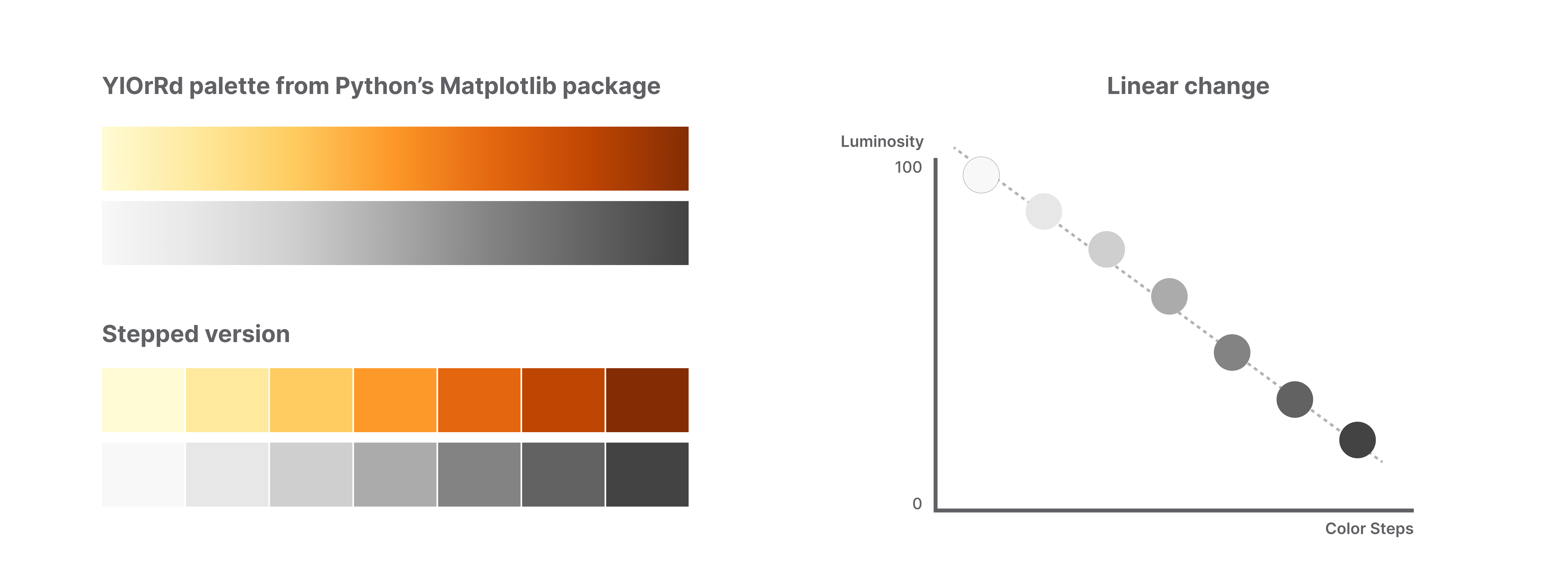
Linear change in luminosity
The sequential palette with a linear change in luminosity is well balanced in both a continuous and a discrete variant. Therefore there is no confusion about the relationship between any two colors. If you want to ensure that your palette follows the linear pattern, you can use the Chroma.js Color Palette Helper. This free online tool will help you correct the lightness. I recommend starting with the article explaining how to utilize its full potential [3].
2) Add hue variation
If the luminous change must be linear, does it mean we have to avoid using more than two colors?
The answers might surprise you, but there is nothing wrong with using more the two colors in a sequential palette. Moreover, adding a hue variation can bring additional improvement to our palette. It provides better color contrast and thus makes the colors easier to differentiate. It de-emphasizes the extremes and increases the significance of all values along the sequence [4].
In a multi-hue sequential palette based on two colors, we should pick more luminance for the lighter end and less for the darker end. Starting the palette with yellow, which is the most luminance color, and ending it with blue, green, or red is a good option because of the noticeable difference in luminance. But as you can see in the example below, starting the palette with dark green and ending it with light blue will not work.

If we want to include more than two hues, the process gets more complicated because all three dimensions of color (hue, saturation/chroma, lightness/brightness) are changing simultaneously [1]. The rule for employing a sequence of hues is to order them based on their luminosity and keep the high saturation/chroma throughout the palette.
In the example below are two pairs of complementary palettes. The top row consists of versions with three hues. Color steps in the middle are more saturated, making them stand out more. The palettes at the bottom consist only of two hues that de-emphasize the middle values and stress the extremes.

3) Play with chroma trajectory in a single hue
We already covered that luminosity in a sequential palette should change linearly, but how about the hue? It might be counterintuitive, but having the most colorful step in the middle is a good solution for a single-hue palette. To achieve this, we must start by using chroma rather than saturation. This means switching from HSL (Hue-Saturation-Lightness) or HSB (Hue-Saturation-Brightness) color model to HCL (Hue-Chroma-Luminance).
The most significant advantage of the HCL model is that it matches the closest the way humans perceive colors. That’s why **** it’s widely popular in data visualization software and incorporated in R, Python, or JavaScript packages.
According to psychophysical theories, humans describe colors in three dimensions [5]:
- hue (which is popularly associated with the color itself)
- chroma (intensity of color as compared to gray)
- luminance (brightness, amount of gray)
Having the richest color in the middle of the palette makes the color steps easier to distinguish [4]. Below are two examples of palettes created with the HCL model. The left one follows the linear change in chroma, which makes it look flat, while the right incorporates the triangular chroma trajectory. Similar to the previous example, when the middle part of the palette is desaturated, it accentuates the extremes. Adding richness to the colors in the middle makes them equally important.
![Example inspired by Colorspace toolbox [4]. On the left side sequential palette with a linear change in chroma, on the right side palette with a triangular change in chroma (the richest color is in the middle)- a graph by the author.](https://towardsdatascience.com/wp-content/uploads/2022/04/1IiZOsW5JHbrhOR9Vpoaq8Q.png)
Don’t wanna miss any of my posts? Get them directly to your inbox!
And if you are not a part of Medium family yet, consider signing up for a membership. It only costs $5 per month, supporting thousands of writers. Sign up with my affiliate link, and apart from access to all published content, you will get my eternal gratitude.
Links
[1] M. Harrower, C. Brewer, ColorBrewer.org: An Online Tool for Selecting Colour Schemes for Maps (2003), The Cartographic Journal
[2] C. Shanley, Mixing Colours of Equal Luminance – Part 1 (2020), Medium
[3] G. Aisch, Mastering Multi-hued Color Scales with Chroma.js (2013), author’s blog
[4] A. Zeileis, J.C. Fisher, K. Hornik, R. Ihaka, C.D. McWhite, P. Murrell, R. Stauffer, C.O. Wilke, Colorspace: A Toolbox for Manipulating and Assessing Colors and Palettes (2019), arXiv.org E-Print Archive
[5] A. Zeileis, K. Hornik, P. Murrell, Escaping RGBland: Selecting Colors for Statistical Graphics (2007), Research Report Series / Department of Statistics and Mathematics


